Dojo Mobile
| Authors: | Yoshiroh Kamiyama, Doug Hays, Chris Mitchell |
|---|---|
| Developers: | Yoshiroh Kamiyama, Doug Hays |
| since: | V1.5 |
Introduction
The Dojo Mobile package provides a number of widgets that can be used to build web-based applications for mobile devices such as iPhone, Android, BlackBerry, or Windows Phone 8. These widgets work best with webkit-based browsers, such as Safari or Chrome, or with IE10, since CSS3 features are extensively used. However, the widgets should work in a “graceful degradation” manner even on non-CSS3 browsers, such as IE (before IE10) or (older) Firefox. In that case, fancy effects, such as animation, gradient color, or round corner rectangle, may not work, but you can still operate your application. Furthermore, as a separate file, a compatibility module, dojox/mobile/compat, is available, which simulates some of the CSS3 features used in this module. If you use the compatibility module, fancy visual effects work better even on non-CSS3 browsers.
Dojo Mobile is designed to be as lightweight as possible to achieve a better user experience on mobile. It only has a few dependencies on other dojo/dijit modules. It has less dependency even on the dojo and dijit base modules, so many of the base modules can be eliminated at build time. Also, it has its own very small parser that is a subset of the core dojo/parser, but has enough capability to bootstrap your application.
Available Widgets
Views
-
A container widget for any HTML element and/or Dojo widgets
-
A view with touch scroll capability
-
A view that can be swiped horizontally
-
A scrollable view with tree-style navigation. (Experimental)
-
A singleton class that controls view transitions
Heading
-
A navigation bar that appears at the top
-
A button that is placed in the Heading widget
Lists
-
Rounded-corner list category
-
Edge-To-Edge list category
-
A list of items in a rounded-corner rectangle
-
A list of items with equal width
-
RoundRectList with dojo/data support
-
EdgeToEdgeList with dojo/data support
-
RoundRectList with dojo/store support
-
EdgeToEdgeList with dojo/store support
-
A list item to use in a list widget
-
A mixin to add filtering capabilities to all list widgets
-
A mixin to enhance scrolling performances of lists containing many items
IconContainer
-
A container to house icons for actions/events
-
A widget for representing an icon and associated actions
TabBar
-
A bar that can contain TabBarButtons to control the visibility of views
-
A button that is placed in the TabBar widget
Panes
-
A rounded rectangle container for any HTML and/or widgets.
-
A pane that can load and display HTML content/fragments. Similar to dijit/layout/ContentPane.
-
A simple container widget that can be used for any purposes.
-
A simple div-wrapper pane widget that can be used for any purposes.
-
A pane that has the touch-scrolling capability.
Openers
-
A component that encapsulates the mechanism for displaying secondary views such as dialogs. Openers take the screen size into account and can display the next view as a slide-in dialog (phone) or inside a tooltip dialog (tablet)
-
A component that displays a secondary view which partially occludes the original view using a slide-in transition effect. Useful for displaying dialogs.
-
A non-templated popup bubble widget
Form Controls
-
A button that changes its color when pressed
-
A checkbox component displaying a boolean value.
-
A combo box allowing users to edit input values with the built-in keyboard. (Experimental)
-
A text area that can automatically adjust its dimensions based on how much content it holds.
-
A component for displaying a discrete set of selectable items.
-
A control that allows changing a numeric value by touching and dragging a slide handle.
-
A toggle switch with a sliding knob. Useful for displaying boolean settings.
-
A multi-line text input control.
-
A text input control.
-
A button that can toggle between two states.
-
A non-templated base class for INPUT type=”search”
Layout
-
A layout component that displays two content areas, with the separation between the areas fixed at a given position.
-
Used for the two content areas in a fixed splitter control.
-
A layout widget that allows the user to freely navigate between panes.
-
A container widget that places its children in a grid layout.
-
A pop-up menu that shows icons and labels in a table layout.
-
A widget that represents an item of IconMenu.
-
A module to make a screen-size-aware application. (Experimental)
-
A simple dialog box for mobile.
Indicators
-
A widget that displays a series of gray and white dots to indicate which page is currently being viewed.
-
A round spinning graphical indicator
-
A widget that shows the progress of a task.
-
A widget that shows the rating using stars.
Carousel
-
A widget that manages a list of images or content, and displays a paging indicator. Allows the user to flick left/right to move between content items.
-
A widget that represents an item of Carousel.
-
An enhanced version of Carousel that supports dojo/data.
-
An enhanced version of Carousel that supports dojo/store.
Spin Wheel
-
A value picker component that has one or more slots.
-
A slot that is placed in a SpinWheel.
-
A date picker component that is derived from SpinWheel.
-
A time picker component that is derived from SpinWheel.
Value Picker
-
A widget for selecting some values using the +/- buttons or an input field.
-
A slot that is placed in a ValuePicker.
-
A date picker component that is derived from ValuePicker.
-
A time picker component that is derived from ValuePicker.
Date/Time Picker
-
A wrapper widget around SpinWheelDatePicker or ValuePickerDatePicker.
-
A wrapper widget around SpinWheelTimePicker or ValuePickerTimePicker.
Media
Utils
-
A utility to create/update a badge node.
-
A utility for creating an image icon.
-
An automatic theme loader.
-
Utilities to provide page turning effects just like turning the pages of a real book.
Getting Started
Loading the basic Dojo Mobile codebase is extremely simple. It’s a couple requires and then selecting the CSS. That’s it.
Loading Dojo Mobile
This example assumes the Dojo script is being loaded asynchronously with “async:1” config property. Using this approach helps to ensure that the bare minimum code is used, and loaded as fast as possible.
require([
  "dojox/mobile/parser", // (Optional) This mobile app uses declarative programming with fast mobile parser
  "dojox/mobile",        // (Required) This is a mobile app.
  "dojox/mobile/compat"  // (Optional) This mobile app supports running on desktop browsers
], function(parser, mobile, compat){ Optional module aliases that can then be referenced inside callback block
  // Do something with mobile api's.  At this point Dojo Mobile api's are ready for use.
);
If you prefer to use “progressive enhancement” design techniques and not use Dojo’s simple declarative programming model, you can choose not to specify the dojox/mobile/parser module, and instead script and construct widgets programmatically.
If you don’t need compatibility support for modern desktop browsers (FF, IE8+), you can choose not to specify the dojox/mobile/compat module. In this case, mobile support will only work properly on Webkit-based mobile browsers (Dojo Mobile’s default environment support).
Themes
Dojox Mobile provides a set of visual themes that can be applied dynamicaly to your application in order to give it a native look depending on the browser user agent, or that can be applied whatever the browser displaying the application in order to give it the same look whatever the device or browser in use.
To apply a native theme (that is, a theme that makes your application look like a native application on the mobile device on which it is displayed), you just need to include the following statement in your HTML pages:
<script type="text/javascript" src="dojox/mobile/deviceTheme.js"></script>
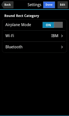
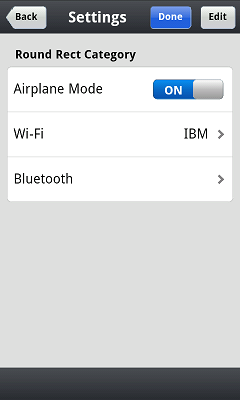
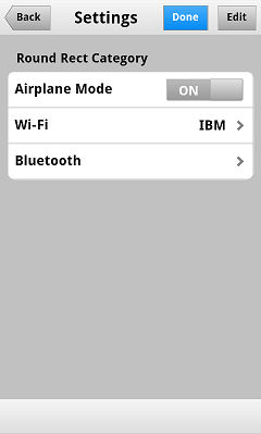
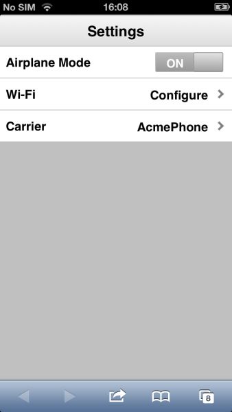
See dojox/mobile/deviceTheme for more information. When this approach is taken, you can also pass an additional query parameter string, theme={theme id} to force a specific theme from a browser url input (this feature is useful for creating samples and demos as well as testing what a page looks like on various devices). The theme id value is used instead of the navigator.userAgent property to determine the theme, possible values are: Android, Holodark, BlackBerry, iPhone, iPad, WindowsPhone or Custom (see the list of available themes below).
To apply the same theme whatever the client browser, you just need to include the main css file for the theme. For example, to use the custom theme (more on available themes below), you just need to include the following statement in the header section of your HTML pages:
<link rel="stylesheet" type="text/css" href="dojox/mobile/themes/custom/custom.css"></link>
Themes currently available
The themes that are currently available for a dojo mobile application are the following:
iPhone
This theme is modeled on the native iphone look. When using dojox/mobile/deviceTheme.js, this theme is triggered for an iPhone user agent and for any other user agent that does not specifically trigger another theme (the iPhone theme is the default theme). To apply it whatever the user agent, use the following CSS link statement instead:
<link rel="stylesheet" type="text/css" href="dojox/mobile/themes/iphone/iphone.css"></link>
Note that the iPhone theme has a different rendering on iOS5 than on iOS6, just as natives applications. On iOS6, by default, there are no vertical stripes on the background of the pages. To display vertical stripes as in native iOS6 system properties pages, simply add the class mblIOS6Stripes to the body of your page:
<!-- On iOS6, displays vertical stripes on the background -->
<body class="mblIOS6Stripes" style="visibility: hidden;">
iPad
This theme is modeled on the native iPad look. When using dojox/mobile/deviceTheme.js, this theme is triggered for an iPad user agent. To apply it whatever the user agent, use the following CSS link statement instead:
<link rel="stylesheet" type="text/css" href="dojox/mobile/themes/iphone/ipad.css"></link>
Note that the iPad theme has a different rendering on iOS5 than on iOS6, just as natives applications. On iOS6, by default, there are no vertical stripes on the background of the pages. To display vertical stripes as in native iOS6 system properties pages, simply add the class mblIOS6Stripes to the body of your page:
<!-- On iOS6, displays vertical stripes on the background -->
<body class="mblIOS6Stripes" style="visibility: hidden;">
Android
This theme is modeled on the native Android 1.x and 2.x look. When using dojox/mobile/deviceTheme.js, this theme is triggered for Android 1.x and 2.x user agents. To apply it whatever the user agent, use the following CSS link statement instead:
<link rel="stylesheet" type="text/css" href="dojox/mobile/themes/android/android.css"></link>
Holodark
This theme is modeled on the native Android 3.x and 4.x look. When using dojox/mobile/deviceTheme.js, this theme is triggered for Android 3.x and 4.x user agents. To apply it whatever the user agent, use the following CSS link statement instead:
<link rel="stylesheet" type="text/css" href="dojox/mobile/themes/holodark/holodark.css"></link>
Blackberry
This theme is modeled on the native BlackBerry look. When using dojox/mobile/deviceTheme.js, this theme is triggered for Blackberry user agents. To apply it whatever the user agent, use the following CSS link statement instead:
<link rel="stylesheet" type="text/css" href="dojox/mobile/themes/blackberry/blackberry.css"></link>
WindowsPhone
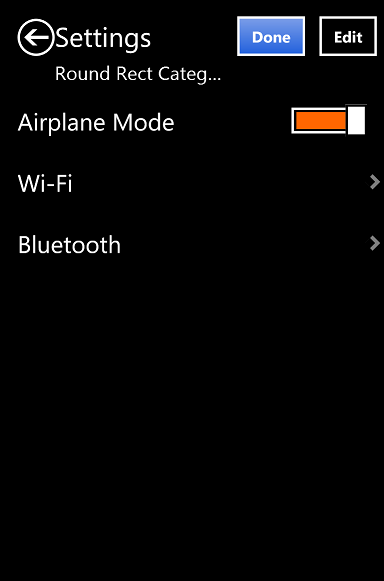
This theme is modeled on the native Windows 8 look for touch devices. When using dojox/mobile/deviceTheme.js, this theme is triggered for Windows Phones and Internet Explorer 10 user agents. To apply it whatever the user agent, use the following CSS link statement instead:
<link rel="stylesheet" type="text/css" href="dojox/mobile/themes/windows/windows.css"></link>
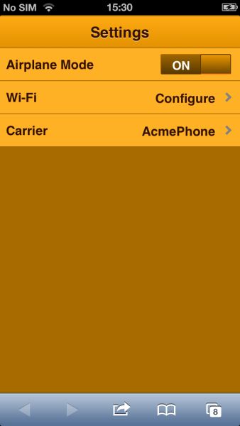
Custom
This theme is a generic grey theme that is not modeled on any existing native look. As such, it is not triggered when using dojox/mobile/deviceTheme.js, but it can be applied using the following CSS link statement:
<link rel="stylesheet" type="text/css" href="dojox/mobile/themes/custom/custom.css"></link>
Generating Mobile Themes
The directory ‘themes/utils’ contains a script to generate themes. Read ‘themes/utils/README’ to configure your environment.
Creating a new theme from the Custom theme
The ‘custom’ theme (i.e. mobile/themes/custom folder) is a generic grey theme. It is a good starting point for creating a new theme. All colors of this theme are derived from 2 colors defined at the beginning of themes/custom/variables.less.
To create a new theme, you can change these colors (i.e. @lightColor and @darkColor) as well as other parts of variables.less and then run the compile script.
Example:
- Ensure your environment is ready for themes compilation (instructions available in themes/README)
- Change base colors in themes/custom/variables.less: @lightColor: #FFB126; @darkColor: #331100;
- Execute themes/utils/compile script, all themes are regenerated. The custom theme is now orange.
- Try you new theme by applying the custom theme.
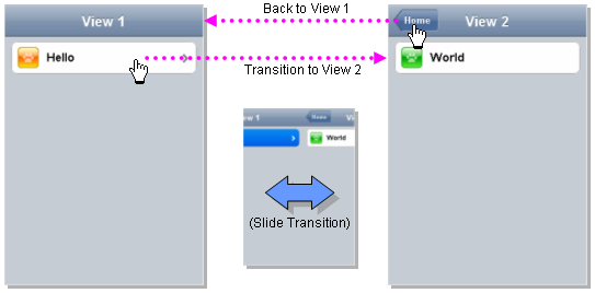
Typical Use
Typical usage is to create one or more views in a page, and create a round rectangle list, an edge-to-edge list, an icon container, etc. in the views. You can specify an animated transition between the views. The following example shows how to create views and perform a transition between them.
Example (using HTML5 validating declarative markup and mobile parser)
01:<!DOCTYPE HTML>
02: <html>
03:   <head>
04:     <meta name="viewport" content="width=device-width,initial-scale=1,maximum-scale=1,minimum-scale=1,user-scalable=no"/>
05:     <meta name="apple-mobile-web-app-capable" content="yes" />
06:     <link href="dojox/mobile/themes/iphone/iphone.css" rel="stylesheet"></link>
07:     <script src="dojo/dojo.js" data-dojo-config="async:true, parseOnLoad:true"></script>
08:     <script>
09:       require([
10:         "dojox/mobile/parser",    // This mobile app uses declarative programming with fast mobile parser
11:         "dojox/mobile",           // This is a mobile app.
12:       ]); // Skip module alias and function block because we're not doing anything special...
13:     </script>
14:   </head>
15:   <body>
16:     <div id="foo" data-dojo-type="dojox/mobile/View">
17:       <h1 data-dojo-type="dojox/mobile/Heading">View 1</h1>
18:       <ul data-dojo-type="dojox/mobile/RoundRectList">
19:         <li data-dojo-type="dojox/mobile/ListItem" data-dojo-props="moveTo:'bar',label:'Hello',
20:            icon:'dojox/mobile/tests/images/i-icon-1.png'"></li>
21:       </ul>
22:     </div>
23:
24:     <div id="bar" data-dojo-type="dojox/mobile/View">
25:       <h1 data-dojo-type="dojox/mobile/Heading" data-dojo-props="back:'Home',moveTo:'foo'">View 2</h1>
26:       <ul data-dojo-type="dojox/mobile/RoundRectList">
27:         <li data-dojo-type="dojox/mobile/ListItem" data-dojo-pros="label:'World',
28:           icon:'dojox/mobile/tests/images/i-icon-2.png'"></li>
29:       </ul>
30:     </div>
31:   </body>
32: </html>
- Line 1 is the standard HTML5 DOCTYPE.
- Line 4 is a viewport setting, which sets the width, height and scale of the browser area used to display the content. Mobile Safari recognizes this meta tag.
- Line 5 tells iPhone/iPad that the web application should run in full-screen mode.
- Line 6 loads a style sheet for iPhone theme. You may want to load a different theme instead.
- Line 7 loads the Dojo kernel APIs using the asynchronous AMD loader.
- Line 10 loads the lightweight mobile parser, since this example uses declarative markup. The parser will automatically instantiate the mobile widgets associated with dom elements. You can of course use the default parser (dojo/parser) instead if your don’t have size requirements (like in an hybrid application), but the mobile parser is much smaller and has enough capability to bootstrap simple dojo application pages like this example. The desktop browser compatibility module for non-CSS3 browsers is not used in this example, so it will likely only render properly on webkit-based browsers.
- Line 16 through Line 22 is the first view. It contains a heading and a round rectangle list. This view will be shown at startup, since it is the first view and the selected:’true’ property is not specified for the second view.
- Line 24 through Line 30 is the second view, which will be shown when you tap on a list item in the first view.