dojox/mobile/ComboBox
| Authors: | Doug Hays |
|---|---|
| Developers: | Doug Hays |
| since: | V1.7 |
ComboBox is a hybrid between a SELECT HTML element and an INPUT text box.
Like SELECT, you provide a list of acceptable values. But like an INPUT text field, the user can also type whatever they want. As the user types, partially matched values will be shown in a pop-up menu below the INPUT text box.
On FORM submit, the displayed text value of a non-disabled ComboBox widget is submitted if the name attribute was specified at widget creation time.
ComboBox widgets are dojo/store-enabled. This means rather than embedding all the OPTION tags within the page, you can have dojo/store fetch them from a server-based store. The unified dojo/store architecture can get its data from various places such as databases and web services. See the new Dojo Object Store API section for complete details.
And see the new dojo/store section for complete details.
Constructor Parameters
| Parameter | Type | Default | Description |
| baseClass | String | mblComboBox | Default CSS class name used to render the ComboBox INPUT node. |
| class | String | Additional CSS class names to add to baseClass. | |
| store | dojo/store | dojo/store to use for acceptable values. | |
| list | DataList | dijit/form/DataList store made from OPTION tags and supports selected attribute. | |
| placeHolder | String | Prompt text to display inside the INPUT when it would otherwise be empty (requires browser support). | |
| onChange | Function | An event handler used for value change notifications. | |
| trim | Boolean | false | Remove leading and trailing spaces. |
| uppercase | Boolean | false | Convert text to uppercase. |
| lowercase | Boolean | false | Convert text to lowercase. |
| propercase | Boolean | false | Convert text to propercase (Leading Uppercase). |
Examples
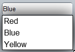
Using a dojo/store
require([
  "dojo/store/Memory",
  "dojox/mobile/ComboBox"
], function(Memory, ComboBox){
  colorMemoryStore = new Memory({ idProperty: "name", data: [
    { name: "Red" },
    { name: "Blue" },
    { name: "Yellow" }
  ]});
});
<input type="text" data-dojo-type="dojox/mobile/ComboBox"
   data-dojo-props='store:colorMemoryStore, value:"Blue"'>

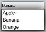
Using inline OPTION tags
require(["dijit/form/DataList", "dojox/mobile/ComboBox"]);
<select data-dojo-type="dijit/form/DataList"
  data-dojo-props='id:"fruitDataList"'>
      <option>Apple</option>
      <option selected>Banana</option>
      <option>Orange</option>
</select>
<input type="text" data-dojo-type="dojox/mobile/ComboBox"
  data-dojo-props='list:"fruitDataList"'>

The DataList widget must be defined prior to the ComboBox widget since it defines the currently selected value for the ComboBox.