dojox/mobile/ListItem
| Authors: | Yoshiroh Kamiyama |
|---|---|
| Developers: | Yoshiroh Kamiyama |
| since: | V1.5 |
Introduction
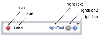
ListItem represents an item of either dojox/mobile/RoundRectList or dojox/mobile/EdgeToEdgeList. It can have icons and/or labels as shown below. There are three ways to move to a different view, using the properties ‘moveTo’, ‘href’, or ‘url’. You can choose only one of them.


Constructor Parameters
Inherited from dojox/mobile/_ItemBase
| Parameter | Type | Default | Description |
| transition | String | “slide” | A type of animated transition effect. You can choose from the standard transition types: “slide”, “fade”, “flip”, or from the extended transition types: “cover”, “coverv”, “dissolve”, “reveal”, “revealv”, “scaleIn”, “scaleOut”, “slidev”, “swirl”, “zoomIn”, “zoomOut”, “cube”, and “swap”. If “none” is specified, transition occurs immediately without animation. |
| transitionDir | Number | 1 | The transition direction. If 1, transition forward. If -1, transition backward. For example, the slide transition slides the view from right to left when transitionDir == 1, and from left to right when transitionDir == -1. |
| icon | String | “” | An icon to display at the left of the item. The value can be either a path for an image file or a class name of a DOM button. If icon is not specified, the iconBase parameter of the parent widget is used. Default icon size for List Items is 29px wide by 29px height. |
| iconPos | String | “” | The position of an aggregated icon. IconPos is comma separated values like top, left, width, height (ex. “0,0,29,29”). If iconPos is not specified, the iconPos parameter of the parent widget is used. |
| moveTo | String | “” | The id of the transition destination view which resides in the current page. If the value has a hash sign (‘#’) before the id (e.g. #view1) and the dojo/hash module (=the dojox/mobile/bookmarkable module since V1.8) is loaded by the user application, the view transition updates the hash in the browser URL so that the user can bookmark the destination view. In this case, the user can also use the browser’s back/forward button to navigate through the views in the browser history. If null, transitions to a blank view. If ‘#’, returns to the previous view immediately without transition. |
| href | String | “” | A URL of another web page to go to. |
| hrefTarget | String | “” | A target that specifies where to open a page specified by href. The value will be passed to the 2nd argument of window.open(). |
| url | String | “” | A URL of an html fragment page or JSON data that represents a new view content. The view content is loaded with XHR and inserted in the current page. Then a view transition occurs to the newly created view. The view is cached so that subsequent requests would not load the content again. |
| urlTarget | String | “” | Node id under which a new view will be created according to the url parameter. If not specified, The new view will be created as a sibling of the current view. |
| clickable | Boolean | false | If true, this item becomes clickable even if a transition destination (moveTo, etc.) is not specified. |
| callback | Function String | A callback function that is called when the transition has been finished. A function reference, or name of a function in context. | |
| sync | Boolean | true | If true, XHR for the view content specified with the url parameter is performed synchronously. If false, it is done asynchronously and the progress indicator is displayed while loading the content. This parameter is effective only when the url parameter is used. In dojo-1.8, however, this property is no longer supported. It always behaves in the async manner regardless of the value of this property. |
| label | String | “” | A label of the item. If the label is not specified, innerHTML is used as a label. |
| alt | String | “” | An alt text for the icon image. |
| tabIndex | String | “0” | Tabindex setting for the item so users can hit the tab key to focus on it. |
Parameters from this widget
| Parameter | Type | Default | Description |
| rightText | String | “” | A right-aligned text to display on the item. |
| rightIcon | String | “” | An icon to display at the right hand side of the item. The value can be either a path for an image file or a class name of a DOM button. |
| rightIcon2 | String | “” | An icon to display at the left of the rightIcon. The value can be either a path for an image file or a class name of a DOM button. |
| deleteIcon | String | “” | A delete icon to display at the left of the item. The value can be either a path for an image file or a class name of a DOM button. |
| anchorLabel | Boolean | false | If true, the label text becomes a clickable anchor text. When the user clicks on the text, the onAnchorLabelClicked handler is called. You can override or connect to the handler and implement any action. The handler has no default action. |
| noArrow | Boolean | false | If true, the right hand side arrow is not displayed. |
| selected | Boolean | false | If true, the item is highlighted to indicate it is selected. |
| checked | Boolean | false | If true, a check mark is displayed at the right of the item. |
| arrowClass | String | “mblDomButtonArrow” | An icon to display as an arrow. The value can be either a path for an image file or a class name of a DOM button. |
| checkClass | String | “mblDomButtonCheck” | An icon to display as a check mark. The value can be either a path for an image file or a class name of a DOM button. |
| uncheckClass | String | “” | An icon to display as an uncheck mark. The value can be either a path for an image file or a class name of a DOM button. |
| variableHeight | Boolean | false | If true, the height of the item varies according to its content. |
| rightIconTitle | String | “” | An alt text for the right icon. |
| rightIcon2Title | String | “” | An alt text for the right icon2. |
| header | Boolean | false | If true, this item is rendered as a category header. |
| tag | String | “li” | A name of html tag to create as domNode. |
| busy | Boolean | false | If true, a progress indicator spins. |
| progStyle | String | “” | A css class name to add to the progress indicator. |
Examples
Declarative example
In this example, no view transition is specified, but if you specify, for example, moveTo=”view1”, an arrow icon is displayed at the position of the rightIcon even if rightIcon is specified. In this case, if you want to change the arrow icon to another, you can use the arrowClass property instead of rightIcon.
<link href="../themes/common/domButtons.css" rel="stylesheet"/>
<ul data-dojo-type="dojox/mobile/RoundRectList">
  <li data-dojo-type="dojox/mobile/ListItem"
      data-dojo-props='icon:"mblDomButtonRedCircleMinus",
                       label:"Label",
                       rightText:"rightText",
                       rightIcon2:"mblDomButtonSilverCircleDownArrow",
                       rightIcon:"mblDomButtonBlueCircleArrow"'>
  </li>
</ul>

View content examples
A new view can be created from an external HTML fragment or from JSON data specified with the url property. Below are examples of such view content. The first one is an HTML fragment, and the second one is the equivalent JSON. They produce the same view.
Note that the JSON format cannot have duplicate keys at the same level, while the HTML format has no such limitation.
html fragment:
<div data-dojo-type="dojox/mobile/View">
    <h1 data-dojo-type="dojox/mobile/Heading"
        data-dojo-props='back:"Home", moveTo:"foo"'>view1.html</h1>
    <ul data-dojo-type="dojox/mobile/EdgeToEdgeList">
    <li data-dojo-type="dojox/mobile/ListItem">
        Jack Coleman
    </li>
    <li data-dojo-type="dojox/mobile/ListItem">
        James Evans
    </li>
    <li data-dojo-type="dojox/mobile/ListItem">
        Jason Griffin
    </li>
    </ul>
</div>
JSON data:
{
  "dojox/mobile/View": {
    "dojox/mobile/Heading": {
      "@back": "Home",
      "@moveTo": "foo",
      "@label": "view1.json"
    },
    "dojox/mobile/EdgeToEdgeList": {
      "dojox/mobile/ListItem": [{
        "@label": "Jack Coleman"
      }, {
        "@label": "James Evans"
      }, {
        "@label": "Jason Griffin"
      }]
    }
  }
}
Variable height example
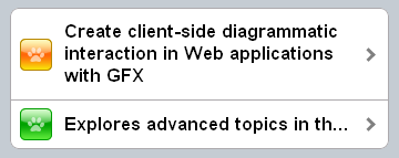
In this example, the first ListItem has the ‘variableHeight’ parameter and the height of the item is adjusted according to its content.
<ul data-dojo-type="dojox/mobile/RoundRectList">
  <li data-dojo-type="dojox/mobile/ListItem"
      data-dojo-props='icon:"images/i-icon-1.png",
                       moveTo:"#article",
                       variableHeight:true'>
    Create client-side diagrammatic interaction in Web applications with GFX
  </li>
  <li data-dojo-type="dojox/mobile/ListItem"
      data-dojo-props='icon:"images/i-icon-2.png",
                       moveTo:"#article"'>
    Explores advanced topics in the new Java framework for implementing
    and consuming REST-based Web services.
  </li>
</ul>

Child alignment and preventTouch example
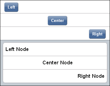
ListItem supports different options for the alignment of its children elements: left, right, or center alignment. To align a child widget of the ListItem, use its ‘layout’ property. For children which are not widgets, set their ‘data-mobile-layout’ attribute (for backward compatibility, the attribute ‘layout’ is also supported but it is deprecated and will be removed in a next release).
Also, ListItem allows to selectively disable the touch events for some of its children, such that touching these children does not trigger item’s action. For children which are widgets, use the “preventTouch” property. For children which are not widgets, set their ‘data-mobile-prevent-touch’ attribute (for backward compatibility, the attribute ‘preventTouch’ is also supported but it is deprecated and will be removed in a next release).
The following example illustrates the child alignment and the enabling of preventTouch for both widget and non-widget children of ListItem.
<ul data-dojo-type="dojox/mobile/EdgeToEdgeList">
  <li data-dojo-type="dojox/mobile/ListItem">
    <div data-mobile-layout="left" data-mobile-prevent-touch="true">
      <span data-dojo-type="dojox/mobile/ToolBarButton">Left</span>
    </div>
  </li>
  <li data-dojo-type="dojox/mobile/ListItem">
    <span data-dojo-type="dojox/mobile/ToolBarButton"
      data-dojo-props="layout: 'center', preventTouch:'true'">Center</span>
  </li>
  <li data-dojo-type="dojox/mobile/ListItem">
    <span data-dojo-type="dojox/mobile/ToolBarButton"
      data-dojo-props="layout: 'right'">Right</span>
  </li>
</ul>

<ul data-dojo-type="dojox/mobile/RoundRectList">
  <li data-dojo-type="dojox/mobile/ListItem">
    <div data-mobile-layout="left">Left Node</div>
  </li>
  <li data-dojo-type="dojox/mobile/ListItem">
    <div data-mobile-layout="center">Center Node</div>
  </li>
  <li data-dojo-type="dojox/mobile/ListItem">
    <div data-mobile-layout="right">Right Node</div>
  </li>
</ul>

See also the dojox/mobile/RoundRectList and dojox/mobile/EdgeToEdgeList widgets for various examples.