dojox.mobile.IconMenu
| Authors: | Yoshiroh Kamiyama, Atsushi Ono |
|---|---|
| Developers: | Yoshiroh Kamiyama |
| since: | V1.8 |
Introduction
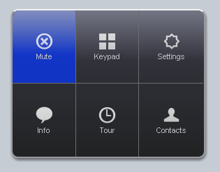
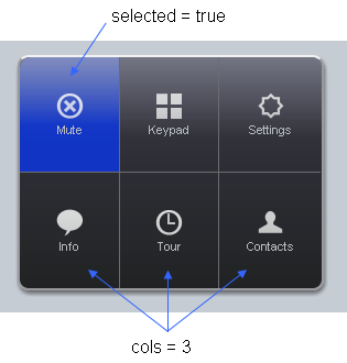
The dojox.mobile.IconMenu widget displays a pop-up menu just like iPhone’s call options menu that is shown while you are on a call. Each menu item must be dojox.mobile.IconMenuItem.
Constructor Parameters
| Parameter | Type | Default | Description |
| transition | String | “slide” | The default animated transition effect for child items. If a child item does not have its own transition parameter specified, this value is used as its animated transition type. You can choose from the standard transition types, “slide”, “fade”, “flip”, or from the extended transition types, “cover”, “coverv”, “dissolve”, “reveal”, “revealv”, “scaleIn”, “scaleOut”, “slidev”, “swirl”, “zoomIn”, “zoomOut”, “cube”, and “swap”. If “none” is specified, transition occurs immediately without animation. |
| iconBase | String | “” | The default icon path for child items. If a child item does not have its own icon parameter specified, this value is used as its icon path. This parameter is especially useful when all or most of the icons are the same, or you use CSS sprite icons, where you specify an aggregated icon image with this parameter and an icon position for each icon. |
| iconPos | String | “” | The default icon position for child items. This parameter is especially useful when all or most of the icons are the same. |
| cols | Number | 3 | The number of child items in a row. |
| tag | String | “ul” | A name of html tag to create as domNode. |
Examples
Declarative example
<!-- Need to load the theme file for IconMenu as well as base theme file -->
<script type="text/javascript" src="dojox/mobile/deviceTheme.js"
        data-dojo-config="mblThemeFiles: ['base','IconMenu']"></script>
require([
    "dojox/mobile/parser",
    "dojox/mobile",
    "dojox/mobile/IconMenu"
]);
<ul data-dojo-type="dojox.mobile.IconMenu" style="width:274px;height:210px;margin:20px;"
    data-dojo-props='cols:3'>
    <li data-dojo-type="dojox.mobile.IconMenuItem"
        data-dojo-props='label:"Mute", icon:"images/mute.png", selected:true'></li>
    <li data-dojo-type="dojox.mobile.IconMenuItem"
        data-dojo-props='label:"Keypad", icon:"images/keypad.png"'></li>
    <li data-dojo-type="dojox.mobile.IconMenuItem"
        data-dojo-props='label:"Settings", icon:"images/settings.png"'></li>
    <li data-dojo-type="dojox.mobile.IconMenuItem"
        data-dojo-props='label:"Info", icon:"images/info.png"'></li>
    <li data-dojo-type="dojox.mobile.IconMenuItem"
        data-dojo-props='label:"Tour", icon:"images/tour.png", moveTo:"view2", transition:"slide"'></li>
    <li data-dojo-type="dojox.mobile.IconMenuItem"
        data-dojo-props='label:"Contacts", icon:"images/contacts.png"'></li>
</ul>
Programmatic example
<!-- Need to load the theme file for IconMenu as well as base theme file -->
<script type="text/javascript" src="dojox/mobile/deviceTheme.js"
        data-dojo-config="mblThemeFiles: ['base','IconMenu']"></script>
require([
    "dojo/ready",
    "dojox/mobile/IconMenu",
    "dojox/mobile/IconMenuItem",
    "dojox/mobile",
    "dojox/mobile/parser"
], function(ready, IconMenu, IconMenuItem){
    ready(function(){
        var menu = new IconMenu({
            cols: 3,
        }, "iconMenu");
        menu.startup();

        var item = new IconMenuItem({
            label: "Mute",
            icon: "images/menu.png",
            selected: true
        });
        menu.addChild(item);

        item = new IconMenuItem({
            label: "Keypad",
            icon: "images/keypad.png"
        });
        menu.addChild(item);

        item = new IconMenuItem({
            label: "Settings",
            icon: "images/settings.png"
        });
        menu.addChild(item);

        item = new IconMenuItem({
            label: "Info",
            icon: "images/info.png"
        });
        menu.addChild(item);

        item = new IconMenuItem({
            label: "Tour",
            icon: "images/tour.png"
        });
        menu.addChild(item);

        item = new IconMenuItem({
            label: "Contacts",
            icon: "images/contacts.png"
        });
        menu.addChild(item);
    });
});
<div id="iconMenu" style="width:274px;height:210px;margin:20px;"></div>
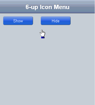
Using IconMenu with SimpleDialog widget
This example shows a pop-up menu by using IconMenu widget with dojox.mobile.SimpleDialog widget. You can close the dialog when selecting the IconMenuItem which has “closeOnAction:true” parameter.
<!-- Need to load the theme files for IconMenu, SimpleDialog and Button widgets -->
<script type="text/javascript" src="dojox/mobile/deviceTheme.js"
        data-dojo-config="mblThemeFiles: ['base','IconMenu','SimpleDialog','Button']"></script>
require([
    "dijit/registry",
    "dojox/mobile/parser",
    "dojox/mobile",
    "dojox/mobile/IconMenu",
    "dojox/mobile/SimpleDialog",
    "dojox/mobile/Button"
], function(registry){
    show = function(){
        registry.byId("dlg1").show();
    };
    hide = function(){
        registry.byId("dlg1").hide();
    };
});
<div id="dlg1" data-dojo-type="dojox.mobile.SimpleDialog" data-dojo-props='modal:false'>
    <ul data-dojo-type="dojox.mobile.IconMenu" data-dojo-props='cols:3'>
        <li data-dojo-type="dojox.mobile.IconMenuItem"
            data-dojo-props='label:"Mute", icon:"images/mute.png", selected:true'></li>
        <li data-dojo-type="dojox.mobile.IconMenuItem"
            data-dojo-props='label:"Keypad", icon:"images/keypad.png"'></li>
        <li data-dojo-type="dojox.mobile.IconMenuItem"
            data-dojo-props='label:"Settings", icon:"images/settings.png"'></li>
        <li data-dojo-type="dojox.mobile.IconMenuItem"
            data-dojo-props='label:"Info", icon:"images/info.png"'></li>
        <li data-dojo-type="dojox.mobile.IconMenuItem"
            data-dojo-props='label:"Tour", icon:"images/tour.png",
                             moveTo:"view2", transition:"slide", closeOnAction:true'></li>
        <li data-dojo-type="dojox.mobile.IconMenuItem"
            data-dojo-props='label:"Contacts", icon:"images/contacts.png", closeOnAction:true'></li>
    </ul>
</div>
<div id="view1" data-dojo-type="dojox.mobile.View">
    <h1 data-dojo-type="dojox.mobile.Heading">6-up Icon Menu</h1>
    <button data-dojo-type="dojox.mobile.Button" class="mblBlueButton"
            style="width:100px;margin:10px;" onclick="show()">Show</button>
    <button data-dojo-type="dojox.mobile.Button" class="mblBlueButton"
            style="width:100px;margin:10px;" onclick="hide()">Hide</button>
</div>
<div id="view2" data-dojo-type="dojox.mobile.View" style="background-color:white;height:100%;">
    <h1 data-dojo-type="dojox.mobile.Heading" data-dojo-props='back:"Home", moveTo:"view1"'>View2</h1>
</div>