dojox.mobile.ScreenSizeAware (EXPERIMENTAL)
| Authors: | Yoshiroh Kamiyama, Atsushi Ono |
|---|---|
| Developers: | Yoshiroh Kamiyama |
| since: | V1.8 |
Contents
The dojox.mobile.ScreenSizeAware is an EXPERIMENTAL widget.
Introduction
dojox.mobile.ScreenSizeAware is a module to make a screen size aware application. This module helps you create an application that transforms its UI layout according to the screen size. It assumes that the application consists of two horizontally split panes, and the left pane has a list widget as shown in the example below.
<div data-dojo-type="dojox.mobile.FixedSplitter" data-dojo-props='orientation:"H"'>
  <div data-dojo-type="dojox.mobile.Container" style="width:300px;">
    <div id="leftView" data-dojo-type="dojox.mobile.ScrollableView">
      <h1 data-dojo-type="dojox.mobile.Heading" data-dojo-props='fixed:"top"'>Left Pane</h1>
      <ul data-dojo-type="dojox.mobile.EdgeToEdgeList" data-dojo-props='stateful:true'>
        <li data-dojo-type="dojox.mobile.ListItem"
            data-dojo-props='label:"View1", moveTo:"view1"'></li>
        ....
      </ul>
    </div>
  </div>
  <div data-dojo-type="dojox.mobile.Container">
    <div id="view1" data-dojo-type="dojox.mobile.ScrollableView">
      <h1 data-dojo-type="dojox.mobile.Heading"
          data-dojo-props='fixed:"top", back:"Home", moveTo:"leftView"'>Right Pane</h1>
      ....
    </div>
  </div>
</div>
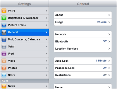
If you place this module in such an application, the application is rendered in a split view as shown below when the screen size is detected as tablet size.
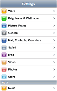
It is rendered in single view layout as shown below when the screen size is detected as phone size.
The ScreenSizeAware modules analyzes the document’s DOM structure to determine which node is the FixedSplitter, which node is the left pane, etc. You can also explicity specify those nodes using the properties such as splitterId, leftPaneId, etc.
Usage
All you need to do is to require dojox.mobile.ScreenSizeAware and place the following tag somewhere in your application.
<span data-dojo-type="dojox.mobile.ScreenSizeAware"></span>
Then the ScreenSizeAware widget transforms the UI layout according to the current screen size. No inline JavaScript code is necessary in your application html file.
There is another way to apply ScreenSizeAware to your application. Instead of placing the <span> tag, you can use the screenSizeAware property of FixedSplitter as below. In this case, you do not need to explicitly require dojox.mobile.ScreenSizeAware, because it is dynamically loaded by FixedSplitter.
<div data-dojo-type="dojox.mobile.FixedSplitter"
     data-dojo-props='orientation:"H", screenSizeAware:true'>
Constructor Parameters
| Parameter | Type | Default | Description |
| splitterId | String | “” | The id of the FixedSplitter. |
| leftPaneId | String | “” | The id of the left pane. |
| rightPaneId | String | “” | The id of the right pane. |
| leftViewId | String | “” | The id of the left View. |
| leftListId | String | “” | The id of the list widget in the left view. |
Examples
Applying ScreenSizeAware by placing a span tag
<!-- Need to load the theme file for FixedSplitter widget as well as base theme file -->
<script type="text/javascript" src="dojox/mobile/deviceTheme.js"
        data-dojo-config="mblThemeFiles: ['base','FixedSplitter']"></script>

<!-- FixedSplitter typically needs the following styles -->
<style>
html, body{
    height: 100%;
    overflow: hidden;
    position: relative;
}
</style>
require([
    "dojox/mobile/parser",
    "dojox/mobile",
    "dojox/mobile/FixedSplitter",
    "dojox/mobile/Container",
    "dojox/mobile/ScrollableView",
    "dojox/mobile/ScreenSizeAware"
]);
<span data-dojo-type="dojox.mobile.ScreenSizeAware"></span>
<div data-dojo-type="dojox.mobile.FixedSplitter" data-dojo-props='orientation:"H"'>
    <div data-dojo-type="dojox.mobile.Container" style="width:300px;border-right:1px solid black;">
        <div id="settings" data-dojo-type="dojox.mobile.ScrollableView" data-dojo-props='selected:true'>
            <h1 data-dojo-type="dojox.mobile.Heading" data-dojo-props='fixed:"top"'>Settings</h1>
            <ul data-dojo-type="dojox.mobile.EdgeToEdgeList" data-dojo-props='transition:"flip", stateful:true'>
                <li data-dojo-type="dojox.mobile.ListItem"
                    data-dojo-props='icon:"images/i-icon-1.png", moveTo:"general"'>
                    General
                </li>
                <li data-dojo-type="dojox.mobile.ListItem"
                    data-dojo-props='icon:"images/i-icon-2.png", moveTo:"wifi"'>
                    Wi-Fi
                </li>
            </ul>
        </div>
    </div>
    <div data-dojo-type="dojox.mobile.Container">
        <div id="general" data-dojo-type="dojox.mobile.ScrollableView" data-dojo-props='selected:true'>
            <h1 data-dojo-type="dojox.mobile.Heading"
                data-dojo-props='fixed:"top", back:"Settings", moveTo:"settings"'>General</h1>
            <div data-dojo-type="dojox.mobile.RoundRect">General</div>
        </div>
        <div id="wifi" data-dojo-type="dojox.mobile.ScrollableView">
            <h1 data-dojo-type="dojox.mobile.Heading"
                data-dojo-props='fixed:"top", back:"Settings", moveTo:"settings"'>Wi-Fi</h1>
            <div data-dojo-type="dojox.mobile.RoundRect">Wi-Fi</div>
        </div>
    </div>
</div>
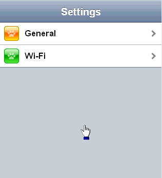
On phone:
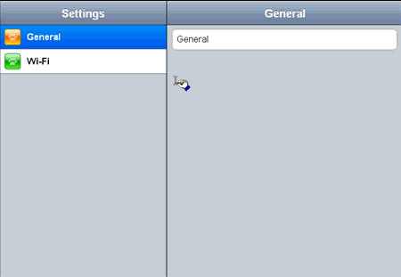
On tablet:
Applying ScreenSizeAware by the property of FixedSplitter widget
You can do the same thing with the example above by specifying the “screenSizeAware:true” property to FixedSplitter widget as described in the example below.
<!-- Need to load the theme file for FixedSplitter widget as well as base theme file -->
<script type="text/javascript" src="dojox/mobile/deviceTheme.js"
        data-dojo-config="mblThemeFiles: ['base','FixedSplitter']"></script>

<!-- FixedSplitter typically needs the following styles -->
<style>
html, body{
    height: 100%;
    overflow: hidden;
    position: relative;
}
</style>
require([
    "dojox/mobile/parser",
    "dojox/mobile",
    "dojox/mobile/FixedSplitter",
    "dojox/mobile/Container",
    "dojox/mobile/ScrollableView",
    "dojox/mobile/ScreenSizeAware"
]);
<div data-dojo-type="dojox.mobile.FixedSplitter" data-dojo-props='orientation:"H", screenSizeAware:true'>
    <div data-dojo-type="dojox.mobile.Container" style="width:300px;border-right:1px solid black;">
        <div id="settings" data-dojo-type="dojox.mobile.ScrollableView" data-dojo-props='selected:true'>
            <h1 data-dojo-type="dojox.mobile.Heading" data-dojo-props='fixed:"top"'>Settings</h1>
            <ul data-dojo-type="dojox.mobile.EdgeToEdgeList" data-dojo-props='transition:"flip", stateful:true'>
                <li data-dojo-type="dojox.mobile.ListItem"
                    data-dojo-props='icon:"images/i-icon-1.png", moveTo:"general"'>
                    General
                </li>
                <li data-dojo-type="dojox.mobile.ListItem"
                    data-dojo-props='icon:"images/i-icon-2.png", moveTo:"wifi"'>
                    Wi-Fi
                </li>
            </ul>
        </div>
    </div>
    <div data-dojo-type="dojox.mobile.Container">
        <div id="general" data-dojo-type="dojox.mobile.ScrollableView" data-dojo-props='selected:true'>
            <h1 data-dojo-type="dojox.mobile.Heading"
                data-dojo-props='fixed:"top", back:"Settings", moveTo:"settings"'>General</h1>
            <div data-dojo-type="dojox.mobile.RoundRect">General</div>
        </div>
        <div id="wifi" data-dojo-type="dojox.mobile.ScrollableView">
            <h1 data-dojo-type="dojox.mobile.Heading"
                data-dojo-props='fixed:"top", back:"Settings", moveTo:"settings"'>Wi-Fi</h1>
            <div data-dojo-type="dojox.mobile.RoundRect">Wi-Fi</div>
        </div>
    </div>
</div>