dojox.grid.EnhancedGrid.plugins.Selector
| Authors: | Oliver Zhu |
|---|---|
| Project owner: | Evan Huang |
| since: | V.1.6 |
Selector plugin provides extended selection for columns, rows and cells.
Contents
Introduction
Selector is a plugin for dojox.grid.EnhancedGrid. It supports extended selection for columns, rows, and cells.
dojo.require("dojo.data.ItemFileWriteStore");
dojo.require("dojox.grid.EnhancedGrid");
dojo.require("dojox.grid.enhanced.plugins.Selector");

var data = {
    identifier: 'id',
    label: 'id',
    items: []
};
var cols = ["A", "B", "C", "D", "E", "F", "G", "H", "I", "J", "K", "L", "M", "N", "O", "P", "Q", "R", "S", "T", "U", "V", "W", "X", "Y", "Z"];
var data_list = [];
var i, row, j;
for(i = 0; i < 100; ++i){
    row = {};
    for(j = 0; j < cols.length; ++j){
        row[cols[j]] = (i + 1) + cols[j];
    }
    data_list.push(row);
}
var len = data_list.length;
for(i=0; i < len ; ++i){
    data.items.push(dojo.mixin({ 'id': i+1 }, data_list[i]));
}

var layout = [{
    defaultCell: {width: 3},
    rows: [
        {field: "A"},
        {field: "B"},
        {field: "C"},
        {field: "D"},
        {field: "E"},
        {field: "F"},
        {field: "G", hidden: true},
        {field: "H", hidden: true},
        {field: "I", hidden: true},
        {field: "J"},
        {field: "K"},
        {field: "L"},
        {field: "M"},
        {field: "N"},
        {field: "O"},
        {field: "P"},
        {field: "Q"},
        {field: "R"},
        {field: "S"},
        {field: "T"},
        {field: "U"},
        {field: "V"},
        {field: "W"},
        {field: "X"},
        {field: "Y"},
        {field: "Z"}
    ]
}];
function setSelectConfig(type, mode, selected){
    if(selected){
        var config = {};
        config[type] = mode;
        dijit.byId('grid').setupSelectorConfig(config);
    }
};

dojo.ready(function(){
    var store = new dojo.data.ItemFileWriteStore({data: data});

    var grid = new dojox.grid.EnhancedGrid({
        id: "grid",
        store: store,
        structure: layout,
        rowSelector: "20px",
        canSort: function(){return false;},
        plugins: {
            selector: true
        }
    });
    grid.placeAt('gridContainer');
    grid.startup();
});
<div id="gridContainer"></div>
<table class="cfgtable" border="1">
    <thead>
        <tr>
            <th>Select</th>
            <th>Disabled</th>
            <th>Single</th>
            <th>Multi</th>
        </tr>
    </thead>
    <tbody>
        <tr>
            <td>Row</td>
            <td><input type="radio" name="rowCfg" onchange="setSelectConfig('row', 'disabled', this.checked)"/></td>
            <td><input type="radio" name="rowCfg" onchange="setSelectConfig('row', 'single', this.checked)"/></td>
            <td><input type="radio" name="rowCfg" onchange="setSelectConfig('row', 'multi', this.checked)" checked="checked"/></td>
        </tr>
        <tr>
            <td>Column</td>
            <td><input type="radio" name="colCfg" onchange="setSelectConfig('col', 'disabled', this.checked)"/></td>
            <td><input type="radio" name="colCfg" onchange="setSelectConfig('col', 'single', this.checked)"/></td>
            <td><input type="radio" name="colCfg" onchange="setSelectConfig('col', 'multi', this.checked)" checked="checked"/></td>
        </tr>
        <tr>
            <td>Cell</td>
            <td><input type="radio" name="cellCfg" onchange="setSelectConfig('cell', 'disabled', this.checked)"/></td>
            <td><input type="radio" name="cellCfg" onchange="setSelectConfig('cell', 'single', this.checked)"/></td>
            <td><input type="radio" name="cellCfg" onchange="setSelectConfig('cell', 'multi', this.checked)" checked="checked"/></td>
        </tr>
    </tbody>
</table>
@import "{{baseUrl}}dojo/resources/dojo.css";
@import "{{baseUrl}}dijit/themes/claro/claro.css";
@import "{{baseUrl}}dijit/themes/claro/document.css";
@import "{{baseUrl}}dojox/grid/enhanced/resources/claro/EnhancedGrid.css";
@import "{{baseUrl}}dojox/grid/enhanced/resources/EnhancedGrid_rtl.css";

.cfgtable th,
.cfgtable td{
    font-weight: bolder;
    padding: 3px;
}
#gridContainer {
    width: 600px;
    height: 400px;
}
Configuration
Prerequisites
This selector plugin is only available for EnhancedGrid, so use the following statement in the head of your HTML file:
dojo.require("dojox.grid.EnhancedGrid");
dojo.require("dojox.grid.enhanced.plugins.Selector");
Plugin Declaration
The declaration name of this plugin is selector . It is declared in the plugins property of grid.
If your grid is created declaratively:
<div id="grid" data-dojo-type="dojox.grid.EnhancedGrid"
  store="mystore" structure="mystructure"
  plugins="{
    selector: /* a Boolean value or an configuration object */{}
}" ></div>
If your grid is created in JavaScript:
var grid = new dojox.grid.EnhancedGrid({
  id:"grid",
  store:"mystore",
  structure:"mystructure",
  plugins:{
    selector: /* a Boolean value or an configuration object */{}
  }
});
As shown in the above code, you can simply set the selector property to true or false (disabled), or further configure it in an configuration object.
In the configuration object, you can further configure the selection mode for rows/columns/cells:
| Property | Type | Default Value | Description |
|---|---|---|---|
| row | String|Boolean | “multi” | Can be “single”, “multi”, “disabled”. If false, means “disabled”. Any other value means “multi” |
| col | String|Boolean | “multi” | Can be “single”, “multi”, “disabled”. If false, means “disabled”. Any other value means “multi” |
| cell | String|Boolean | “multi” | Can be “single”, “multi”, “disabled”. If false, means “disabled”. Any other value means “multi” |
Usage
Extended Selection
Extended selection allows the following operations:
| Operation | Use Mouse | Use Keyboard | Result |
|---|---|---|---|
| Point Selection | Click mouse selection button with pointer on object to be selected. | With cursor on object to be selected, press Space or Enter. | Deselects all other objects in this grid, selects single identified object. |
| Swipe Range Selection | Press mouse selection button at the start point and hold while move the pointer to the end point; release the mouse selection button at the end point. | Press Shift at the start point and hold while using cursor-movement keys to move the cursor to the end point; release shift at end point. | Deselects all other objects in this grid; selects all objects in order from the identified start point to the identified end point. |
| Click Range Selection | Click mouse selection button at the start point; press Shift and click the mouse selection button at the end point, then release Shift key. | Press Space or Enter to select the start point; use cursor-movement keys to move the cursor to the end point; Press Shift ANDSpace/Enter at the end point. | Deselects all other objects in this grid; selects all objects in order from the identified start point to the identified end point. |
Here the selection “object” can be rows, columns or cells.
The user can also press and hold CTRL key while selecting, to modify (deselect) the current selection.
Here’s some demos for selecting operations:
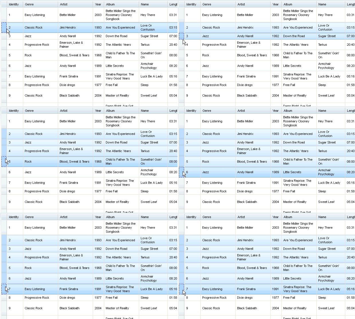
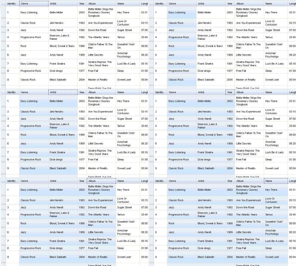
Swipe range selection using mouse:


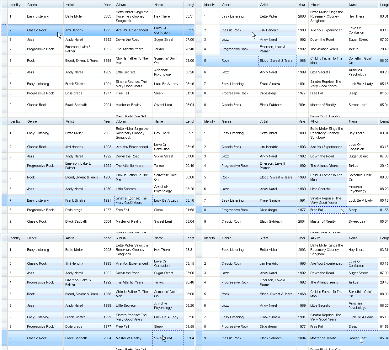
Extend selection using keyboard:

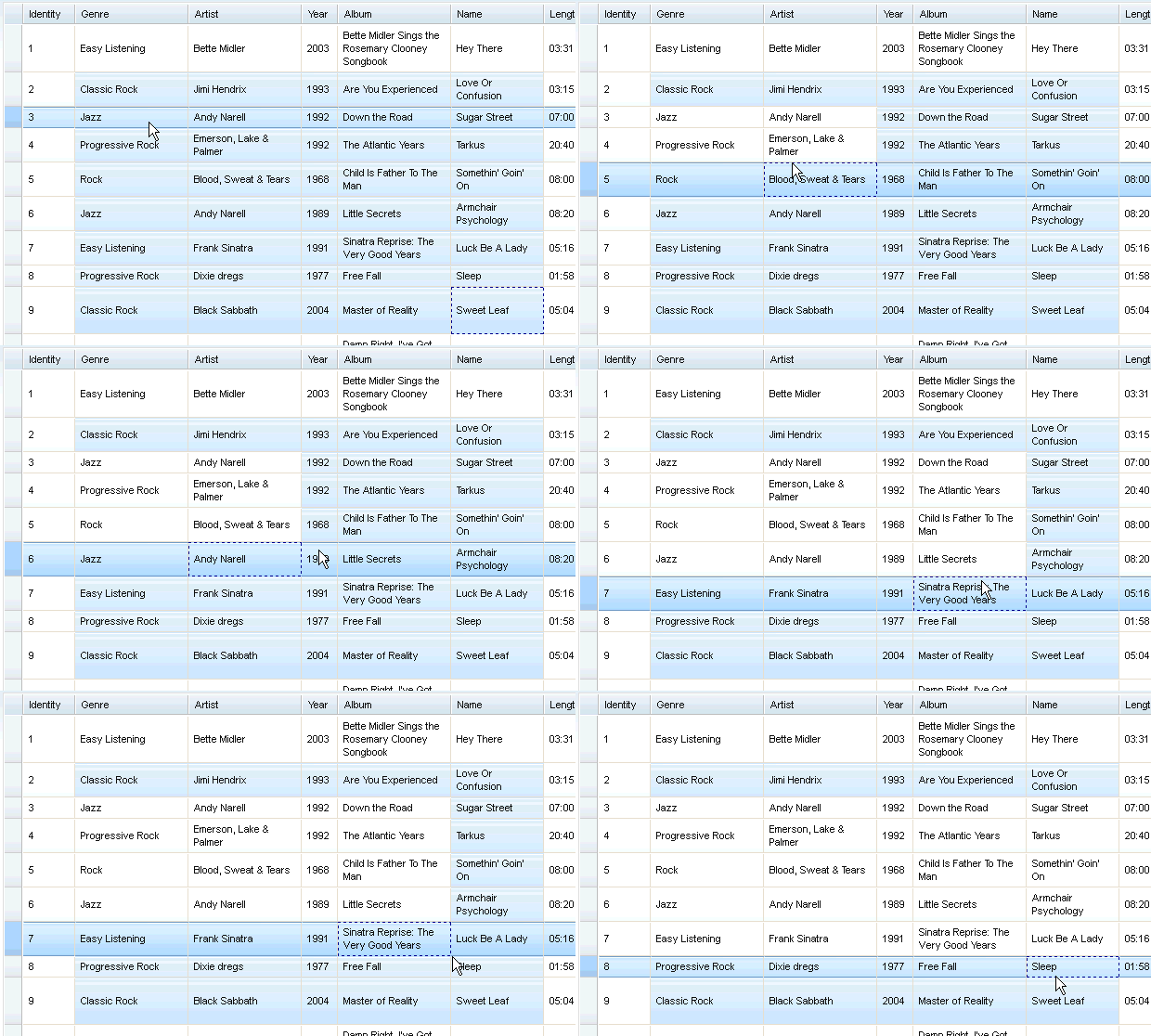
Hole CTRL to modify current selection:

Events
This plugin provides several events to the grid, as the following table shows:
- onStartSelect(type, startPoint):
- When some of the grid contents are starting to be selected. A typical time point is when the user presses down the mouse selection button.
- onEndSelect(type, startPoint, endPoint):
- When the selection completes. A typical time point is when the user releases the mouse selection button.
- onStartDeselect(type, startPoint):
- When the user start to deselect some grid contents. i.e. removing some parts of the current selection.
- onEndDeselect(type, startPoint, endPoint):
- When the user completes the deselection.
- onSelectCleared(type):
- When all the selection status are cleared.
| Arguments | Type | Description |
|---|---|---|
| type | String | One of “row”, “col”, “cell” |
| startPoint | Object | The start point of selection. See description of __SelectItem for details. |
| endPoint | Object | The end point of selection. See description of __SelectItem for details. |
Arguments “start point” and “end point” can be one of __SelectColItem, __SelectRowItem, and __SelectCellItem, which are extended classes of __SelectItem, as the following shows:
/*===== These classes do NOT really exist, they are just concepts for illustration.

dojo.declare("__SelectItem", null,{
  // summary:
  //        An abstract representation of an item.
});
dojo.declare("__SelectCellItem", __SelectItem,{
  // summary:
  //        An abstract representation of a cell.

  // row: Integer
  //        Row index of this cell
  row: 0,

  // col: Integer
  //        Column index of this cell
  col: 0
});
dojo.declare("__SelectRowItem", __SelectItem,{
  // summary:
  //        An abstract representation of a row.

  // row: Integer
  //        Row index of this row
  row: 0,

  // except: Integer[]
  //        An array of column indexes of all the unselected cells in this row.
  except: []
});
dojo.declare("__SelectColItem", __SelectItem,{
  // summary:
  //        An abstract representation of a column.

  // col: Integer
  //        Column index of this column
  col: 0,

  // except: Integer[]
  //        An array of row indexes of all the unselected cells in this column.
  except: []
});

=====*/
To connect to these events, just say (for example):
var handle = dojo.connect(grid, "onEndSelect", function(type, startPoint, endPoint, selected){
  // Your code goes here.
});
Public Methods
This Plugin exposes the following methods to grid widget:
- setupConfig(config):
- Set selection mode for row/col/cell.
| Arguments | Type | Optional/Mandatory | Description |
|---|---|---|---|
| config | Object | Mandatory | Same as the plugin configuration object. |
- isSelected(type, rowIndex, colIndex):
- Check whether an item (a cell, a column or a row) is selected.
- select(type, rowIndex, colIndex):
- Select an item (a cell, a column or a row).
- deselect(type, rowIndex, colIndex):
- Deselect an item (a cell, a column or a row).
| Arguments | Type | Optional/Mandatory | Description |
|---|---|---|---|
| type | String | Mandatory | “row” or “col” or “cell” |
| rowIndex | Integer | Mandatory | If type is “row” or “cell”, this is the row index. If type if “col”, this is the column index. |
| colIndex | Integer | Optional(default to undefined) | Only valid when type is “cell” |
| [return] | Boolean | true if selected, false if not. If cell is covered by a selected column or row, it’s selected. |
- selectRange(type, start, end):
- Select a continuous range (a block of cells, a set of continuous columns or rows)
| Arguments | Type | Optional/Mandatory | Description |
|---|---|---|---|
| type | String | Mandatory | “row” or “col” or “cell” |
| start | Integer | __SelectCellItem | Mandatory | If type is “row” or “col”, this is the index of the starting row or column. If type if “cell”, this is the left-top cell of the range. |
| end | Integer | __SelectCellItem | Mandatory | If type is “row” or “col”, this is the index of the ending row or column. If type if “cell”, this is the right-bottom cell of the range. |
- clear(type):
- Clear all selections of given type.
| Arguments | Type | Optional/Mandatory | Description |
|---|---|---|---|
| type | String | Optional(default to undefined) | “row” or “col” or “cell”. If omitted, clear all. |
- getSelected(type, includeExceptions):
- Get an array of selected items. (__SelectItem[])
| Arguments | Type | Optional/Mandatory | Description |
|---|---|---|---|
| type | String | Mandatory | “row” or “col” or “cell” |
| includeExceptions | Boolean | Optional(default to false) | Only meaningful for rows/columns. If true, all selected rows/cols, even they are partly selected, are all returned. |
| [return] | __SelectItem[] | Array of selected items. |
Miscellany
- When cell selection is disabled and row selection is enabled, clicking on a cell will select the whole row.
See Also
- dojox.grid.DataGrid - The base grid
- dojox.grid.EnhancedGrid - The enhanced grid supporting plugins
- dojox.grid.EnhancedGrid.plugins - Overview of the plugins of enhanced grid
- dojox.grid.TreeGrid - Grid with collapsible rows and model-based (dijit.tree.ForestStoreModel) structure