dojox.dgauges
| Version: | 1.0 |
|---|---|
| Available: | since V1.8 |
Contents
This page describes how to use and extend the Dojo Gauges Framework.

Introduction
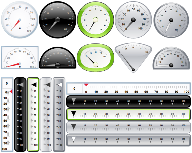
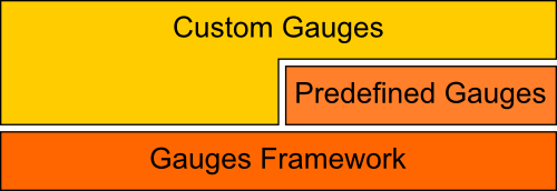
Dojo’s Gauges module provides a framework of classes for creating gauges as well as predefined, ready to use gauge widgets. Both circular and rectangular gauges (horizontal and vertical) are supported.
- The main features for this framework are:
- Rich set of new gauges, circular, semi circular, vertical and horizontal that can be used with markups,
- Interact with the gauges with mouse and touch gestures,
- Ability to easily create new gauges by assembling pre-existing elements (scales, indicators, drawings),
- Predefined gauges extensibility,
- Ability to create non-linear scales and thus non linear gauges,
- All gauges are implemented as dijits that work nicely with dijit layouts,
- Gauges work in both desktop and mobile environments (dojox.mobile).
- The three ways to use the module:
- Using predefined gauges as-is,
- Extending/modifying predefined gauges,
- Creating custom gauges using the framework.

Using predefined gauges
Introduction
Predefined gauges are available in the dojox.dgauges.components package. There are 5 sets of gauges; each set contains 4 gauges: a circular, a semi-circular, a horizontal and a vertical gauge. All these gauges contain one linear scale and one marker.
This example shows how to add a gauge to a Dojo application using markup:
<script type="text/javascript">
  require([
     "dojo/_base/kernel",
     "dojo/parser",
     "dojox/dgauges/components/default/CircularLinearGauge"]
  );
</script>
<div data-dojo-type="dojox/dgauges/components/default/CircularLinearGauge"
     value="20" minimum="-50" maximum="50"
     style="width:300px; height:300px">
</div>
Setting properties using markup
- Predefined gauges inherit from DefaultPropertiesMixin which wraps the main properties of sub-elements on the top-level widget. Supported properties are:
- value: The value of the marker. Default: 0
- minimum: The minimum value of the scale. Default: 0
- maximum: The maximum value of the scale. Default: 100
- snapInterval: The snapping interval (only used on mouse and gesture interactions). Default: 1
- majorTickInterval: The interval between two major ticks. Default: 10
- minorTickInterval: The interval between two minor ticks. Default: 1
- minorTicksEnabled: Show/Hide minor ticks. Default: true
- interactionArea: The area that reacts to user interaction. Valid values are “indicator”, “gauge”, “area” and “none”. Default: “gauge”
- interactionMode: The interaction method, “mouse” or “touch”. Default: “mouse”
- animationDuration: The duration of the animation in milliseconds. Default: 0
Main framework classes
Gauge Base Classes
CircularGauge and RectangularGauge
These classes are Dijits responsible for holding the elements of the gauge. They provide a layout mechanism to control the size and position of elements. A gauge is made of GFX decorations, text indicators and scales (subclasses of ScaleBase). Scales hold one or more indicators (value or range indicators). These elements are added to the scale using the addElement method.
There is a noticeable difference between circular and rectangular gauges about their drawing/layout mechanisms:
Circular gauges have a fixed aspect ratio; the gauge visual representation is scaled to use as much room as possible, and then translated to be centered.
Note: To create a circular gauge with no background, add a drawing function which return a “ghost” shape (no fill and no stroke) of the desired gauge size.
Rectangular gauges use a different approach; they are redrawn when the widget is resized. This allows having “elastic” components that can have any size. A rectangular gauge can be separated into 3 parts: “leading”, “middle” and “trailing”. The “leading” and “trailing” areas have fixed size; the “middle” area fills the remaining room. When adding an element to a rectangular gauge, set the third argument of addElement method to “leading”, “middle” or “trailing”. If the third argument is not specified, the element uses all the room. For an example of rectangular gauge layout, see gauge.components.default.LinearHorizontalGauge implementation.

Using gauge events
- The framework provides 2 events:
- “startEditing” dispatched when an indicator’s value change; programmatically or by user interaction.
- “endEditing” dispatched when an indicator’s value has changed; programmatically or by user interaction.
var gauge = registry.byId("g1");
gauge.on("startEditing", function(event){console.log(event.indicator.value);});
gauge.on("endEditing", function(event){console.log(event.indicator.value);});
Scalers
LinearScaler, MultiLinearScaler and LogScaler
Scalers are used by scales to generate logical ticks (ticks are drawn by scales) and data-transform operations. Logical ticks are rendered by scales; they are passed as argument to the tickShapeFunc of the scale which is called for each tick generated by the scaler.
- The current version provides 3 types of scalers:
- LinearScaler: The most common type of scaler, mainly characterized by “minimum”, “maximum”, “majorTickInterval” and “minorTickInterval”.
- MultiLinearScaler: This type of scaler is useful to display very large value intervals that are difficult to render with a linear scale. This type of scaler is configured with an array of numbers representing the major tick values.
- LogScaler: A common logarithmic implementation.
Scales
CircularScale and RectangularScale
A scale handles a scaler (mandatory) and one or more value or range indicators. A scale and its scaler collaborate to handle the ticks. The scale provides a tick drawing function which can be redefined by the user. This function takes a tick and a GFX Group as arguments; the following code snippet shows the default tick rendering function used in the library:
scale.tickShapeFunc = function(group, scale, tick){
  return group.createLine({
    x1: 0,
    y1: 0,
    x2: tick.isMinor ? 6 : 10,
    y2: 0
  }).setStroke({
    color: "black",
    width: 1
  });
};
Ticks labeling is handled in a similar way using the tickLabelFunc method:
scale.tickLabelFunc = function(tick){
  if (!tick.isMinor){
    return tick.value + "°";
  }
};
Value and Range Indicators
CircularValueIndicator, RectangularValueIndicator, CircularRangeIndicator and RectangularRangeIndicator
Indicators are responsible for displaying one or two values (range indicators) according to the scale properties. These indicators are always associated to a scale. A single value indicator is typically used for needles in circular gauge and thumbs in rectangular gauges. Range indicators display a range of values defined by start and value properties. They can be used as decorations to give information on the range (i.e. Low/Normal/High) or as dynamic indicators by changing value programmatically or using interactions.
A value indicator is drawn by its indicatorShapeFunc. The following code show a needle drawn around its (0, 0) coordinates origin. The origin is used as center for rotation of needles in circular gauges. For rectangular gauges, the origin is aligned with the rendered value.
indicator1.indicatorShapeFunc = function(group, indicator){
  return group.createPolyline([0, -3, 30, 0, 0, 3, 0, -3]).setStroke({
    color: "blue",
    width: 0.25
  }).setFill([100, 100, 255, 1]);
}
Note: Due to VML limitations, circular range indicators are displayed quite distorded.
Text Indicator class
TextIndicator
Text can be added to a gauge using addElement with a TextIndicator instance as argument. A text indicator can be configured in two ways:
- By setting the value property with an arbitrary text,
- By setting the indicator property to a value or a range indicator. In this case, the text is automatically updated when the value of the indicator changes. The labelFunc can be used to customize the rendered text.
Drawing functions
- The drawing function pattern is widely used in the framework:
- as anonymous function for decorating the gauge, typically for defining the background of a gauge,
- for drawing ticks, see Scales section,
- for drawing indicators, see Value and Range Indicators section.
The first argument of a drawing function is always a GFX group. It is the only mandatory argument; other arguments depend on the context.
Creating custom gauges
The first thing to decide is the type of gauge to create, i.e. circular or rectangular.
For creating a circular gauges, subclass CircularGauge:
define(["dojo/_base/lang", "dojo/_base/declare", "dojox/dgauges/CircularGauge"],
   function(lang, declare, CircularGauge){
     return declare("MyGauge", CircularGauge, {
        constructor: function(){
          // Add your elements here
       }
    });
});
For creating a horizontal or vertical gauge, subclass RectangularGauge and set the orientation property:
define(["dojo/_base/lang", "dojo/_base/declare", "dojox/dgauges/RectangularGauge"],
  function(lang, declare, RectangularGauge){
  return declare("MyGauge", RectangularGauge, {
    constructor: function(){
      this.orientation = "vertical" // or "horizontal" (default)
      // Add your elements here
    }
  });
});
Then you define the logic and the visual representation of the gauge in the constructor by adding elements. The addElement() method accepts three kinds of arguments:
- A scale instance (CircularScale or RectangularScale instance),
- A text instance (TextIndicator),
- A drawing function.
Example of a custom circular gauge
define(["dojo/_base/lang", "dojo/_base/declare", "dojox/dgauges/CircularGauge",
      "dojox/dgauges/LinearScaler", "dojox/dgauges/CircularScale",
      "dojox/dgauges/CircularValueIndicator", "dojox/dgauges/CircularRangeIndicator",
      "dojox/dgauges/TextIndicator"],
function(lang, declare, CircularGauge, LinearScaler, CircularScale, CircularValueIndicator,
        CircularRangeIndicator, TextIndicator){
  return declare("dojox.dgauges.tests.gauges.SimpleCircularGauge", CircularGauge, {
    constructor: function(){
      // Changes the font
      this.font = {
        family: "Helvetica",
        style: "normal",
        size: "10pt",
        color: "white"
      };

      // Draws the background
      this.addElement("background", function(g){
        g.createEllipse({
          cx: 100,
          cy: 100,
          rx: 100,
          ry: 100
        }).setFill("#444444");
      });

      // The scaler
      var scaler = new LinearScaler({
        minimum: -100,
        maximum: 100,
        majorTickInterval: 20,
        minorTickInterval: 5
      });

      // The scale
      var scale = new CircularScale({
        scaler: scaler,
        originX: 100,
        originY: 100,
        startAngle: 110,
        endAngle: 70,
        radius: 75,
        labelPosition: "outside",
        tickShapeFunc: function(group, scale, tick){
          return group.createLine({
            x1: tick.isMinor ? 2 : 0,
            y1: 0,
            x2: tick.isMinor ? 8 : 12,
            y2: 0
          }).setStroke({
            color: tick.isMinor ? "black" : "white",
            width: tick.isMinor ? 0.5 : 1
          })
        }
      });
      this.addElement("scale", scale);

      // A value indicator
      var indicator = new CircularValueIndicator({
        interactionArea: "indicator",
        indicatorShapeFunc: function(group){
          return group.createPolyline([20, -6, 60, 0, 20, 6, 20, -6]).setFill("black").setStroke("white");
        },
        value: 50
      });
      scale.addIndicator("indicator", indicator);

      // A green range indicator
      var rangeIndicator = new CircularRangeIndicator({
        start: 0,
        value: 100,
        radius: 62,
        startThickness:10,
        endThickness: 30,
        fill: "green",
        interactionMode: "none",
      });
      scale.addIndicator("rangeIndicator", rangeIndicator, true);


      // Indicator Text"
      this.addElement("text", new TextIndicator({
        value: "G", x:100, y:100
      }));
    }
  });
});
Example of a custom horizontal gauge
define(["dojo/_base/lang", "dojo/_base/declare", "dojox/dgauges/RectangularGauge",
       "dojox/dgauges/LinearScaler", "dojox/dgauges/RectangularScale", "dojox/dgauges/RectangularValueIndicator",
       "dojox/dgauges/RectangularRangeIndicator", "dojox/dgauges/TextIndicator"],
      function(lang, declare, RectangularGauge, LinearScaler, RectangularScale, RectangularValueIndicator,
             RectangularRangeIndicator, TextIndicator){
  return declare("dojox.dgauges.tests.gauges.SimpleRectangularGauge", RectangularGauge, {
    constructor: function(){
      // Draw background
      this.addElement("background", function(g, w){
        return g.createRect({
          x: 1,
          y: 1,
          width: w - 2,
          height: 50,
          r: 3
        }).setFill("#CBCBCB").setStroke({
          color: "black",
          width: 2
        });
      });

      this.addElement("leadingArea", function(g, w){
        return g.createRect({
          x: 1,
          y: 1,
          width: 60,
          height: 50,
          r: 3
        }).setFill("#ABABAB").setStroke({
          color: "black",
          width: 2
        });
      }, "leading");

      this.addElement("trailingArea", function(g, w){
        // A spacer to take into account the width of the stroke on the right;
        g.createLine({
          x2: 62
        });
        return g.createRect({
          x: 1,
          y: 1,
          width: 60,
          height: 50,
          r: 3
        }).setFill("#ABABAB").setStroke({
          color: "black",
          width: 2
        });
      }, "trailing");

      // Scale
      var scale = new RectangularScale({
        scaler: new LinearScaler({
          minimum: -100
        }),
        labelPosition: "trailing",
        paddingTop: 15
      });
      this.addElement("scale", scale);

      // Value indicator
      var indicator = new RectangularValueIndicator();
      indicator.indicatorShapeFunc = lang.hitch(this, function(group){
        group.createPolyline([-5, 0, 5, 0, 0, 10, -5, 0]).setFill("black");
        return group;
      });
      indicator.set("paddingTop", 5);
      indicator.set("interactionArea", "gauge");
      scale.addIndicator("indicator", indicator);

      // Indicator Text
      var trailingText = new TextIndicator({
        x: 30,
        y: 30,
        indicator: indicator,
        labelFunc: function(v){
          return v + " °C"
        }
      });

      this.addElement("trailingText", trailingText, "trailing");
      var leadingText = new TextIndicator({
        x: 30,
        y: 30,
        indicator: indicator,
        labelFunc: function(v){
          return ((9 / 5) * v + 32).toFixed() + " °F"
        }
      });
      this.addElement("leadingText", leadingText, "leading");

      scale.addIndicator("gradientIndicator", new RectangularRangeIndicator({
        start: -100,
        value: 100,
        paddingTop: 15,
        stroke: null,
        fill: {
          type: "linear",
          x1: 0,
          y1: 0,
          x2: 1,
          y2: 0,
          colors: [{
            color: "#7FB2F0",
            offset: 0
          }, {
            color: "#FFFFFF",
            offset: .5
          }, {
            color: "#F03221",
            offset: 1
          }]
        }
      }), true);
    }
  });
});