Now that Dojo 1.8 beta is out, I encourage you to check out some of the new features in this release. There are three brand new visualization components for mobile (phones & tablets) and desktop browser platforms. Each of these components answers specific advanced needs in term of visualization and may be useful in your apps.
The first component I’d like to introduce is the calendar component. This is a full featured UI component that displays calendar events either in day, week, month or yearly view. It its fully compatible with the dojo/store APIs and can be filled with any kind of data coming from your server. It is easily styled using CSS.
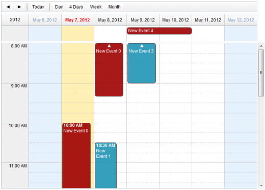
You can read more about the calendar component in the Dojo calendar beta documentation.
The second component is a fully redesigned gauges framework for Dojo that comes with several predefined gauges. With this new framework, creating your own gauges or customizing existing ones is now as easy as assembling predefined elements such as indicators, scales or tracks and connecting a few custom functions for custom drawings. Gauges can be horizontal, vertical, circular or semi-circular.

You can read more about the new gauges and their framework in the Dojo gauges beta documentation.
Finally, I’ll mention a pure data visualization analysis component, the treemap. This component displays data as a set of colored, potentially nested, rectangular cells. It can be used to explore large data sets by using convenient drill-down capabilities. It relies on data clustering, using areas and color information to represent the data you want to explore. Like the calendar component, it can connect to any dojo/store implementation.
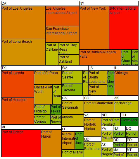
You can read more about the treemap in the Dojo Treemap beta documentation
We are looking forward to your feedback on these new components. Download the beta and try them out. You may send your feedback to the Dojo interest list or file any issues you may find.
Excellent! this look great
I am new to Dojo, so, the right “thing” to do to learn it, is studying the Tutorials.
But, the tutorials aren’t organized in a progressive or ordered way.
The one I started reading, after some point, it stated something like “as you saw in tutorial xxxx, …”, so to understand this tutorial it has a pre-requisite to read the other one, and so on.
So, the best form to organize the documentation and the tutorials are to order them in the order they have to be read, with the lowest basic ones (“elementary”), growing up to the most advanced ones.
Also, the tuts I have read so far, are too much messy, badly written ones.
See “CodeIgniter’s Guide” (http://codeigniter.com/user_guide/toc.html), how organized it is.
Sorry writing about this here, but I did not saw any “contact” page, or form. in the dojo site.
Please, forward this message to the person(s) that take care of the site, thanks.
Gero.
Gero, I actually did organize them in what I considered to be the most logical order. That said, Dojo has many features, and not everyone needs all of those features. The current order was based on feedback from many users. If there’s a better order, we’re open to suggestions!
calendar treemap value for $/day –> spreedshet for sales revenue cost…