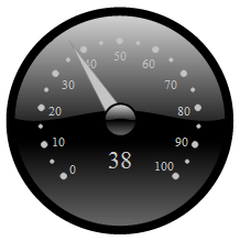
dojox.gauges.GlossyCircularGauge
| Project owner: | Emmanuel Tissandier, Philippe Toussaint |
|---|---|
| since: | 1.7 |
A glossy circular gauge with a variety of indicators, used to display numerical data.

Introduction
This gauge widget is based on dojox.gauges.AnalogGauge. It provides a way to display data on a circular gauge with a glossy appearance, such as a speedometer or a pressure gauge, for displaying a finite data value at a point in time. It is created with predefined indicators and thus is ready to use.
Usage
Creating a default circular glossy gauge requires a few parameters: size and eventually a background color. The others gauge’s parameters such as start and end angle, minimum and maximum values, etc... have default values. Thus, you can quickly use the gauge in you application and customize it according to you needs. Here are the other customizable parameters.
| Parameter | Default value | Description |
|---|---|---|
| width | “300” | The width of gauge. |
| height | “300” | The height of the gauge |
| min | “0” | The minimum allowed value. |
| max | “100” | The maximum allowed value. |
| value | “0” | The current value. |
| majorTicksInterval | “10” | The interval between each majors tick |
| majorTicksColor | “#c4c4c4” | Color of the major tick marks on the scale |
| minorTicksInterval | “5” | The interval between each minor tick |
| minorTicksColor | “#c4c4c4” | Color of the minor tick marks on the scale |
| color | “black” | Color of the gauge |
| needleColor | “#c4c4c4” | Color of the needle |
| font | “normal normal normal 10pt sans-serif” | Definition of the font used to display the values on the scale |
| textIndicatorFont | “normal normal normal 20pt sans-serif” | Definition of the font used to display the current value |
| textIndicatorVisible | “true” | Indicates if the text displaying the current value is visible |
| textIndicatorColor | “#c4c4c4” | The color of the text displaying the current value |
| majorTicksLabelPlacement | “inside” | Indicates how label are placed relatively to the tick marks: either “inside” or “outside”. “inside” means between the ticks and the center of the gauge, and “outside” means between the gauge’s border and the tick marks |
| noChange | “true” | Indicates if user can change the value of the gauge by interacting with the needle |
| title | “title” | The title displayed in the needle’s tooltip |
| scalePrecision | “0” | The precision for the formatting of numbers in the scale |
| textIndicatorPrecision | “0” | The precision for the formatting of numbers in the text indicator |
Examples
circular gauge (programmatic)
version: local <div id="CircularGauge" ></div>
dojo.require('dijit.form.Button');
dojo.require('dojox.gauges.GlossyCircularGauge');
makeGauge = function(){
    var glossyCircular = new dojox.gauges.GlossyCircularGauge({
        background: [255, 255, 255, 0],
        title: 'Value',
        id: "glossyGauge",
        width: 300,
        height: 300
    }, dojo.byId("CircularGauge"));
    glossyCircular.startup();
};
dojo.ready(makeGauge );
An other gauge sample
| version: | local |
|---|
  <div data-dojo-type="dojox.gauges.GlossyCircularGauge"
     id="csGaugeMargin"
     value="0"
     width="170"
     height="100"
     min="-150"
     max="150"
     majorTicksInterval="150"
     minorTicksInterval="50"
     background="[255, 255, 255, 0]"
     title="Margin"
     noChange="true"
     textIndicatorFont="normal small-caps bold 12pt Arial"
     radius="40"
     majorTicksLabelPlacement="outside"
     majorTicksColor="white"
     textIndicatorVisible="false">
</div>