dojox.charting
| Project owners: | Eugene Lazutkin, Tom Trenka, Christophe Jolif |
|---|---|
| since: | V0.9 |
Contents
Dojo comes with an amazing charting library, in the form of dojox/charting. A large number of features are supported, with new ones being added constantly.
require(["dojox/charting/Chart", "dojox/charting/axis2d/Default", "dojox/charting/plot2d/StackedAreas", "dojox/charting/themes/Wetland" , "dojo/ready"],
  function(Chart, Default, StackedAreas, Wetland, ready){
    ready(function(){
      var c = new Chart("chartOne");
      c.addPlot("default", {type: StackedAreas, tension:3})
        .addAxis("x", {fixLower: "major", fixUpper: "major"})
        .addAxis("y", {vertical: true, fixLower: "major", fixUpper: "major", min: 0})
        .setTheme(Wetland)
        .addSeries("Series A", [1, 2, 0.5, 1.5, 1, 2.8, 0.4])
        .addSeries("Series B", [2.6, 1.8, 2, 1, 1.4, 0.7, 2])
        .addSeries("Series C", [6.3, 1.8, 3, 0.5, 4.4, 2.7, 2])
        .render();
    });
});
<div id="chartOne" style="width: 400px; height: 240px; margin: 10px auto 0px auto;"></div>
Introduction
Dojo’s Charting module provides a way to quickly and easily add great looking and functional dynamic charts and graphs to your web pages. All you need is a tiny bit of JavaScript skills and a copy of Dojo.
Charting Basics
Below is a typical example of how to create a Dojo Chart in HTML and JavaScript. It is using the the new Dojo AMD syntax for modules however you can still use the historical Dojo provide / require syntax for packages if you want to. However you are encouraged using the new AMD syntax. See AMD loader documentation for more details on AMD.
<div id="simplechart" style="width: 250px; height: 150px; margin: 5px auto 0px auto;"></div>
require(["dojox/charting/Chart", "dojox/charting/axis2d/Default", "dojox/charting/plot2d/Lines", "dojo/ready"],
  function(Chart, Default, Lines, ready){
  ready(function(){
    var chart1 = new Chart("simplechart");
    chart1.addPlot("default", {type: Lines});
    chart1.addAxis("x");
    chart1.addAxis("y", {vertical: true});
    chart1.addSeries("Series 1", [1, 2, 2, 3, 4, 5, 5, 7]);
    chart1.render();
  });
});
As you can see from the source it is simple to create charts.
As part of configuring any Chart, you’ll need to define Plots, Axes and Series data. Plots describe how data is to be visualized. Axes describe the dimensions of data that are being visualized and includes things like specifying labels. Series describes the Data itself that the chart will visualize.
Adding Title
You can add a general title to the chart, and the title can be specified on position and font styles. Here are related parameters:
| Name | Type | Default | Description |
|---|---|---|---|
| titlePos | string | top | determine adding title at the top/bottom of the chart. |
| titleGap | number | 20 | determine the spacing between title and the chart. |
| title | string | null | chart title text. |
And here comes an example:
require(["dojox/charting/Chart", "dojo/ready"], function(Chart, ready){
  ready(function(){
    var chart = new dojox.charting.Chart("test", {
      title: "Production(Quantity)",
      titlePos: "bottom",
      titleGap: 25,
      titleFont: "normal normal normal 15pt Arial",
      titleFontColor: "orange"
    });
  }
}));
Working with Plots
The addPlot() call is used to determine what type of chart you are going to produce, and there are a variety of options to select. Here are a few examples:
addPlot() accepts 2 parameters, a name and an arguments array. The name is important if you want to have more than one plot type on your chart. The arguments array contains your plot options, and these may vary depending on the type of plot you use. Note that your choice of plot type may define appropriate default options.
type is the main option, with a default value being a basic line chart.
require(["dojox/charting/plot2d/Areas", ...], function(Areas, ...){
  // ...
  chart.addPlot("default", { type: Areas });
});
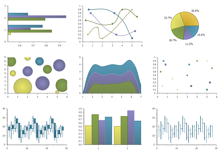
Available 2D chart types include:
- Line charts:
- Default - Universal line chart capable to draw lines, fill areas under them, and placing markers at data points. This plot type is used if no plot type was specified when adding it to a chart.
- Lines - Basic line chart. Uses Default.
- Areas - Area under data line(s) will be filled. Uses Default.
- Markers - Lines with markers. Uses Default.
- MarkersOnly - Markers, sans lines. Uses Default.
- Stacked line charts:
- Stacked - Data sets charted in relation to the previous data set. Extension of Default.
- StackedLines - Stacked data sets using lines. Uses Stacked.
- StackedAreas - Stacked data sets with filled areas under chart lines. Uses Stacked.
- Bars:
- Bars - Horizontal bars.
- ClusteredBars - Horizontal bars with clustered data sets. Uses Bars.
- StackedBars - Stacked data sets with horizontal bars. Uses Bars.
- Columns:
- Columns - Vertical bars.
- ClusteredColumns - Vertical bars with clustered data sets. Uses Columns.
- StackedColumns - Stacked data sets with vertical bars. Uses Columns.
- Miscellaneous:
- Pie - Typical pie chart or circle graph.
- Spider - A very effective tool for comparing multiple entities based on different characteristics.
- Scatter - Similar to MarkerOnly, yet capable to chart using gradient fields.
- Bubble - Similar to scatter but with bubbles elements which sizes vary depending on the data.
- Grid - For adding a grid layer to your chart.
- Indicator - For adding vertical or horizontal indicator threshold on the chart.
Lines, Areas and Markers Plots
With any of the lines, areas or markers types you have five specific options. First, there are three options for controlling aspects of lines, areas, and markers. These are often defined by the chosen plot type, but can be changed to get other behaviors. The lines option determines whether or not lines are used to connect data points. If the areas type is selected, the area below the data line will be filled. The markers option will determine if markers are placed at data points.
require(["dojox/charting/plot2d/StackedAreas", ...], function(StackedAreas, ...){
  chart.addPlot("default", { type: StackedAreas, lines: true, areas: true, markers: false });
});
There are also two specific graphical options, tension and interpolate.
Tension allows you to add some curve to the lines on you plot. By default this option is set to “” which is off. Other valid values are:
- “X” for a cubic bezier smooth lines.
- “x” is similar to “X” but assumes that the point set is closed (a loop). It can be used when plotting true XY data.
- “S” for a quadratic bezier smooth lines.
require(["dojox/charting/plot2d/StackedLines", ...], function(StackedLines, ...){
  chart.addPlot("default", {type: StackedLines, tension: "S" });
});
Finally interpolate let’s you choose the behavior when a data point is missing in the chart (i.e. its data value is null). If interpolate is false (default) a the line or area will be cut at that data point and will start back at the next valid data point. If interpolate is true, the missing data point will be interpolated and the chart continuously drawn.
About markers
The markers are fixed size symbols retrieved from the chart theme. To change the markers size you need to change the symbols in the theme. For example to double the size of the first symbols:
require["dojox/charting/Chart", "dojox/charting/SimpleTheme"], function(Chart, SimpleTheme){
  var myTheme = new SimpleTheme({
    markers: {
      CIRCLE: "m-6,0 c0,-8 12,-8 12,0, m-12,0 c0,8 12,8 12,0"
      SQUARE: "m-6,-6 12,0 0,12 -12,0z"
    }
  });
  var chart = new Chart().setTheme(myTheme);
});
Bars, Columns, Candle Stick Plots
Bar, column, and candle stick graph types have some unique option to control width of columns:
- gap - determines the spacing between your bars or columns in pixels.
- minBarSize - defines the minimal width of a column/candle, or a height of bar.
- maxBarSize - defines the maximal width of a column/candle, or a height of bar.
All three restrictions are applied in the following order: gap, minBarSize, maxBarSize.
require(["dojox/charting/plot2d/Bars", ...], function(Bars, ...){
  chart.addPlot("default", { type: Bars, gap: 5, minBarSize: 3, maxBarSize: 20 });
});
In addition the bar and column graph types can benefit from gfx shapes caching when rendered in order to improve further rendering performances. To enable this option do the following:
require(["dojox/charting/plot2d/Columns", ...], function(Columns, ...){
  chart.addPlot("default", {type: Columns, enableCache: true});
});
Note that you should enable it only if you except the chart to re-render often like for example when you intend to zoom it in or out in order to not penalize first rendering for nothing.
For any chart type that supports axes, you can also define custom names to your axes here. By default they are “x” and “y”, but this option becomes useful if you wish to have a chart with multiple plots and multiple axes.
require(["dojox/charting/plot2d/Bars", ...], function(Bars, ...){
  chart.addPlot("default", { type: Bars, hAxis: "cool x", vAxis: "super y" });
});
Bubble Plot
Tne bubble plot provides several options including bubble fill, stroke and shadow.
require(["dojox/charting/plot2d/Bubble", ...], function(Bubble, ...){
  chart.addPlot("default", { type: Bubble, fill: "red" });
});
The important point is that the data series used for the Bubble plot must be of the following form:
[ { x: x0, y: y0, size: size0 }, { x: x1, y: y1, size: size1 }, ... ]
With size corresponding to the size of the bubble for a given data point.
Pie Plot
Pie charts have a separate list of parameters. Here are the parameters for the pie chart, from Pie.js:
defaultParams: {
    labels: true,
    ticks: false,
    fixed: true,
    precision: 1,
    labelOffset: 20,
    labelStyle: "default",      // default/columns/rows/auto
    htmlLabels: true            // use HTML to draw labels
},
optionalParams: {
    font: "",
    fontColor: "",
    radius: 0
}
Style on Lines, Areas, Bars, Columns, Bubble & Pie plots
These plots support a common set of style properties that when provided override the style taken from the chart theme. This includes for example fill property to specify with fill is used by the plot and the stroke property to specify the border of a column for example.
require(["dojox/charting/plot2d/Columns", ...], function(Columns, ...){
  chart.addPlot("default", { type: Columns, stroke: {color: "blue", width: 2}, fill: "lightblue"});
});
This includes as well a shadow property that allows you to add a shadow effect, and can be a dojox.gfx stroke object with two extra parameters: dx and dy, which represent the offset to the right, and the offset down, respectively. Negative values can be specified for the dx and dy parameters to produce a shadow that is to the left or above the chart line.
Shadows can be added to a plot on data points as follows:
require(["dojox/charting/plot2d/Lines", ...], function(Lines, ...){
  chart.addPlot("default", { type: Lines, markers: true,
    tension: "X", shadow: {dx: 2, dy: 2} });
});
This also includes a filter property that allows you to add a filter effect. This will work only if the underlying drawing system of the chart, gfx, is using the SVG rendering engine. In order for the filter to be functional you also need to explicitly require dojox/gfx/svgext module in your application as follows:
require(["dojox/charting/plot2d/Columns", "dojox/gfx/filters", ... , "dojox/gfx/svgext"],
  function(Columns, filters, ...){
  chart.addPlot("default", { type: Columns, fill: "red", filter: filters.shadows.dropShadow });
});
See GFX documentation on how to use pre-defined filters or create new ones.
Finally if you need to specify the style of your plot elements depending on a function you can use the styleFunc property of these plots to compute the color based for example on data values:
require(["dojox/charting/plot2d/Columns", ...], function(Columns, ...){
  chart.addPlot("default", { type: Columns, styleFunc: function(item){
    if(item.y < 10){
      return { fill : "red" };
    }else if(item.y > 60){
      return { fill: "green" };
    }
    return {};
  }});
});
About labels
All these plots also have the ability to render labels for each of the data points. The feature can be disabled using the labels property of the plots. It is on by default for Pie and off for the other type of plots.
Several properties can be used to configure how the labels are rendered in particular you can choose how the labels will be laid out using the labelStyle property. For Pie you can specify “default” in which case the labels will be rendered on the pie slices or next to them depending on the labelOffset or “column” to render the labels by columns on the side of the chart. For other plots you can specify “inside” to render the labels inside the shape representing the data point (a column, a bar, a marker...) or “outside” to render the label above the data point. In that latter case you can use the labelOffset property to specify how far from the data point the label must be rendered.
An example of a column plot with outside labels:
require(["dojox/charting/plot2d/Columns", ...], function(Columns, ...){
  chart.addPlot("default", { type: Columns, label: true, labelStyle: "outside", labelOffset: 25 });
});
Spider Plot
Spider chart also keeps a separate list of parameters. Here comes the parameters of spider chart.
defaultParams: {
  precision:1,
  labelOffset:     -10,        // axis title offset
  divisions:       3,            // axis tick count
  axisColor:       "",        // spider axis color
  axisWidth:       0,            // spider axis stroke width
  axisFont: "normal normal normal 11pt Arial" // spider axis font
  spiderColor:     "",        // spider web color
  spiderWidth:     0,            // spider web stroke width
  seriesWidth:     0,            // plot border with
  seriesFillAlpha: 0.2,        // plot fill opacity
  spiderOrigin:    0.16,       // distance of 0 value from the middle of the circle
  markerSize:      3,            // radius of plot vertex (px)
  divisions: 5,                // set division of the radar chart
  precision: 0,                 // set decimal of the displayed number
  spiderType:         "polygon",     // style of spider web, "polygon" or "circle"
  animationType:   dojo.fx.easing.backOut,
}
And here is an example for spider chart:
require(["dojox/charting/plot2d/Spider", "dojox/charting/widget/SelectableLegend", ...], function(Spider, SelectableLegend, ...){
   // ...
  chart.addPlot("default", {
    type: Spider,
    labelOffset: -10,
    divisions: 5,
    seriesFillAlpha: 0.2,
    markerSize: 3,
    precision: 0,
    spiderType: "polygon"
  });
  chart.addSeries("China", {data: {"GDP": 2, "area": 6, "population": 2000, "inflation": 15, "growth": 12}}, { fill: "blue" });
  chart.addSeries("USA", {data: {"GDP": 3, "area": 20, "population": 1500, "inflation": 10, "growth": 3}}, { fill: "green" });
  // ...
  chart.addSeries("Canada", {data: {"GDP": 1, "area": 18, "population": 300, "inflation": 3, "growth": 15}}, { fill: "purple" });
  chart.render();

  var legend = new SelectableLegend({chart: chart, horizontal: true}, "legend");
});
The Spider plot contains as many axes as the number of dimensions in its data (5 in the example above). By default each axis minimum and maximum is computed from the data. You can override this (for example if you have a single data series) by explicitly adding axis to you charts instead of relying on the default mechanism. In the following example the minimum and maxium for GDP axis is overridden:
require(["dojox/charting/axis2d/Base", ...], function(Base, ...){
  // ...
  chart.addAxis("GDP", { type: Base, min: 0, max: 5 });
  chart.addSeries("China", {data: {"GDP": 2, "area": 6, "population": 2000 }}, { fill: "blue" });
  chart.addSeries("USA", {data: {"GDP": 3, "area": 20, "population": 1500 }}, { fill: "green" });
});
Note that all the parameters supported for Cartesian plots except min and max are not support here.
Grid Plot
One other type with unique options is the grid. This plot type will draw grid lines along the tick marks and supports four boolean options to determine if lines will be displayed at the horizontal or vertical and major or minor axis tick marks. There are also options to determine the stroke used to draw the lines.
require(["dojox/charting/plot2d/Grid", ...], function(Grid, ...){
  chart.addPlot("default", { type: Grid,
         hMajorLines: true,
         hMinorLines: false,
         vMajorLines: true,
         vMinorLines: false,
         majorHLine: { color: "green", width: 3 },
         majorVLine: { color: "red", width: 3 } });
});
There are also options to enable stripes between the grid lines as well as pick the color/fill used to render them. By default no stripes are rendered.
require(["dojox/charting/plot2d/Grid", ...], function(Grid, ...){
  chart.addPlot("default", { type: Grid,
         hStripes: true,
         vStripes: false,
         hFill: "red",
         vFill: "blue" });
});
If you need the grid to be aligned with alternate axes you can do the following:
require(["dojox/charting/plot2d/Grid", ...], function(Grid, ...){
  chart1.addPlot("Grid", { type: Grid,
    hAxis: "other x",
    vAxis: "other y" });
});
Similarly to the axis if your grid is changing often you can use the enableCache option to improve further renderings:
require(["dojox/charting/plot2d/Grid", ...], function(Grid, ...){
  chart.addPlot("Grid", { type: Grid,
    hAxis: "other x",
    vAxis: "other y",
    enableCache: true });
});
Finally to avoid a grid line to be rendered on the axis lines you can set the renderOnAxis option to false:
require(["dojox/charting/plot2d/Grid", ...], function(Grid, ...){
  chart.addPlot("Grid", { type: Grid,
    renderOnAxis: false });
});
Indicator Plot
The indicator plot type will draw horizontal or vertical lines on the chart at a given position. Optionally a label as well as markers can also be drawn on the indicator line. These indicators are typically used as threshold indicators showing the data displayed by the chart are reaching particular threshold values.
To display a horizontal threshold dashed line at data coordinate 15 on the vertical axis you can do the following:
require(["dojox/charting/plot2d/Indicator", ...], function(Indicator, ...){
  chart.addPlot("threshold", { type: Indicator,
        vertical: false,
        lineStroke: { color: "red", style: "ShortDash"},
        stroke: null,
        outline: null,
        fill: null,
        offset: { y: -7, x: -10 },
        values: 15});
});
The offset property allows to adjust the position of the label with respect to its default position (that is the end of the threshold line). To hide the label, set the labels property to “none”:
require(["dojox/charting/plot2d/Indicator", ...], function(Indicator, ...){
  chart.addPlot("threshold", { type: Indicator,
        vertical: false,
        lineStroke: { color: "red", style: "ShortDash"},
        labels: "none",
        values: 15});
});
If you want to display markers on the indicator line you can specify a series for the indicator which will contain the marker coordinates. In the following example a vertical indicator is rendered data coordinate 15 on the horizontal axis and on the threshold line markers are rendered at coordinates 8, 17 and 30 along the vertical axis.
require(["dojox/charting/plot2d/Indicator", "dojox/charting/Series", ...], function(Indicator, Series, ...){
  chart.addPlot("threshold", { type: Indicator,
        lineStroke: { color: "red", style: "ShortDash"},
        labels: "none",
        values: 15});
      chart.addSeries("markers", [ 8, 17, 30 ], { plot: "threshold" });
});
Multiple Plots
Multiple plots can be added to the chart and associated to various series. They can be of differing types and can all be configured separately. Each plot you add with addPlot() will be layered behind the previous plot. In addition, plots can have their own axes or share them with other plots on the chart.
require(["dojox/charting/Chart", "dojox/charting/plot2d/Lines", "dojox/charting/plot2d/Areas", ...],
  function(Chart, Lines, Areas, ...){
  var chart = new Chart("simplechart");
  chart.addPlot("default", {type: Lines});
  chart.addPlot("other", {type: Areas});
  chart.addAxis("x");
  chart.addAxis("y", {vertical: true});
  chart.addSeries("Series 1", [1, 2, 2, 3, 4, 5, 5, 7]);
  chart.addSeries("Series 2", [1, 1, 4, 2, 1, 6, 4, 3],
    {plot: "other", stroke: {color:"blue"}, fill: "lightblue"});
  chart.render();
});
To associate a given series to a particular plot you should use the plot parameter when adding the series passing the plot name for the value as “other” in the example adobe.
Plots Animation
When a plot is rendered an animation can be triggered. In order to enable this, an animate parameter must be passed to the plot as shown below:
require(["dojox/charting/plot2d/Columns", "dojo/fx/easing", ...], function(Columns, easing, ...){
  chart.addPlot("cols", {type: Columns, animate: { duration: 1000, easing: easing.linear} });
});
The animate parameter is itself an object that can takes several parameters including:
- duration: the duration of the animation
- easing: the easing function to use for the animation
- rate: the animation rate
Basically these are the same parameters than the ones passe to dojo.Animation. See Animation quickstart documentation for details.
See Animated Chart for a full example.
Configuring Axis
Specifying Axes
When you are using Cartesian plots you can use the addAxis() method on a chart which provides several options for defining axes. Similar to addPlot(), this call takes two parameters, a name and an options array. You will need to use “x” and “y” as your axes names unless you gave them custom names in your addPlot() call. Additionally, you don’t have to define the axes if you wish to create charts with one or zero axes. You can also make charts with more than two axes by adding a second plot and attaching axes to it. Using this approach, you can display up to four different axes, two vertical and two horizontal, using two to four plots. Also, a single axis can be shared by more than one plot, meaning you could have two plots that use the same horizontal axis, but have different vertical axes. Let’s look at all the addPlot() options that make this and more possible.
The first option is vertical, this determines if the axis is vertical or horizontal, it defaults to false for a horizontal axis. Make sure that your alignment matches with values set for hAxis and vAxis, which are “x” and “y” by default, on your plot or your chart will not render.
require(["dojox/charting/plot2d/Lines", ...], function(Lines, ...){
  chart.addPlot("default", {type: Lines, hAxis: "x", vAxis: "y"});
  chart.addAxis("x");
  chart.addAxis("y", {vertical: true});
});
Next we have the fixUpper and fixLower options, which align the ticks and have 4 available options; major, minor, micro, and none. These default to none, and when set will force the end bounds to align to the corresponding tick division. If none is chosen, the end bounds will be the highest and lowest values in your data set. Another related option is the includeZero option, which will make your lower bound be zero. If your lowest data value is negative the includeZero option has no effect.
chart.addAxis("x", {fixUpper: "major", fixLower:"minor"});
chart.addAxis("y", {vertical: true, fixUpper: "major", includeZero: true});
Now let’s examine the leftBottom option. This option defaults to true, and along with the vertical option determines the side of the chart the axis is placed. At the end of Part 1 we examined adding a second plot to our chart. Let’s use that sample and give the second plot its own set of axes and anchor them on the top and right using leftBottom.
require(["dojox/charting/Chart", "dojox/charting/plot2d/Lines", ...], function(Chart, Lines, ...){
  // ...
  var chart = new Chart("simplechart");
  chart.addPlot("default", {type: Lines});
  chart.addPlot("other", {type: Areas, hAxis: "other x", vAxis: "other y"});
  chart.addAxis("x");
  chart.addAxis("y", {vertical: true});
  chart.addAxis("other x", {leftBottom: false});
  chart.addAxis("other y", {vertical: true, leftBottom: false});
  chart.addSeries("Series 1", [1, 2, 2, 3, 4, 5, 5, 7]);
  chart.addSeries("Series 2", [1, 1, 4, 2, 1, 6, 4, 3],
        {plot: "other", stroke: {color:"blue"}, fill: "lightblue"}
  );
  chart.render();
});
Finally another option is the enableCache parameter. If your axis are meant to be often re-rendered (that is the case for example if you use a mouse or touch zoom action on the chart) it might be good to cache the underlying gfx objects and not re-create them. For that do:
chart.addSeries("Series 2", [1, 1, 4, 2, 1, 6, 4, 3],
        {plot: "other", stroke: {color:"blue"}, fill: "lightblue", enableCache: true, htmlLabels: false}
);
As doing this caching will slow down a little bit the first rendering you must enable it only if you the axis will change over time and that you will thus benefit from it. Note that if you keep HTML labels to true (the default) only the ticks will be cached not the labels. Indeed only GFX labels benefit from the caching mechanism. You have to explicitly set htmlLabels to false to be sure labels will be cached in addition to ticks.
Multiple Axes
The one thing you may have noticed is that using multiple axes changes the perspective because the second data set is now charted against a different axis. You are in luck because you have full control to adjust the axis in almost every way possible. For example, you can set min and max options.
min: 0
max: 7
Axis Title
Adding title to axis, the position, orientation and color of the axis title can be specified. The parameters are:
| Name | Type | Default | Description |
|---|---|---|---|
| title | string | null | axis title text. |
| titleGap | number | 15 | the spacing between title and corresponding axis, measured by pixel. |
| titleFontColor | string | black | axis title font color. |
| titleOrientation | string | axis | determine the title orientation to the axis, facing to the axis by “axis”, or facing away from the axis by “away”. |
Enabling and disabling tick marks
You can turn on and off the tick marks at the minor and micro level, and turn labels on and off for the major and minor levels
majorLabels: true
minorTicks: true
minorLabels: true
microTicks: false
Natural & Fixed Precision Axis
The natural property forces all ticks to be on natural numbers, and fixed which will fix the precision on labels and can be specified as follows.
natural: false
fixed: true
Axis Stepping
Defining the step between ticks can be specified as follows.
majorTickStep: 4
minorTickStep: 2
microTickStep: 1
Axis Colors and Ticks Styles
The color of the axis, the color and length of your tick marks and the font and color of your labels can be specified as follows.
chart.addAxis("other y", {vertical: true,
  leftBottom: false,
  max: 7,
  stroke: "green",
  font: "normal normal bold 14pt Tahoma",
  fontColor: "red",
  majorTick: {color: "red", length: 6},
  minorTick: {stroke: "black", length: 3}
});
To render the axis ticks inside the plot area instead of outside of the chart negative length for the ticks can be used.
chart.addAxis("other y", {vertical: true,
  leftBottom: false,
  max: 7,
  stroke: "green",
  font: "normal normal bold 14pt Tahoma",
  fontColor: "red",
  majorTick: {color: "red", length: -10}
});
Axis Labels
By default the labels of an axis are computed from the raw data value and formatted using dojo/number when available (i.e explicitly imported in your application) or using Date.toFixed otherwise.
However one can provide his own labels instead. There are two means for achieving this. When you use lengthy custom labels please make sure to allow sufficient space in your div for the text to display properly.
This code excerpt shows how to use the axis labels property to display abbreviated month names:
chart.addAxis("x", {
    labels: [{value: 1, text: "Jan"}, {value: 2, text: "Feb"},
        {value: 3, text: "Mar"}, {value: 4, text: "Apr"},
        {value: 5, text: "May"}, {value: 6, text: "Jun"},
        {value: 7, text: "Jul"}, {value: 8, text: "Aug"},
        {value: 9, text: "Sep"}, {value: 10, text: "Oct"},
        {value: 11, text: "Nov"}, {value: 12, text: "Dec"}]
    });
Note that the labels object must be sorted by increasing value.
Another possibility is to provide a labeling function that will be used to compute the labels.
In the following code the labeling function is used to add a unit after the expected label:
var myLabelFunc = function(text, value, precision){
   return text+" my unit";
};
chart.addAxis("x", { labelFunc: myLabelFunc });
The first parameter of the labeling function is the text already formatted by the default processing. The second parameter is the raw value for that label and the third one is the desired precision for display. Note that all parameters are optional.
Note that by default the axis make sure to drop superfluous labels to avoid them to overlap. However computing this might be costly and if you know that the labels are short enough to not overlap you can disabled this mechanism by setting the dropLabels property to false on the axis:
chart.addAxis("x", { dropLabels: false });
The drop labels mechanism computes once the size of the labels at initialization time and recompute how many must be dropped when zooming in or out the chart. However in some cases the labels size is varying with the zoom levels. In that case you need to explicitly set the labelSizeChange property on the chart for it to recompute the size of the labels on each zoom level:
chart.addAxis("x", { labelSizeChange: true });
Note that this will hurt performances, so enable this only if your labels are changing size on zoom and you noticed the drop labels mechanism does not work when zooming in or out the chart.
Also if you keep dropLabels to true, and you know minor labels won’t show up or you don’t want them to show up it is advised to set minorLabels property to false to speed up computations:
chart.addAxis("x", { minorLabels: false });
TODO: Month Labels Example
Axis Label Shortening
If dropLabels is set to false axis labels might overlap. In this case label shortening rules can be specified by parameters as follows.
| Name | Type | Default | Description |
|---|---|---|---|
| trailingSymbol | string | null | define the symbol replacing the omitted part of label. |
| maxLabelSize | number | 0 | define the max length of label in pixel. |
| maxLabelCharCount | number | 0 | define the max count of characters in label. |
Data Management
Connecting Charts to Data and Specifying a Data Series
Using addSeries(), you can define the data sets that will be displayed by a plot the chart. addSeries() accepts three parameters, a name, a data array and an options object. There is also an updateSeries() call that takes a name and data array for when you want to refresh your data. Let’s run through the options available in the addSeries() call, then look at the data array.
In the options of addSeries you can pass styling properties that will override the ones from the plot used to render the series like stroke or fill.
See Style on Lines, Areas, Bars, Columns, Bubble & Pie plots for more details on those properties.
chart.addSeries("Series 1", [1, 2, 4, 5, 5, 7], {stroke: {color: "blue", width: 2},
    fill: "lightblue"});
The data array, is just an array of data. All plot types can accept a one dimensional array, but there are some additional format options available based on the type of chart. With a one-dimensional array for cartesian type graphs (lines, columns...) the X axis will be integers; 1,2,3... and the data will be mapped to the Y axis. For bar type plots the X and Y axis are inverted. Finally for pie type charts the sum of the array is your whole pie, each data point representing a slice. All the plot types except pie can have multiple series.
chart.addSeries("Series A", [1, 2, 3, 4, 5]);
For any non “stacked” line plot type you can specify coordinate pairs. You need to use keys that correspond to the hAxis and vAxis parameters defined in the addPlot() call. These default to x and y.
chart.addSeries("Series A", [{x: 1, y: 5}, {x: 1.5, y: 1.7},
    {x: 2, y: 9}, {x: 5, y: 3}]);
chart.addSeries("Series B", [{x: 3, y: 8.5}, {x: 4.2, y: 6}, {x: 5.4, y: 2}]);
Here is an example of using coordinate pairs with a scatter plot:
require(["dojox/charting/Chart", "dojox/charting/axis2d/Default", "dojox/charting/plot2d/Scatter", "dojox/charting/themes/Julie", "dojo/ready"],
  function(Chart, Default, Scatter, Julie, ready){
    ready(function(){
      var c = new Chart("scatter");
      c.addPlot("default", {type: Scatter})
        .addAxis("x", {fixLower: "major", fixUpper: "major"})
        .addAxis("y", {vertical: true, fixLower: "major", fixUpper: "major", min: 0})
        .setTheme(Julie)
        .addSeries("Series A", [1, 2, 0.5, 1.5, 1, 2.8, 0.4])
        .addSeries("Series B", [2.6, 1.8, 2, 1, 1.4, 0.7, 2])
        .addSeries("Series C", [6.3, 1.8, 3, 0.5, 4.4, 2.7, 2])
        .render();
    });
});
<div id="scatter" style="width: 400px; height: 240px; margin: 10px auto 0px auto;"></div>
With any of the stacked plot types each data set added with addSeries() is placed relative to the previous set. Here is a simple example that shows this concept. Instead of the second data set being a straight line across at 1, all the points are 1 above the point from the first data set.
require(["dojox/charting/Chart", "dojox/charting/axis2d/Default", "dojox/charting/plot2d/StackedLines", "dojox/charting/themes/Julie", "dojo/ready"],
  function(Chart, Default, StackedLines, Julie, ready){
    ready(function(){
      var c = new Chart("stacked");
      c.addPlot("default", {type: StackedLines})
        .addAxis("x", {fixLower: "major", fixUpper: "major"})
        .addAxis("y", {vertical: true, fixLower: "major", fixUpper: "major", min: 0})
        .setTheme(Julie)
        .addSeries("Series 1", [1, 2, 3, 4, 5])
        .addSeries("Series 2", [1, 1, 1, 1, 1], {stroke: {color: "red"}})
        .render();
    });
});
<div id="stacked" style="width: 400px; height: 240px; margin: 10px auto 0px auto;"></div>
For pie type charts you can specify additional information: the text label for each slice, the color of the slice and even a font color that overrides the font color definable in the addPlot() call.
chart.addSeries("Series A", [
    {y: 4, color: "red"},
    {y: 2, color: "green"},
    {y: 1, color: "blue"},
    {y: 1, text: "Other", color: "white", fontColor: "red"}
]);
Using dojo/store and dojo/data Data Sources with Charts
dojox/charting/StoreSeries are specific series to be used to connect a chart to a dojo/store. Similarly dojox/charting/DataSeries can be used to connect to the deprecated dojo/data instances.
User should create an instance of these series and pass it instead of a data array to Chart.addSeries() method.
StoreSeries and DataSeries constructor have following parameters:
| Name | Type | Default | Description |
|---|---|---|---|
| store | object | none | The dojo/store or dojo/data to use. For dojo/data it should implement at least dojo.data.api.Read and dojo.data.api.Identity. If it implements dojo.data.api.Notification, it will be used to redraw chart dynamically. |
| kwArgs | object | none | Used for fetching items. Will vary depending upon store. See dojo/store or dojo/data/api/Read.fetch() for details. |
| value | object | function | string | “value” | Function, which takes a store, and an object handle, and produces an output possibly inspecting the store’s item. Or a dictionary object, which tells what names to extract from an object and how to map them to an output. Or a field name to be used as a numeric output. |
Once instantiated the StoreSeries and DataSeries are not supposed to be manipulated by the application developper.
The “value” argument allows to supply complex values for some charts (OHLC, candle stick), and additional values for customization purposes (text labels, tooltips, and so on).
The following example shows a function that can be used to extract the values. It is meant to be used with StoreSeries, for DataSeries you need to invert the item & store parameters.
function getValueObject(item, store){
  // let's create our object
  var o = {
    x: item["order"],
    y: item["value"],
    tooltip: item["title"],
    color: item["urgency"] ? "red" : "green"
  };
  // we can massage the object, if we want, and return it
  return o;
}
If a dictionary is supplied, it is used to pull and rename values. For example, we can emulate (partially, without “color”, which requires an algorithmic processing) the example above using a dictionary like that:
{
  x: "order",
  y: "value",
  tooltip: "title"
}
The effect will be the same as the following function was applied to extract values:
function getValueObect(item, store){
  var o = {
    x: item["order"],
    y: item["value"],
    tooltip: item["title"]
  };
  return o;
}
A dictionary is enough for most transformations. You can use it to cherry-pick desired fields and map them to elements recognized by Charting. But for truly custom processing a function is available.
If a field name is specified, it is used to pull one (numeric) value. The effect will be the same as the following function was applied to extract a value:
var field = "abc";
function getValueObject(item, store){
  return item[field];
}
Changing Themes
Under dojox/charting/themes, you will find a variety of predefined color themes for use with Dojo Charting. Just make sure to require the theme you want to use, and then set the theme on your chart as follows:
require(["dojox/charting/themes/PlotKit/blue", ...], function(blue, ...){
  // ..
  chart.setTheme(blue);
});
You can also create your own theme similarly to the predefined theme are done.
- There are two categories of themes:
- SimpleTheme that do not support gradient but are lighter.
- Theme that supports gradients but that requires a bit more loading time.
Note: If you are using a theme that includes gradients, for the gradients to show in Safari 5.x you must use:
<!DOCTYPE HTML>
at the top of any HTML file the chart is displayed in.
Zooming, Scrolling, and Panning APIs
Dojo Charting provides methods to control arbitrary zooming to drill down to the smallest details of your chart, scrolling, and panning (moving the chart with you mouse in two dimensions). Note that the latter functionality can be taxing on the browser, but the new generation of browsers (Firefox 3, Safari 3, Opera 9.5) are up to the task.
| Name | Description |
| setAxisWindow(name, scale, offset) | Defines a window on the named axis with a scale factor. scale must be >= 1. offset should be >= 0. For example if I have an array of 10 numeric values, and I want to show them ##3-8, chart.setWindow(“x”, 3, 2) will do the trick. This call affects only plots attached to the named axis, other plots are unaffected. |
| setWindow(sx, sy, dx, dy) | Sets scale and offsets on all plots of the chart. sx specifies the magnification factor on horizontal axes. It should be >= 1. sy specifies the magnification factor on vertical axes. It should be >= 1. dx specifies the offset of the horizontal axes in pixels. It should be >= 0. dy specifies the offset of the vertical axes. It should be >= 0. All chart’s axes (and, by extension, plots) will be affected) |
Both methods on Chart perform sanity checks, and won’t allow you to scroll outside of axis’ boundaries, or zoom out too far. You can also zoom and pan using mouse and touch gestures, see Actions & Animated Effects section.
Events Management
Chart events allow you to attach behavior to various chart features, such as markers in response to user actions.
The following events are supported: onclick, onmouseover, and onmouseout.
Event handlers can be attached to individual plots of a chart:
chart.connectToPlot(
    plotName,    // the unique plot name you specified when creating a plot
    object,      // both object and method are the same used by dojo.connect()
    method       // you can supply a function without an object
);
The event handler receives one argument. While it tries to unify information for different charts, its exact layout depends on the chart type:
| Attribute | Expected Value | Description | Since |
| type | “onclick”, “onmouseover”, “onmouseout” | differentiate between different types of events. | 1.0 |
| element | “marker”,”bar”,”column”,”circle”,”slice” | Indicates what kind of element has sent the event. Can be used to define highlighting or animation strategies. | 1.0 |
| x | number | The “x” value of the point. Can be derived from the index (depends on a chart). | 1.0 |
| y | number | The “y” value of the point. Can be derived from the index (depends on a chart). | 1.0 |
| index | number | The index of a data point that caused the event. | 1.0 |
| run | object | The data run object that represents a data series. Example: o.run.data[o.index] returns the original data point value for the event (o is an event handler’s argument). | 1.0 |
| plot | object | The plot object that hosts the event’s data point. | 1.0 |
| hAxis | object | The axis object that is used as a horizontal axis by the plot. | 1.0 |
| vAxis | object | The axis object that is used as a vertical axis by the plot. | 1.0 |
| event | object | The original mouse event that started the event processing. | 1.0 |
| shape | object | The gfx shape object that represents a data point. | 1.0 |
| outline | object | The gfx shape object that represents an outline (a cosmetic shape). Can be null or undefined. | 1.0 |
| shadow | object | The gfx shape object that represents a shadow (cosmetic shape). Can be null or undefined. | 1.0 |
| cx | number | The “x” component of the visual center of a shape in pixels. Supplied only for “marker”, “circle”, and “slice” elements. Undefined for all other elements | 1.0 |
| cy | number | The “y” component of the visual center of a shape in pixels. Supplied only for “marker”, “circle”, and “slice” elements. Undefined for all other elements | 1.0 |
| cr | number | The radius in pixels of a “circle”, or a “slice” element. Undefined for all other elements | 1.0 |
See the following section for examples of predefined actions based on this eventing system.
Actions & Animated Effects
Actions are self-contained objects, which use events to implement certain effects when users interact with a chart. Actions are either interacting with a plot of the chart and inheriting from PlotAction interacting with the chart itself and inheriting ChartAction.
In general plot actions they are designed to attract attention and indicate which charting element is selected, or to show additional information while chart actions usually modify charting properties such as the zoom level.
While you can create your own actions, we took liberty to package some generally useful actions. The default library contains five plot actions classes: Highlight, Magnify, MoveSlice, Shake, and Tooltip. All of them take advantage of the Dojo animation support. It is the best to see them live on the demo page (it demonstrates examples of legends as well). It also contains four chart actions classes: MouseZoomAndPan, MouseIndicator, TouchZoomAndPan and TouchIndicator.
All plot actions except Tooltip support the following common keyword parameters:
| Name | Type | Default | Description |
| duration | Number | 400 | The time of effect in milliseconds. |
| easing | Function | dojox.fx.easing.elasticOut | The easing function that specifies how controlled parameter changes over time. |
Highlight
This action highlights (changes a color by modifying a fill) individual elements of a chart, when a user hovers over an element with the mouse. Affected elements include: markers, columns, bars, circles, pie slices and spider plots.
Highlight supports one additional parameter:
| Name | Type | Default | Description |
| highlight | String, dojo.Color, or Function | The default highlight function | This parameter defines the highlight color for an individual element. |
The parameter can be any valid value for a color, e.g., “red”, “#FF0000”, “#F00”, [255, 0, 0], {r: 255, g: 0, b: 0}, and so on. In this case this color will be used to fill an element.
If the parameter is a function, it receives a charting event object (see the previous article for details), and should return a valid color.
The default highlight function uses special heuristics to select the highlight color. It makes it fully saturated, and light for dark colors, or dark for light colors. In many cases this default is more than adequate. But if you feel a need to implement a custom highlighting scheme, you can easily create your own function.
The picture below demonstrates Highlight (with a constant color) and Tooltip actions.
TODO: Highlight and Tooltip Example
Magnify
This action magnifies an individual element of a chart, when users hover over them with the mouse. Affected elements include markers and circles.
Magnify supports one additional parameter:
| Name | Type | Default | Description |
| scale | Number | 2 | The value to scale an element. |
The picture below demonstrates Magnify and Tooltip actions.
TODO: Example Magnify and Tooltip
MoveSlice
This action moves slices out from a pie chart, when users hover an element with the mouse.
MoveSlice supports the following parameters:
| Name | Type | Default | Description |
| scale | Number | 1.5 | The value to scale an element. |
| shift | Number | 7 | The value in pixels to move an element from the center. |
The picture below demonstrates MoveSlice, Highlight (with default highlighting parameter), and Tooltip actions.
TODO: MoveSlice, Highlight, and Tooltip Examples
Shake
This action shakes charting elements, when users hover over an element with the mouse. Affected elements include markers, columns, bars, circles, and pie slices.
Shake supports the following parameters:
| Name | Type | Default | Description |
| shiftX | Number | 3 | The maximal value in pixels to move an element horizontally during a shake. |
| shiftY | Number | 3 | The maximal value in pixels to move an element vertically during a shake. |
Shake is a highly dynamic effect, so a picture cannot do a justice for it. Please go to the demo page and see it in action.
TODO: Shake Example
Tooltip
This action shows a Tooltip, when users hover over a charting element with the mouse. Affected elements include markers, columns, bars, circles, pie slices and spider circles.
Tooltip supports the following keyword parameters:
| Name | Type | Default | Description |
| text | Function | The default text function | The function to produce a Tooltip text. |
| mouseOver | Boolean | true | Whether the tooltip is enabled on mouse over (default) or click event |
The default text function checks if a data point is an object, and uses an optional “Tooltip” member if available, this is a provision for custom Tooltips. Otherwise, it uses a numeric value. Tooltip text can be any valid HTML, so you can specify rich text multi-line Tooltips if desired.
The example below demonstrates Tooltip action with custom text.
require(["dojox/charting/Chart", "dojox/charting/axis2d/Default", "dojox/charting/plot2d/Columns",
  "dojox/charting/action2d/Tooltip"],
  function(Chart, Default, Columns, Tooltip){
    var chart = new Chart("test");
    chart.addAxis("x", {type: Default, enableCache: true});
    chart.addAxis("y", {vertical: true});
    chart.addPlot("default", {type: Columns, enableCache: true});
    chart.addSeries("Series A", [ ... ]);
    new Tooltip(chart, "default", {
       text: function(o){
          return "Element at index: "+o.index;
       }
    });
    chart.render()
});
The Tooltip action is internally using a dijit/Tooltip object, as such it is required to import dijit.css in your application for the tooltip to be correctly displayed. In addition to that a Dijit theme like claro.css can be imported to further style the tooltip display.
MouseZoomAndPan
This action zooms and pans the chart on mouse gestures. You can zoom the chart using the mouse wheel and you can pan the chart while dragging the mouse over it. Zoom in and out actions are also available on Ctrl + + and Ctrl + - keystroke. Finally you can alternate between the fit mode and zoom mode using double click.
MouseZoomAndPan supports several additional parameters:
| Name | Type | Default | Description |
| axis | String | “x” | The axis name |
| scaleFactor | Number | 1.2 | The scale factor applied on mouse wheel zoom |
| maxScale | Number | 100 | The maximum scale accepted by the chart action |
| enableScroll | Boolean | true | Whether mouse drag gesture scroll the chart |
| enableDoubleClickZoom | Boolean | true | Whether a double click gesture toggle between fit and zoom |
| enableKeyZoom | Boolean | true | Whether keyZoomModifier + + or keyZoomModifier + - key press should zoom |
| keyZoomModifier | String | 1.2 | Which keyboard modifier should used for keyboard zoom in and out |
Here is an example showing how to attach a MouseZoomAndPan action to the chart and configure it:
require(["dojox/charting/Chart", "dojox/charting/axis2d/Default", "dojox/charting/plot2d/Columns",
  "dojox/charting/action2d/MouseZoomAndPan", ...],
  function(Chart, Default, Columns, MouseZoomAndPan, ...){
  var chart = new Chart("test");
  chart.addAxis("x", {type: Default, enableCache: true});
  chart.addAxis("y", {vertical: true});
  chart.addPlot("default", {type: Columns, enableCache: true});
  chart.addSeries("Series A", [ ... ]);
  new MouseZoomAndPan(chart, "default", { axis: "x", "none" });
  chart.render()
});
MouseIndicator
This action display a data indicator on the chart when dragging the mouse over the chart.
MouseIndicator supports several additional parameters:
| Name | Type | Default | Description |
| series | String | null | The series name |
| autoScroll | Boolean | true | Whether when moving indicator the chart is automatically scrolled |
| vertical | Boolean | true | Whether the indicator is vertical or not |
| fixed | Boolean | true | Whether a fixed precision must be applied to displayed value |
| vertical | Number | 0 | The precision at which to round values for display |
| mouseOver | Boolean | false | Whether the mouse indicator is enabled on mouse over or on mouse drag |
It also includes several styling additional parameters that allows to change the color if the indicator test, background, line... These style properties can also be set on the Chart theme.
Here is an example showing how to attach a MouseIndicator action to the chart and configure it:
require(["dojox/charting/Chart", "dojox/charting/axis2d/Default", "dojox/charting/plot2d/Columns",
  "dojox/charting/action2d/MouseIndicator", ...],
  function(Chart, Default, Columns, MouseIndicator, ...){
  var chart = new Chart("test");
  chart.addAxis("x", {type: Default, enableCache: true});
  chart.addAxis("y", {vertical: true});
  chart.addPlot("default", {type: Columns, enableCache: true});
  chart.addSeries("Series A", [ ... ]);
  new MouseIndicator(chart, "default", { series: "Series A",
    font: "normal normal bold 12pt Tahoma",
    fillFunc: function(v){
      return v.y>55?"green":"red";
    },
    labelFunc: function(v){
      return "x: "+v.x+", y:"+v.y;
    }});
  chart.render();
});
TouchZoomAndPan
This action zooms and pans the chart on touch gestures. You can zoom out using pinch gesture and zoom in using spread gesture. You can pan the chart moving a single touch on the screen. Finally you can alternate between the fit mode and zoom mode using double tap gesture. This is particularly useful on mobile devices.
TouchZoomAndPan supports several additional parameters:
| Name | Type | Default | Description |
| axis | String | “x” | The axis name |
| scaleFactor | Number | 1.2 | The scale factor applied on double tap |
| maxScale | Number | 100 | The maximum scale accepted by the chart action |
| enableScroll | Boolean | true | Whether touch drag gesture pans the chart |
| enableZoom | Boolean | true | Whether touch pinch and spread gesture should zoom out or in the chart |
Here is an example showing how to attach a TouchZoomAndPan action to the chart and configure it:
require(["dojox/charting/Chart", "dojox/charting/axis2d/Default", "dojox/charting/plot2d/Columns",
  "dojox/charting/action2d/TouchZoomAndPan", ...],
  function(Chart, Default, Columns, TouchZoomAndPan, ...){
  var chart = new Chart("test");
  chart.addAxis("x", {type: Default, enableCache: true});
  chart.addAxis("y", {vertical: true});
  chart.addPlot("default", {type: Columns, enableCache: true});
  chart.addSeries("Series A", [ ... ]);
  new TouchZoomAndPan(chart, "default", { axis: "x" });
  chart.render();
});
TouchIndicator
This action display a data indicator on the chart when touching the chart. If there is a single touch point the data indicator displays the value of the data point closest to the touch point. If there are two touch points the data indicator display the data variation between the two touch points.
TouchIndicator supports several additional parameters:
| Name | Type | Default | Description |
| series | String | null | The series name |
| autoScroll | Boolean | true | Whether when moving indicator the chart is automatically scrolled |
| vertical | Boolean | true | Whether the indicator is vertical or not |
| dualIndicator | Boolean | false | Whether a double touch on the chart creates an indicator showing trend |
| fixed | Boolean | true | Whether a fixed precision must be applied to displayed value |
| vertical | Number | 0 | The precision at which to round values for display |
It also includes several styling additional parameters that allows to change the color if the indicator test, background, line... These style properties can also be set on the Chart theme.
Here is an example showing how to attach a TouchIndicator action to the chart and configure it:
require(["dojox/charting/Chart", "dojox/charting/axis2d/Default", "dojox/charting/plot2d/Columns",
  "dojox/charting/action2d/TouchIndicator", ...],
  function(Chart, Default, Columns, TouchIndicator, ...){
      var chart = new Chart("test");
      chart.addAxis("x", {type: Default, enableCache: true});
      chart.addAxis("y", {vertical: true});
      chart.addPlot("default", {type: Columns, enableCache: true});
      chart.addSeries("Series A", [ ... ]);
      new TouchIndicator(chart, "default", {
          series: "Series A", dualIndicator : true, font: "normal normal bold 16pt Tahoma",
          fillFunc: function(v1, v2){
            if(v2){
              return v2.y>v1.y?"green":"red";
            }else{
              return "white";
            }
         }
     });
     chart.render();
});
Using Actions
All action objects implement the following methods (no parameters are expected by these methods):
| Name | Description |
| connect() | Connect and start handling events. By default, when an action is created, it is connected. You may need to call fullRender() on your chart object to activate the sending of messages. Typically you create an action object after you define plots, but before the first render() call; it takes care of everything. |
| disconnect() | Disconnect the event handler. |
| destroy() | Call this method when you want to dispose of your action. It disconnects from its event source and destroys all internal structures, if any, preparing to be garbage-collected. |
All actions can be constructed like this:
require(["dojox/charting/action2d/Magnify", ...], function(Magnify, ...){
  // ...
  var a = new Magnify(chart, "default", {duration: 200, scale: 1.1});
});
The first parameter is a chart. The second parameter is the name of a plot. The third parameter is an object (property bag) with all relevant keyword parameters.
As you can see from the example above you can mixin several actions. In order to avoid unnecessary interference between actions, use your best judgment when selecting them. Try to avoid actions that modify the same visual attributes, like geometry. You can safely mix Tooltip, Highlight, and one geometric action (Magnify, MoveSlice, or Shake).
Charts as Widgets
In addition to using the charts programmatically as shown in previous sections, one can declare the chart and its various elements in markup using a chart widget based on the Dijit component model.
The Chart Widget
One of the easiest ways to use Dojo Charting is to use the dojox/charting/widget/Chart widget as shown in the following example:
<div data-dojo-type="dojox/charting/widget/Chart" id="chart4"
    theme="dojox.charting.themes.PlotKit.green"
    style="width: 300px; height: 300px;">
  <div class="plot" name="default" type="Pie" radius="100"
      fontColor="black" labelOffset="-20"></div>
  <div class="series" name="Series C" store="tableStore"
      valueFn="Number(x)"></div>
  <div class="action" type="Tooltip"></div>
  <div class="action" type="MoveSlice" shift="2"></div>
</div>
Yes, it is that simple! just define a <div> with the class “action” and supply the type. If you want to specify a plot’s name, use the “plot” parameter: plot=”Plot1”. By default it will connect to the plot named “default”. If you want to change default keyword parameters, just add them to the <div>, e.g., duration=”500”.
The Chart Legend Widget
You can add a legend widget to your charts using dojox.charting.widget.Legend. The legend automatically takes on the shape markers and colors of the chart to which it is attached. By default the Legend widget uses the “legend” parameter of a series. It reverts to the “name” parameter if legend is not specified.
For a pie chart, the behavior of a Legend is different: if the chart was specified with an array of numbers, it will use numbers. Otherwise it will check object properties in the following order: “legend”, “text”, and the numeric value.
Interactive Legend Widget
An interactive legend for all dojo charts that allows the end-user to click and select/deselect which of the chart series should be displayed on the chart. And series will be highlighted when corresponding legend icon is hovered. By default the border and the body of series vanished when series deselected, you can set “outline” as “true” to keep the border of vanished series. The declaration of interactive legend is as follows.
require(["dojox/charting/widget/SelectableLegend", ...], function(SelectableLegend, ...){
  // ...
  var selectableLegend = new SelectableLegend({chart: chart, outline: true}, "selectableLegend");
});
Examples
Stacked area chart
Here is a very simple example of a stacked area chart.
require(["dojox/charting/Chart", "dojox/charting/axis2d/Default", "dojox/charting/plot2d/StackedAreas",
   "dojox/charting/themes/Wetland" , "dojo/ready"],
  function(Chart, Default, StackedAreas, Wetland, ready){
  ready(function(){
    var c = new Chart("chartOne");
    c.addPlot("default", {type: StackedAreas, tension:3})
      .addAxis("x", {fixLower: "major", fixUpper: "major"})
      .addAxis("y", {vertical: true, fixLower: "major", fixUpper: "major", min: 0})
      .setTheme(Wetland)
      .addSeries("Series A", [1, 2, 0.5, 1.5, 1, 2.8, 0.4])
      .addSeries("Series B", [2.6, 1.8, 2, 1, 1.4, 0.7, 2])
      .addSeries("Series C", [6.3, 1.8, 3, 0.5, 4.4, 2.7, 2])
      .render();
  });
});
<div id="chartOne" style="width: 400px; height: 240px;"></div>
Pie chart
Here is a pie chart, with slice information shown onmouseover and a legend:
require(["dojox/charting/Chart", "dojox/charting/plot2d/Pie", "dojox/charting/action2d/Highlight",
         "dojox/charting/action2d/MoveSlice" , "dojox/charting/action2d/Tooltip",
         "dojox/charting/themes/MiamiNice", "dojox/charting/widget/Legend", "dojo/ready"],
  function(Chart, Pie, Highlight, MoveSlice, Tooltip, MiamiNice, Legend, ready){
  ready(function(){
    var chartTwo = new Chart("chartTwo");
    chartTwo.setTheme(MiamiNice)
     .addPlot("default", {
        type: Pie,
        font: "normal normal 11pt Tahoma",
        fontColor: "black",
        labelOffset: -30,
        radius: 80
    }).addSeries("Series A", [
        {y: 4, text: "Red",   stroke: "black", tooltip: "Red is 50%"},
        {y: 2, text: "Green", stroke: "black", tooltip: "Green is 25%"},
        {y: 1, text: "Blue",  stroke: "black", tooltip: "I am feeling Blue!"},
        {y: 1, text: "Other", stroke: "black", tooltip: "Mighty <strong>strong</strong><br>With two lines!"}
    ]);
    var anim_a = new MoveSlice(chartTwo, "default");
    var anim_b = new Highlight(chartTwo, "default");
    var anim_c = new Tooltip(chartTwo, "default");
    chartTwo.render();
    var legendTwo = new Legend({chart: chartTwo}, "legendTwo");
  });
});
<div id="chartTwo" style="width: 300px; height: 300px;"></div>
<div id="legendTwo"></div>
Animated Chart
Here is a clustered bar chart with a rendering animation:
require(["dojox/charting/Chart", "dojox/charting/axis2d/Default", "dojox/charting/plot2d/ClusteredColumns",
         "dojo/fx/easing" , "dojox/charting/themes/Tufte", "dojo/ready"],
  function(Chart, Default, ClusteredColumns, easing, Tufte, ready){
  ready(function(){
    var animChart = new Chart("animChart");
    animChart.setTheme(Tufte).
      addAxis("x", { fixLower: "minor", fixUpper: "minor", natural: true }).
      addAxis("y", { vertical: true, fixLower: "major", fixUpper: "major", includeZero: true }).
      addPlot("default", { type: ClusteredColumns, gap: 10, animate: { duration: 2000, easing: easing.bounceInOut } }).
      addSeries("Series A", [ 2, 1, 0.5, -1, -2 ] ).
      addSeries("Series B", [ -2, -1, -0.5, 1, 2 ] ).
      addSeries("Series C", [ 1, 0.5, -1, -2, -3 ] ).
      addSeries("Series D", [ 0.7, 1.5, -1.2, -1.25, 3 ] ).
      render();
  });
});
<div id="animChart" style="width: 300px; height: 300px;"></div>
See Plots Animation for more details.
3D Chart
require(["dojox/charting/Chart3D", "dojox/charting/plot3d/Bars", "dojox/gfx3d/matrix", "dojo/ready"],
  function(Chart3D, Bars, m, ready){
    ready(function(){
        var chart3d = new Chart3D("chart3d",
            {
                lights:   [{direction: {x: 5, y: 5, z: -5}, color: "white"}],
                ambient:  {color:"white", intensity: 2},
                specular: "white"
            },
            [m.cameraRotateXg(10), m.cameraRotateYg(-10), m.scale(0.8), m.cameraTranslate(-50, -50, 0)]
        );

        var bars3d_a = new Bars(500, 500, {gap: 10, material: "yellow"});
        bars3d_a.setData([1, 2, 3, 2, 1, 2, 3, 4, 5]);
        chart3d.addPlot(bars3d_a);

        var bars3d_b = new Bars(500, 500, {gap: 10, material: "red"});
        bars3d_b.setData([2, 3, 4, 3, 2, 3, 4, 5, 5]);
        chart3d.addPlot(bars3d_b);

        var bars3d_c = new Bars(500, 500, {gap: 10, material: "blue"});
        bars3d_c.setData([3, 4, 5, 4, 3, 4, 5, 5, 5]);
        chart3d.addPlot(bars3d_c);

        chart3d.generate().render();
    });
});
<div id="chart3d" style="width: 500px; height: 500px;"></div>
See also
- Dive into Dojo Charting
- Dive into Dojo Chart Theming
- A Beginner’s Guide to Dojo Charting, Part 1 of 2
- A Beginner’s Guide to Dojo Charting, Part 2 of 2
- Dojo Charting: Widgets, Tooltips, and Legend
- Dojo Charting: Event Support Has Landed!
- Zooming, Scrolling, and Panning in Dojo Charting
- Dojo Charting Reorganization
- Customizing charts using Dojo
Credits
Much of the information in the above article originally appeared first in the following articles, and excerpts have been used with permission from Sitepen.
- A Beginner’s Guide to Dojo Charting, Part 1 of 2 by Doug McMaster
- A Beginner’s Guide to Dojo Charting, Part 2 of 2 by Doug McMaster
- Dojo Charting: Event Support Has Landed! by Eugene Latzukin