Themes and Theming
Contents
Introduction
Dijit Themes lend a consistent look and feel to widgets. Themes are collections of images (icons and background images) and CSS files that bring a common visual style (font, color, texture, layout, animation, etc.) to all the widgets. Dijit comes bundled with four themes which can be used as is or modified, and users can write their own themes too. Both global theming (such as at a container level) and widget-specific theming is possible.
Using a Theme
To include a given theme on your page or application, first include the themeName.css file (one of claro.css, tundra.css, nihilo.css, or soria.css):
<link rel="stylesheet" href="dojo/dijit/themes/claro/claro.css" />
Then, add a theme class name to the parent <body> element, like:
<body class="claro">
It is recommended you include the theme CSS file before dojo.js to avoid any potential race conditions
where widgets start rendering before the theme has finished loading.
Thus, putting it all together:
<html>
<head>
    <title>Hello, Dijit</title>
    <link rel="stylesheet" href="lib/dijit/themes/claro/claro.css">
    <script src="lib/dojo/dojo.js"></script>
    <script type="text/javascript">
       require(["dojo/parser", "dijit/Dialog"]);
    </script>
</head>
<body class="claro">
    <h1>Hello, Dijit</h1>
</body>
</html>
(except that the <body> section would have widgets to be affected by the theme).
Available Themes
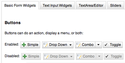
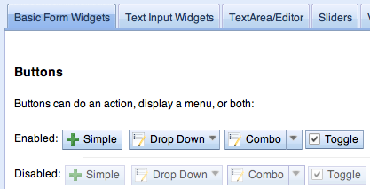
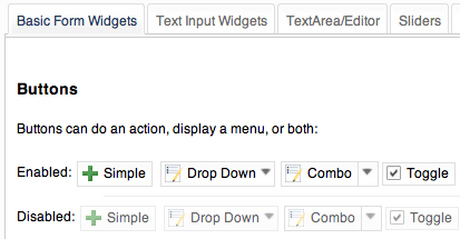
The four available themes in Dijit are Claro, Tundra, Nihilo and Soria.
Claro
The newest theme for Dijit and the dojox.Grid is called Claro (nee Lucid). The Claro theme has several aims:
- to deliver a modern and engaging visual style for rich internet applications using the Dojo Dijit library, with the visual enhancements of transparent gradient background images, drop shadows, and appropriate CSS animation (on webkit and mozilla)
- to deliver the ‘fit and finish’ professional quality with consistent padding, font treatment and alignment, and fix missing expected behavioral states (hover, active and selected) in widgets
- to improve ease of customizing the theme CSS that allows designers to easily create their own theme by styling elements such as padding and color, without designing new background images.
The Claro theme supports both left-to-right (LTR) and right-to-left (RTL) display, and all dijit supported browsers, albeit with graceful degradation of some styling: no 24 bit PNG’s in IE6; and no rounded corners in IE6, 7 and 8.
Claro is accessibility and globalization compliant.
IE7 sample:
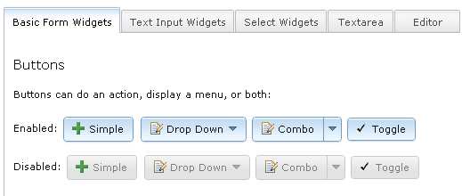
The visual style of Claro is clear, light, luminous, and translucent.
See Claro rendered in the themeTester.html page.
CSS Directory Structure
Hierarchy of the base and theme CSS files:
dojo/
  resources
  dojo.css   <-- Baseline CSS file for general usage; not intended for specific dijit widget styling.
dijit/
  themes/
  djit.css     <-- Essential styles that themes can inherit
  dijit_rtl.css  <-- Essential styles that themes can inherit for right-to-left (BiDi) language support
  themeTester.html    <-- Displays all the Dijit widgets in the four Dijit themes
Theme-specific and widget-specific CSS:
dijit/
  themes/
    claro/
      claro.css  <-- Imports the theme-specific CSS files for all the widgets
      document.css  <-- CSS reset file tailored to claro theme, similar to dojo.css.   Include instead of dojo.css.
      claro_rtl.css  <-- Imports the theme-specific CSS files for all the widgets for right-to-left (BiDi) language support
      common.css  <-- Theme-specific styling across widgets
      widgetX.css  <-- Some Dijit widget CSS files
        form/
          widgetX.css  <-- Form-based Dijit widget CSS files
          common.css
          common_rtl.css
        layout/
          widgetX.css   <-- Layout-based Dijit widget CSS files
The themeX.css file has rules like:
.claro .dijitButtonNode { ... }
Common and theme-specific images
Common
dijit/
  icons/
    CSS
    images/
All common icon images are located in dijit/icons/images and their respective CSS files are located in dijit/icons/. These are 16px X 16px icons in the commonIconsObjAct*.png sprites containing action and object type images which can be used in the following widgets: AccordionContainer, Menu, TabContainer, TitlePane, Tree, and all button widgets.
The editor icons are also located in this same directory; these images are in the editorIcons*.png sprite files.
Icons
Many widgets take a parameter called iconClass to specify an icon. The idea is that the theme defines this CSS class or classes to load the icon as a background-image.
Sprites
For efficiency in loading icons, themes tend to put multiple icons into a single image file called a “sprite”. For example, all of the editor icons are in editorIconsEnabled.png, and editorIcons.css defines access to them.
For the Editor icons, each icon is accessed through two CSS classes.
For example the CSS clases dijitEditorIcon and dijitEditorIconCut indicate the Cut icon, ex:
<button data-dojo-type="dijit/form/Button"
    data-dojo-props="iconClass: 'dijitEditorIcon dijitEditorIconCut">
The first class dijitEditorIcon describes every icon in that editorIconsEnabled.png file:
.dijitEditorIcon {
  background-image: url('images/editorIconsEnabled.png');
  background-repeat: no-repeat;
  width: 18px;
  height: 18px;
  text-align: center;
}
The second class dijitEditorIconCut is specific to the Cut icon:
.dijitEditorIconCut { background-position: -54px; }
The Cut icon starts 54 px from the right edge, and measures 18px by 18px. 54 equals 3 * 18, so it’s the 4th image from the left in the sprite.
You can define your own icons by setting up CSS selectors using code similar to above, and wiring up the iconClass.
Icon Variation By State
Themes may specify variations on an icon depending on state. For example, there can be a faded, or black and white Cut icon for when the Cut function is disabled.
The state-specific icon would be triggered by a selector like:
.dijitDisabled .dijitEditorIcon {
  background-image: url('images/editorIconsDisabled.png');
}
Some icons must have separate left-to-right (ltr) and right-to-left (rtl) versions to be BiDi globalization compliant; therefore, two sets of files exist - widgetXIcons.png (ltr) and widgetXIcons_rtl.png.
Claro theme-specific
themes/
  claro/
     images/   <-- Some Dijit widget image files
        commonHighlight.png   <--All the common highlight images in one 'sprite' image used across the widgets
        spriteArrows.png   <--All the common arrow images in one 'sprite' used across the widgets
        treeExpandImages.png and treeExpandImages8bit.png <-- example of a widget 'sprite' file containing all the tree images. Note there are two files for these images; the '8bit'.png file supports IE6 256 color rendering quality output, while treeExpandImages.png is default to '24bit' colors.
The forms and layout widgets each have their respective /form/images and layout/images folders:
forms/
  images/
layout/
  images/
All images are .png files except for the loadingAnimation.
All images are referenced from the widget via CSS rules (via the background-image property of a dummy node).
Tundra theme-specific
tundra/
  images/
     checkbox.gif <--- all the checkbox and radio button images
     fader.gif    <--- background image referenced by tundra.css
The icons are located in the images directory (along with background images) and are referenced from the widget via CSS rules (via the background-image property of a dummy node).
Minimizing CSS Files Loaded By Your App
If you are only using a few widgets on your page, you can minimize the number of CSS files that you load. This is the base list of files needed when theming only a few widgets (such as Tree, Calendar, TimePicker (dijit.form.TimeTextBox) and dijit.form.DropDownButton (requires Menu):
dojo/
  resources/
  dojo.css   <-- Baseline CSS file for general usage; not intended for specific dijit widget styling.

dijit/
  themes/
  djit.css     <-- Essential styles that themes can inherit
  dijit_rtl.css  <-- Essential styles that themes can inherit for right-to-left (BiDi) language support
  themeTester.html    <-- Displays all the Dijit widgets in the four Dijit themes
  icons/images/

dijit/
  themes/
    claro/
    claro.css  <-- Imports the theme-specific CSS files for all the widgets
    claro_rtl.css  <-- Imports the theme-specific CSS files for all the widgets for right-to-left (BiDi) language support
    common.css  <-- Theme-specific styling; Claro\common.css overrides dojo.css
    widgetX.css  <-- Some Dijit widget CSS files
      form/
        widgetX.css  <-- Form-based Dijit widget CSS files
        <widgets JS files> <-- Form-based Dijit widget JS files
        templates/  <-- Form-based Dijit widget HTML files
        common.css
        common_rlt.css
      layout/
        widgetX.css   <-- Layout-based Dijit widget CSS files
        <widgets JS files> <-- Layout-based Dijit widget JS files
        templates/ <-- Layout-based Dijit widget HTML files
   _CssStateMixin.js
  <widgets JS files>  <-- Some Dijit widget JS files
    templates/ <widgets html files> <-- Some Dijit widget HTML files
Widget CSS inheritance
The following Claro widgets inherit styling from other Claro widgets:
- dijit.Editor.css inherits dijit.Toolbar.css styles
- dijit.DropDownButton.css and dijit.ComboButton.css inherit some dijit.Menu.css styles
- dijit.form.TimeTextBox.css inherits dijit.Menu.css
- dijit.form.ComboBox and dijit.form.FilteringSelect inherit pop up styles from dijit.Menu.css
- dijit.TooltipDialog.css inherits dijit.Tooltip.css
- dijit.AccordionContainer.css inherits TitlePane.css
- dijit.Toolbar inherits and overwrites dijit.form.Button.css
So if (for example) your page uses Editor, then you will need to include Toolbar.css in addition to Editor.css.
Customizing a Theme
You can customize the look of your app by overriding a theme, customizing a theme, or creating your own theme.
Customizing Claro
The Claro CSS files are generated from less files. Most of the important settings for Claro are contained in the file dijit/themes/claro/variables.less, which is referenced during compilation. Thus, by modifying variables.less and rebuilding the CSS files, you could make your own variation on Claro.
The beginning of variables.less looks like:
@primary-color: #cfe5fa;                                                    // Base color for entire theme
@secondary-color: #efefef;                                                // Base color for bar-backgrounds
@text-color: #000;                                                    // Text color for enabled widgets
@disabled-color: #d3d3d3;                                                // Base for disabled backgrounds and borders
@error-color: #d46464;

@container-background-color:#fff;                                        // Backgrounds for various content areas such as TitlePane, ContentPane and Inputs

@minor-selected-color: spin(saturate(darken(@primary-color, 6), 19), 0);                        // Color for various arrows and buttons
@base-border-color: spin(desaturate(darken(@primary-color, 29), 44), -1);        // Augmented and used directly by variables to create border colors for various widgets
@unfocused-clickable-color: spin(saturate(lighten(@primary-color, 5), 10), 0);                // Background color for enabled buttons, text inputs
@border-color: spin(desaturate(darken(@primary-color, 15), 67), 8);                        // Border color for (enabled, unhovered) TextBox, Slider, Accordion, BorderContainer, TabContainer
@minor-border-color: @disabled-color;                                    // Color of borders inside widgets: horizontal line in Calendar between weeks, around color swatches in ColorPalette, above Dialog action bar
@popup-border-color: @base-border-color;                                // Border for Dialog, Menu, Tooltip.   Must also update tooltip.png (the arrow image file) to match
To compile all the less files into CSS files, on mac or other UNIX boxes do:
$ cd dijit/themes/claro
$ node compile.js
This requires Node.js. If you don't have it, then
- Download a built copy from https://github.com/ajaxorg/node-builds. Alternately, go to http://nodejs.org/#download (./configure, make, make install).
- Edit .bash_profile etc. to add node to your path
$ export PATH=$PATH:/opt/less/bin
On a PC, do:
C:\> cd C:\myworkspace\dijit\themes\claro
C:\> node compile.js
To setup Node.js on a PC:
- Install node:
- Go to https://github.com/ajaxorg/node-builds, press download button, and select "download zip"
- unzip the file into C:
- Add node environment variables:
- open Control Panel --> click System icon --> select Advanced tab --> click Environment variables button
- press "edit" on path
- depending on what directory you unzipped to and the exact filenames, you will add something like
;C:ajaxorg-node-builds-0fcee7dwin32
See http://lesscss.org/ and https://github.com/cloudhead/less.js/ for more information.
Writing Your Own Theme
If you want to develop your own theme just make rules like
.myTheme .dijitButtonNode { ... }
and include them into your page.
Then set
<body class="myTheme">
Overriding a theme
Often an application will include a theme, but then override some of the rules in that theme, for example:
.claro .dijitInputField {
  background-color: yellow;
}
You can also override a theme but only in certain sections of a page, for example:
.yellowForm .dijitButton, { background-color: yellow; }
.blueForm .dijitButton { background-color: blue; }
<div data-dojo-type="dijit/layout/TabContainer">
    <div data-dojo-type="dijit/layout/ContentPane" data-dojo-props="label:'Tab1'" class="yellowForm">
        <input data-dojo-type="dijit/form/TextBox">
        <button data-dojo-type="dijit/form/Button">Yellow Button</button>
        ...
    </div>
    <div data-dojo-type="dijit/layout/ContentPane" data-dojo-props="label:'Tab2'" class="blueForm">
        <input data-dojo-type="dijit/form/TextBox">
        <button data-dojo-type="dijit/form/Button">Blue Button</button>
        ...
    </div>
</div>
The two tabs would then be the Tundra theme except for the background color on form fields.
Applying style directly to a widget
Finally, you can apply styles directly to widgets and to plain dom nodes in various ways:
<div style="margin: 30px;">...</div>
or
<style>
   #xyz { margin: 30px; }
</style>
<div id="xyz">...</div>
or
<style>
 .myClass { margin: 30px; }
</style>
<div class="myClass">...</div>
The first two techniques should work for widgets also. However, the third technique is not likely to work, because some of the theme selectors like ".tundra .dijitButton" will take precedence.
Elements Of a Theme
The following visual style elements are the most common aspects of customizing a theme: color, font, layout (padding=spacing), corner style, images.
Color
Color customization can be applied to the behavioral states of a widget. Six behavioral state class names are defined in the widgets to support a better user experiences, with hover, active and selected behavioral states as the most pervasively applied:
- Normal
- Hover
- Active (aka 'mouse down')
- Selected (and browser 'Focus' for A11y)
- Disabled
- SelectedHover (only for dijit.Layout.AccordionContainer).
In the Claro theme, each of these states is defined by a specific hex value that can be modified:
.claro .dijitAccordionInnerContainerActive {
  border:1px solid #769DC0;
  background-color:#7dbefa;
}
Font
Fonts can be customized in the following ways:
Font family
Maintain font family order as is; re-order family or modify the list of fonts
in dojo/resources/dojo.css
body {
  font: 12px Myriad,Helvetica,Tahoma,Arial,clean,sans-serif;
  *font-size: 75%;
}
in theme/claro/common.css (overrides dojo.css)
.claro {
  font-family: Verdana,Arial,Helvetica,sans-serif;
}
Font styling
The following font style treatments can be applied for emphasis and hierarchical information cueing:
- Regular
- Bold
- Italics (use sparingly)
Font measurements
Relative: 'EM' and '%' units of font measure to ensure support across all browsers (accessibility).
In Dojo.css: 75%=12px.
Absolute: not recommended
Dojo's font size defaults to the browser which is 16px. To define your theme font size, start with 16px, choose your default font size, define that in your theme/common.css body font size and then define all other sizes based off of that. A good tool to reference is the PX to EM converter
Example:
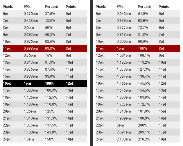
For the Claro theme, 11px (.688em) has been defined as the body font size in claro/common.css.
.claro {
  font-family:Verdana,Arial,Helvetica,sans-serif;
  font-size: .688em;
  color:#131313;
}
So in claro/Calendar.css, the font sizes for the following MonthLabel and DayLabel style elements are relative to the claro default body font size. (i.e. MonthLabel= 12px, DayLabel= 10px)
.claro .dijitCalendarMonthLabel {
  color:#000000;
  font-size: 1.091em;
}
and
.claro .dijitCalendarDayLabelTemplate {
  text-align:center;
  font-size:0.909em;
}
Note: There is some unique font styling applied across all themes within specific widgets.
Layout
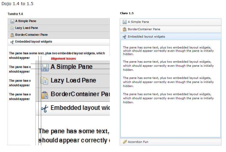
Layout is the process of arranging the various visual components of a user interface (e.g., menus, panes, tabs, text fields, icons, etc.) to enhance usability, clarity, legibility and aesthetics. Layout encompasses spacing, positioning, grouping, emphasis, and alignment.
The example below illustrates the before and after implementation of the best practice for alignment.
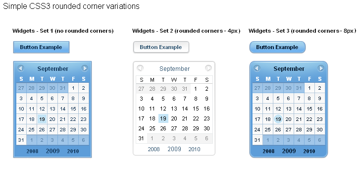
Corner styling
CSS3 ('border-radius') is used to render corner styling (rounded corners); Rounded corners are supported in all browsers except old IE, where styling defaults to square corners.
- Claro theme defaults to 4px rounded corners (based on Dojo community feedback), with the exception of dijit.tabContainer at 2px.
Example of CSS3 corner styling:
.claro .dijitTabContainerTop-tabs .dijitTabInnerDiv,
.claro .dijitTabContainerTop-tabs .dijitTabContent {
    border-radius: 2px 2px 0px 0px;
    -moz-border-radius: 2px 2px 0px 0px;
    -webkit-border-top-left-radius:2px;
    -webkit-border-top-right-radius:2px;
}
- If rounded corner styling is required in old IE, it will need to be implemented using rounded corner images and will require significant modifications to CSS, JS and HTML templates; basically, not recommended.
Examples of corner style output renderings:
Images
Typical images in themes are icons, background images, and accent graphics.
Dojo supports:
- 8–bit and 24-bit PNG and GIFs (exception for loading animation)
- ‘Sprite’ image (contains all images for one widget) e.g. dijit.Editor.
- Sprite images can be vertical or horizontal. Sprites help improve overall Dojo performance, however there is no header in the sprite file to label the list of images in the sprite file.
- Specific ‘/images’ folders (forms/images, layout/images, etc.)
See Common and theme-specific images above.
Customizing images
- You can customize images in any of the following ways:
- color bit
- individual image vs combined image set (sprite)
- no background image
- modify existing or create new image
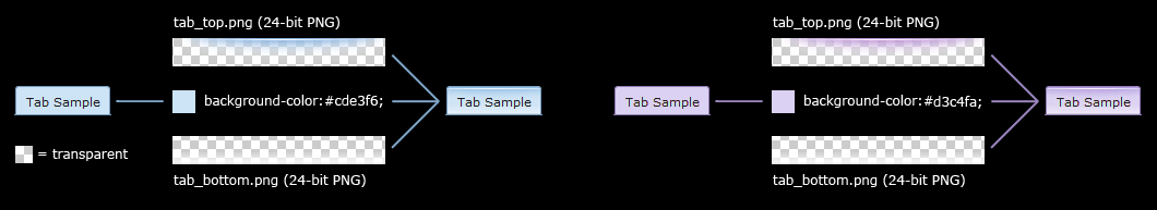
Customizing background images
- dijit.titlePane–transparent white image (using PNG technology)
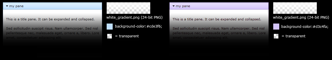
- dijit.tabContainer–colored highlight image
Drop Shadows
Drop shadows can be generated as graphics or can be coded using CSS3 (supported in FireFox, Safari & Chrome); the latter is preferred.
Several widgets have inherited .lucid dijitPopup(CSS3) drop shadow treatment:
- dijit/form/Button; dijit/form/ComboButton, dijit/form/DropDownButton, dijit/form/ToggleButton
- dijit/Calendar, dijit/form/TimeTextBox, dijit/form/DateTextBox
- dijit/ColorPalette
- dijit/Menu
(generic)
.claro .dijitPopup {
    box-shadow: 0px 1px 3px rgba(0,0,0,0.25);
    -webkit-box-shadow: 0px 1px 3px rgba(0,0,0,0.25);
    -moz-box-shadow: 0px 1px 3px rgba(0,0,0,0.25);
}
Widgets with unique CSS3 drop shadow treatment:
- dijit/Dialog
- dijit/Tooltip
Animation
Animation is another styling element that can be customized depending on the audience, task, widget and performance requirements and expectations.
There are various kinds of transitions: fade, ease, wipe, glow, zoom, fisheye, etc. Animated effects serve as an added visual cue to in context information. They can also provide visual delight without rendering effects that are too 'eye candy' or gratuitous, at least within rich internet applications.
- Animation is generated using the following technologies:
- Dojo Animation API (dojo.fx)
- CSS3
- animated GIF files
JavaScript and CSS3 Animations
dojo.fx and CSS3 -webkit-transition (supported and viewable in Safari & Chrome) animations have been applied to the following Dijit widgets:
- AccordionContainer (wipe in/out API / fade CSS3)
- Calendar (fade CSS3)
- TitlePane (wipe in/out API)
- Tree (wipe in/out API / fade CSS3)
- Tab (fade CSS3)
- Button (fade CSS3)
- TextBox (fade CSS3)
The CSS3 -webkit-transition settings enable designers to tune the animations as part of a customized theme. Sample of CSS3 animation styling in AccordionContainer:
.claro .dijitAccordionInnerContainer {
    background-color: #e6e6e7;
    border:solid 1px #b5bcc7;
    margin-bottom:1px;
    -webkit-transition-property:background-color,border;  /* "property" describes what styling you want to animate */
    -webkit-transition-duration:.3s; /* "duration" describes the timing of your animation */
    -webkit-transition-timing-function:linear;  /* "timing-function" allow an animation to change speed over its duration (ease-in, ease-out, etc.) */
}
Animated GIFs
- The loadingAnimation.gif is used in the following widgets:
- dijit.Tree
- dijit.layout.ContentPane and subclasses, used when loading from href
- dojox.Grid
See the animation in action in the Claro theme rendered in the themeTester.html page, on the slow loading Dialog example
See more on Animations and Effects with Dojo..
Using multiple themes
To use multiple themes on the same page, assuming Tundra is your base theme, include the additional theme CSS files into your document, like:
@import "dojo/dijit/themes/nihilo/nihilo.css";
@import "dojo/dijit/themes/claro/claro.css";
@import "dojo/dojo/resources/dojo.css"
Each themeX.css file(s) will define rules like:
.nihilo .dijitButton { ... }
so they won't conflict with other themeX.css styling.
Then, to have different sections of your document that are different themes, you just change the class of each section. For example, to make the main document Claro theme, but then have sections that are Tundra and Soria themes, do:
<body class=claro>
  ...
      <div data-dojo-type="dijit/layout/TabContainer">
              <div data-dojo-type="dijit/layout/ContentPane" data-dojo-props="label:'Tab1'" class="tundra">
                      <input data-dojo-type="dijit/form/TextBox">
                      <button data-dojo-type="dijit/form/Button">Tundra Button</button>
                      ...
              </div>
              <div data-dojo-type="dijit/layout/ContentPane" data-dojo-props="label:'Tab2'" class="soria">
                      <input data-dojo-type="dijit/form/TextBox">
                      <button data-dojo-type="dijit/form/Button">Soria Button</button>
                      ...
              </div>
      </div>
  ...
</body>
All the widgets in the first tab will have the Tundra theme and all the widgets in the second tab will have the Soria theme, and the rest of the UI will be Claro.
Note that although you can specify the theme name on nodes other than <body>,
generally the class should be set on <body> so that all the widgets in the page have the same theme, and also
because some widgets like Dialog intentionally attach themselves to the <body> element,
so no styling is present if the class identifier is on some child node.
Even if your page has multiple themes, it may make sense to set class="themeName" on <body> for one of the themes.