This tutorial is for Dojo 1.8 and may be out of date.
Up to date tutorials are available.
Introduction to TweetView
The first article in our series, Getting Started with dojox/mobile, detailed the fundamental concepts and usage of the Dojo Toolkit's dojox/mobile library. In the remaining posts in this series, we'll embark on creating our own fully functional dojox/mobile web application called TweetView. This post will focus on familiarizing you with what TweetView is, what we want it to do, and we'll get started on building the mobile application's HTML and CSS layout.
What is TweetView?
TweetView is the name of the application we're going to create using dojox/mobile and a few custom Dojo resources of our own. TweetView wont simply be a small exercise in using dojox/mobile; TweetView will be a useful, fully-functioning web application. Our goals for TweetView are as follows:
- Utilize
dojox/mobile'snative widgets to create a cross-device compatible, elegant mobile application - Add our own custom elements, controls, and functionality to the web application
- Connect to Twitter using JSONP to retrieve tweets from multiple accounts
- Use Dojo's data store API to store tweets
- Code with minimal dependencies and maximum speed in mind
Spending time planning and brainstorming before jumping into application creation is even more critical when creating mobile applications due to the restrictions on bandwidth.
As with creating any Dojo-based web application, a more general goal is to keep our code flexible, extendable, and well-commented.
TweetView Design
We'll be creating TweetView from the following mockups. Each mockup provides a glimpse into the features we'll be adding in subsequent posts:

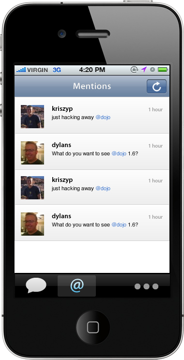
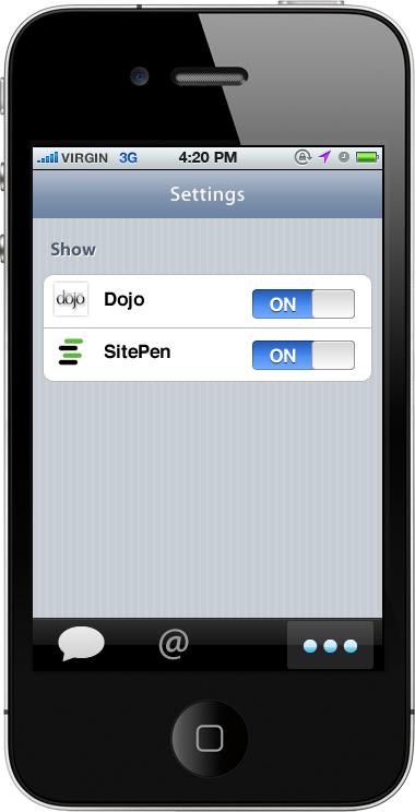
Click on any of the images above to enlarge.
You'll note that these mockups show only the iOS theme. Our posts will focus on implementing the iOS theme. Android and Blackberry-themed images and element styles will be sized the same as the iOS resources and will be implemented later in this tutorial series.
Attacking the markup for all of these mockups is out of scope for this post; instead we'll focus on creating the overall HTML/CSS structure of the web application, most notably the top content display and the bottom control area.
TweetView HTML Structure
The first article provided a solid mobile web application template and the required theme stylesheet and SCRIPT tags from which to start from:
<!DOCTYPE html>
<html>
	<head>
	<meta name="viewport"
	         content="width=device-width,initial-scale=1,maximum-scale=1,minimum-scale=1,user-scalable=no"/>
	<meta name="apple-mobile-web-app-capable" content="yes" />
	<title>TweetView</title>
	<script data-dojo-config="async:true"
			src="//ajax.googleapis.com/ajax/libs/dojo/1.8.9/dojo/dojo.js">
	</script>
	<script>
		// Load the parser, base widgets, device theme, compat
		require(["dojox/mobile/parser", "dojox/mobile", "dojox/mobile/deviceTheme", "dojox/mobile/compat"],
		  function(parser) {
			// Parse the page!
			parser.parse();
		  }
		);
	</script>
	</head>
	<body>

	<!-- application will go here -->

	</body>
</html>
With the basic app template in place, let's focus on putting together the three views (Tweets, Mentions, and Settings) as well as the bottom navigation bar for each. Let's start with the views:
<!-- tweets view -->
<div id="tweets" data-dojo-type="dojox.mobile.ScrollableView" data-dojo-props="selected: true">
	<h1 data-dojo-type="dojox.mobile.Heading" data-dojo-props="fixed: 'top'">
		<!-- the refresh button -->
		<div data-dojo-type="dojox.mobile.ToolBarButton" data-dojo-props="icon: 'images/refresh.png'"
		            class="mblDomButton tweetviewRefresh" style="float:right;"></div>
		Tweets
	</h1>
	<ul data-dojo-type="dojox.mobile.RoundRectList">
		<li data-dojo-type="dojox.mobile.ListItem">
			Tweet item here
		</li>
	</ul>
</div>

<!-- mentions view -->
<div id="mentions" data-dojo-type="dojox.mobile.ScrollableView">
	<h1 data-dojo-type="dojox.mobile.Heading" data-dojo-props="fixed: 'top'">
		<!-- the refresh button -->
		<div data-dojo-type="dojox.mobile.ToolBarButton" data-dojo-props="icon: 'images/refresh.png'"
		            class="mblDomButton tweetviewRefresh" style="float:right;"></div>
		Mentions
	</h1>
	<ul data-dojo-type="dojox.mobile.RoundRectList">
		<li data-dojo-type="dojox.mobile.ListItem">
			Mention tweet item here
		</li>
	</ul>
</div>

<!-- settings view -->
<div id="settings" data-dojo-type="dojox.mobile.ScrollableView">
	<h1 data-dojo-type="dojox.mobile.Heading" data-dojo-props="fixed: 'top'">Settings</h1>
	<h2 data-dojo-type="dojox.mobile.RoundRectCategory">Show</h2>
	<ul data-dojo-type="dojox.mobile.RoundRectList">
		<li data-dojo-type="dojox.mobile.ListItem">
			Setting item here
		</li>
	</ul>
</div>
Note that I've included a sample list for the content of each view. Final content creation for TweetView's panes will be covered in future posts.
Instead of using dojox/mobile's base View class, I've chose to use the ScrollableView. ScrollableView will allow the header to be fixed to the top of the view (thanks to the data-dojo-props="fixed: 'top'" attribute), while the control bar can be fixed to the bottom (thanks to the fixed="bottom" attribute). The content within the ScrollableView will scroll. I've also used the ToolBarButton widget for the refresh buttons. Note the mblDomButton CSS class is just one of many button styles available in dojox/mobile. The refresh buttons don't serve a function at this point -- we're simply putting them into place. Lastly, I've added a custom CSS class to the ToolBarButton instances called tweetviewRefresh. The contents of that CSS class are:
<style>
/* vertically center the image */
.tweetviewRefresh img	{
	margin-top:6px;
}
</style>
The refresh icon is now vertically centered within my heading button!
With the three views in place, we can focus on creating the bottom menu bar with a dojox/mobile/TabBar widget, containing three dojox/mobile/TabBarButton widgets:
<!-- the bottom tabbar -->
<ul data-dojo-type="dojox.mobile.TabBar"
         data-dojo-props="iconBase: 'images/iconStrip.png', fixed: 'bottom'">
	<!-- top left width height -->
	<li data-dojo-type="dojox.mobile.TabBarButton"
	         data-dojo-props="iconPos1: '0,0,29,30', iconPos2: '29,0,29,30', selected: true, moveTo: 'tweets'">
	             Tweets
	</li>
	<li data-dojo-type="dojox.mobile.TabBarButton"
	         data-dojo-props="iconPos1: '0,29,29,30', iconPos2: '29,29,29,30', moveTo: 'mentions'">
	             Mentions
	</li>
	<li data-dojo-type="dojox.mobile.TabBarButton"
	         data-dojo-props="iconPos1: '0,58,29,30', iconPos2: '29,58,29,30', moveTo:'settings'">
	             Settings
	</li>
</ul>
The image sprite is separated into 29x30 divisions with the normal state image on top and the active state image below it. Tapping each control button shows its corresponding view.
dojox/mobile/TabBar and dojox/mobile/TabBarButton debuted in Dojo 1.6. dojox/mobile/TabBar has two types: tabBar and segementControl. You can view them side by side. Also note the -49px margin-top added to the TabBar. That will keep the TabBar above the fold at all times.
Now that both pieces are in place, let's review a few pieces of each code snippet:
- The ID attributes of each view correspond to the
moveToattributes of eachTabBarButtonwidget - If we weren't using sprites for the normal state control image path and selected image path, the different image paths would be placed in the
TabBarButton'sicon1andicon2attributes. Since we're using a sprited image, the image path is added to theTabBar'siconBaseattribute and eachTabBarButtonusesiconPos1andiconPos2attributes to provide the positions of the sprite. - The
iconPos1andiconPos2format is: top, left, width, height - The usage of
ScrollableViewanchors the header and control bar to the top and bottom, respectively, of the app
It's also important to note we used three widgets that are not bundled into dojox/mobile's base: TabBar, TabBarButton, and ScrollableView. Adding the following require statements to the page will provide us those resources:
// Include base mobile resources and extra widgets
require(["dojox/mobile/parser", "dojox/mobile/deviceTheme", "dojox/mobile",
         "dojox/mobile/ScrollableView", "dojox/mobile/TabBar", "dojox/mobile/compat"],
	function(parser) {
		// Parse the page for widgets!
		parser.parse();
	}
);
These two additional resources are small in size so our application will stay small. These classes do not require additional stylesheets.
Our application layout is now complete! See the base layout for TweetView!
View DemoTweetView Has Taken Shape!
Creating the basic layout of TweetView was simple: add a few ScrollingView widgets and the ToolBar. I'd like to point out that every piece of our TweetView application is currently included within dojox/mobile: headings, toolbars, buttons...they're all there to be quickly implemented!
Looking forward to the next post in our TweetView series, where we will create a new class which will display the Tweets and Mentions views!