This tutorial is for Dojo 1.7 and may be out of date.
Up to date tutorials are available.
Introduction to the DataGrid
The DataGrid is the central component of many applications due to its effective and usable presentation of tabular data. In this tutorial we will look at how to define a grid's layout and discuss the scrolling mechanism the DataGrid uses.
dgrid
This tutorial covers the dojox/grid/DataGrid in depth. Beginning with Dojo 1.7, you should use the dgrid, a next-generation grid component that takes full advantage of modern browsers and object stores. Visit the dgrid site for a collection of dgrid tutorials.
dojox/grid/DataGrid
We've all been there: your boss comes to you and asks you to display an enormous amount of data in the application you're developing. As a web developer, you know that the more data displayed at a time means more memory the browser will consume—but your boss doesn't understand, he just wants this data in the application. This is where Dojo's dojox/grid/DataGrid can help you. The DataGrid is able to consume and scroll through thousands of rows of data with only a minimal memory footprint. In this tutorial, we will learn about the basics of the DataGrid.
To give you a taste of the DataGrid's ability to handle a massive amount of data, we've put together a grid that displays batting statistics for every person who has played professional baseball in the United States:
 View Demo
As you can see, the DataGrid easily handles this data set containing 17,452 records. For the purposes of this tutorial, we will be using a smaller set of data: batting statistics only for those players that are in the hall of fame. Let's get started.
Parts of the DataGrid
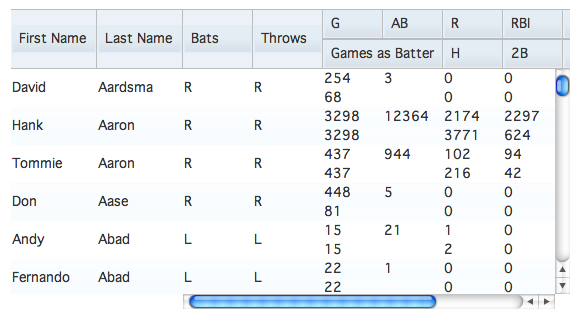
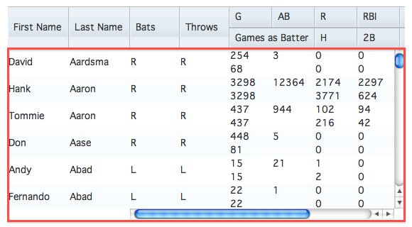
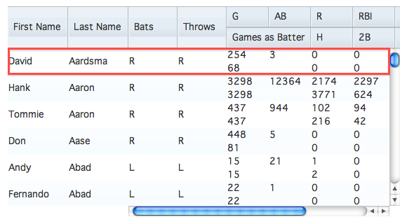
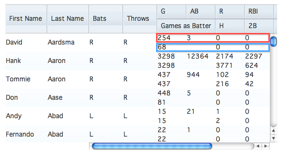
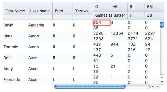
As you probably guessed, the DataGrid is made up of several different parts. At the highest level, a DataGrid is made up of views. Views break the DataGrid up into sections and render the header and content for each section. Headers and contents contain rows (although the header only contains one row) which are populated by sub-rows of cells. Let's look at some pictures for a better understanding:
We'll be recreating and modifying the layout of the first demo in this tutorial. To define how a DataGrid will look, we will be passing different objects and arrays to the structure property of the DataGrid constructor. We'll be working from the smallest definable object — a cell — to the largest — a view. We won't be describing how to retrieve the data from the server quite yet, but we'll get to it in the next tutorial.
Cells
The first thing we need to do is tell the DataGrid what cells, or columns, we want to be displayed for each data record. To do this, we will pass an array of cell definition objects to the structure property. Each cell definition object can have several properties defined:
name: the string to use in the header cellfield: the name of the field of the data record to displaywidth: a string containing the CSS width (with units) of the columnhidden: a boolean that when true will hide the column
require(["dojox/grid/DataGrid" /*, other deps */, "dojo/domReady!"],
	function(DataGrid /*, other deps */){
		/* create store here ... */

		var grid = new DataGrid({
			store: store,
			query: { id: "*" },
			structure: [
				{ name: "First Name", field: "first", width: "84px" },
				{ name: "Last Name", field: "last", width: "84px" },
				{ name: "Bats", field: "bats", width: "70px" },
				{ name: "Throws", field: "throws", width: "70px" },
				{ name: "G", field: "totalG", width: "60px" },
				{ name: "AB", field: "totalAB", width: "60px" },
				{ name: "Games as Batter", field: "totalGAB", width: "120px" },
				{ name: "R", field: "totalR", width: "60px" },
				{ name: "RBI", field: "totalRBI", width: "60px" },
				{ name: "BB", field: "totalBB", width: "60px" },
				{ name: "K", field: "totalK", width: "60px" },
				{ name: "H", field: "totalH", width: "60px" },
				{ name: "2B", field: "total2B", width: "60px" },
				{ name: "3B", field: "total3B", width: "60px" },
				{ name: "HR", field: "totalHR", width: "60px" }
			]
		}, "grid");

});
View Demo
The DataGrid also provides a way to control visual styling via CSS styles or CSS classes. The cell definition properties headerStyles, cellStyles, and styles are strings of CSS style definitions (that must be terminated with a semi-colon) that are applied to only the header cell, only the content cells, and to all cells respectively. Likewise, the cell definition properties headerClasses, cellClasses, and classes are space separated strings of class names to apply to the respective cells:
<style>
.firstName {
	font-style: italic;
}
.lastName {
	font-weight: bold;
}
</style>
<script>
grid = new DataGrid({
	store: store,
	query: { id: "*" },
	structure: [
		{ name: "First Name", field: "first", width: "84px",
			classes: "firstName" },
		{ name: "Last Name", field: "last", width: "84px",
			cellClasses: "lastName" },
		{ name: "Bats", field: "bats", width: "70px",
			cellStyles: "text-align: right;" },
		{ name: "Throws", field: "throws", width: "70px" },
		{ name: "G", field: "totalG", width: "60px" },
		{ name: "AB", field: "totalAB", width: "60px" },
		{ name: "Games as Batter", field: "totalGAB", width: "120px",
			styles: "text-align: center;" },
		{ name: "R", field: "totalR", width: "60px" },
		{ name: "RBI", field: "totalRBI", width: "60px" },
		{ name: "BB", field: "totalBB", width: "60px" },
		{ name: "K", field: "totalK", width: "60px" },
		{ name: "H", field: "totalH", width: "60px" },
		{ name: "2B", field: "total2B", width: "60px" },
		{ name: "3B", field: "total3B", width: "60px" },
		{ name: "HR", field: "totalHR", width: "60px" }
	]
}, "grid");
</script>
View Demo
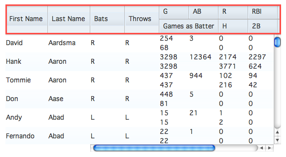
Sub-Row
We now have all of the fields we care about from our data records displaying, but it's not very easy to look at. Sub-rows can make some data easier to understand and read. To define sub-rows, pass an array of arrays of cell definitions to the DataGrid. Sub-rows allow us to use two more properties of cell definitions: rowSpan defines how many rows a cell should take up and colSpan defines how many columns wide a cell should be.
colSpan cannot be defined on cells in the first sub-row. This is a because the DataGrid uses table-layout: fixed; to speed up the rendering of rows.
grid = new DataGrid({
	store: store,
	query: { id: "*" },
	structure: [
		[
			{ name: "First Name", field: "first", width: "84px", rowSpan: 2 },
			{ name: "Last Name", field: "last", width: "84px", rowSpan: 2 },
			{ name: "Bats", field: "bats", width: "70px", rowSpan: 2 },
			{ name: "Throws", field: "throws", width: "70px", rowSpan: 2 },
			{ name: "G", field: "totalG", width: "60px" },
			{ name: "AB", field: "totalAB", width: "60px" },
			{ name: "R", field: "totalR", width: "60px" },
			{ name: "RBI", field: "totalRBI", width: "60px" },
			{ name: "BB", field: "totalBB", width: "60px" },
			{ name: "K", field: "totalK", width: "60px" }
		],[
			{ name: "Games as Batter", field: "totalGAB", colSpan: 2 },
			{ name: "H", field: "totalH" },
			{ name: "2B", field: "total2B" },
			{ name: "3B", field: "total3B" },
			{ name: "HR", field: "totalHR" }
		]
	]
}, "grid");
View Demo
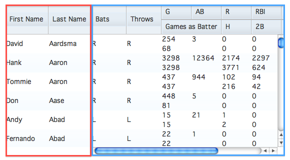
Views
We've made it a little easier to view our data, however once you scroll to the right you can't see whose records you're looking at. By defining a view definition, we can lock sections of columns from scrolling left and right. A view definition is an object with some specific properties set on it:
cells: an array or an array of arrays of cell definitionsnoscroll: a boolean that when true will prevent the view from scrolling horizontallywidth: a string specifying the CSS width of the view — this is only needed when your cells are defined with relative widths like percentages
grid = new DataGrid({
	store: store,
	query: { id: "*" },
	structure: [
		{
			noscroll: true,
			cells: [
				{ name: "First Name", field: "first", width: "84px" },
				{ name: "Last Name", field: "last", width: "84px" }
			]
		},{
			cells: [
				[
					{ name: "Bats", field: "bats", width: "70px", rowSpan: 2 },
					{ name: "Throws", field: "throws", width: "70px", rowSpan: 2 },
					{ name: "G", field: "totalG", width: "60px" },
					{ name: "AB", field: "totalAB", width: "60px" },
					{ name: "R", field: "totalR", width: "60px" },
					{ name: "RBI", field: "totalRBI", width: "60px" },
					{ name: "BB", field: "totalBB", width: "60px" },
					{ name: "K", field: "totalK", width: "60px" }
				],[
					{ name: "Games as Batter", field: "totalGAB", colSpan: 2 },
					{ name: "H", field: "totalH" },
					{ name: "2B", field: "total2B" },
					{ name: "3B", field: "total3B" },
					{ name: "HR", field: "totalHR" }
				]
			]
		}
	]
}, "grid");
View Demo
View definitions provide one more property that is helpful in reducing redundant code: defaultCell. This property allows you to define a default cell definition that the DataGrid will use if a property is missing from a cell definition:
grid = new DataGrid({
	store: store,
	query: { id: "*" },
	structure: [
		{
			noscroll: true,
			defaultCell: { width: "84px" },
			cells: [
				{ name: "First Name", field: "first" },
				{ name: "Last Name", field: "last" }
			]
		},{
			defaultCell: { width: "60px" },
			cells: [
				[
					{ name: "Bats", field: "bats", width: "70px", rowSpan: 2 },
					{ name: "Throws", field: "throws", width: "70px", rowSpan: 2 },
					{ name: "G", field: "totalG" },
					{ name: "AB", field: "totalAB" },
					{ name: "R", field: "totalR" },
					{ name: "RBI", field: "totalRBI" },
					{ name: "BB", field: "totalBB" },
					{ name: "K", field: "totalK" }
				],[
					{ name: "Games as Batter", field: "totalGAB", colSpan: 2 },
					{ name: "H", field: "totalH" },
					{ name: "2B", field: "total2B" },
					{ name: "3B", field: "total3B" },
					{ name: "HR", field: "totalHR" }
				]
			]
		}
	]
}, "grid");
View Demo
As you can see, by defining the width of the defaultCell, we only have to specify a width if it differs from the default value.
The default width of a cell definition (if none is provided in either the default or main cell definition) is 6em.
Paging and Virtual Scrolling
Historically, when a large set of data needed to be displayed, developers would use a method called paging: only a small subset (perhaps 25-50 records) of the entire set would be displayed. The user would navigate through "pages" of data using buttons or other controls. With the advent of the scroll wheel (and one could argue the mouse), paging controls started to seem cumbersome.
The DataGrid takes a slightly different approach called virtual scrolling: to navigate, a user only needs to scroll. The reason it is called virtual scrolling is that although it may seem as though it is a long list of records, only a small subset of the data is ever rendered at one time. However, the DataGrid also uses paging: as a user scrolls, "pages" of data are requested from the data source, or "store". It also, by default, keeps the last three pages rendered intact in case you need to scroll back. The number of rows per page of data can be controlled by the rowsPerPage property of the DataGrid constructor, and the number of rows to keep rendered is controlled by keepRows.
To calculate how many pages the DataGrid will keep rendered, divide keepRows by rowsPerPage. By default, rowsPerPage is set to 25 and keepRows to 75.
Binding DataGrid to Data
To learn how to bind a data or object store to the DataGrid, be sure to read the Populating your Grid using dojo/data, Connecting a Store to a DataGrid and the Using Dojo Data tutorials.
Conclusion
The DataGrid is a powerful component. Not only can it render large data sets, but you can create complex layouts of rows and sub-rows for your data. It also allows users to intuitively scroll through long lists of information without having to click controls. In the next tutorial, we will discover how DataGrid can be coupled with Dojo's data stores.