Charting
Presenting statistical data in a readable, eye-catching manner is important, but it can also be difficult. The dojox/charting system was created to alleviate those pains by allowing developers to create dynamic, unique, and functional charts from varying sets of data. In addition, dojox/charting provides numerous themes and chart types to allow developers to display their data any way they'd like. This tutorial will show you how to create basic charts with varying data, plots, axes, and themes.
Getting Started
Dojo's charting library lives within the dojox/charting resource. The dojox/charting collection is very unique in that it:
- Allows charts to be created with HTML (declaratively) or with JavaScript (programmatically)
- Works on almost all devices
- Can render charts in SVG, VML, Silverlight, and Canvas. An effort to allow SVGWeb rendering is also under way.
- Allows for the developer to decide which renderer to use
- Evaluates the client and uses an appropriate renderer based on what the client supports
- Creates charts with dojox/gfx, a powerful vector graphic library capable of making your charts animate in a wide variety of ways
- Comes packaged with dozens of attractive, diverse themes
- Allows for linear and radial gradients within chart themes (and even works in Internet Explorer!)
Configuring dojox/charting
Before creating these wonderful charts, it's important to make chart resources available within the page.
As with any Dojo Toolkit resource, use require to load dependencies. Two dependencies that the developer will always need are the chart resource and the desired theme:
require([
     // Require the basic 2d chart resource
    "dojox/charting/Chart",

    // Require the theme of our choosing
    "dojox/charting/themes/Claro",

], function(Chart, theme){
    // ....
}
If a specific rendering priority is preferred, it may be added to the dojoConfig object that's created before loading Dojo:
<script>
    dojoConfig = {
        parseOnLoad: true, //enables declarative chart creation
        gfxRenderer: "svg,silverlight,vml" // svg is first priority
    };
</script>
<script src="/path/to/dojo/dojo/dojo.js"></script>
Note that in 1.7+, the Chart2D "catch-all" module which loads all axis and plot types is deprecated. It is still available for use, but the preferred approach is to use Chart and include just the axis and plot modules you need.
With these minimal dependencies loaded, your application is now empowered to create charts!
Creating a Basic Chart
Declaratively
There are two ways to create a basic chart: declaratively and programmatically. Before creating the chart, however, it's important to first create/access data. The following data sample will be used for creating the basic chart:
// x and y coordinates used for easy understanding of where they should display
// Data represents website visits over a week period
chartData = [
    { x: 1, y: 19021 },
    { x: 1, y: 12837 },
    { x: 1, y: 12378 },
    { x: 1, y: 21882 },
    { x: 1, y: 17654 },
    { x: 1, y: 15833 },
    { x: 1, y: 16122 }
];
With data properly formatted and available, a chart created declaratively would look like:
<!-- create the chart -->
<div
data-dojo-type="dojox/charting/widget/Chart"
data-dojo-props="theme:dojox.charting.themes.Claro" id="viewsChart" style="width: 550px; height: 550px;">
<!-- Pie Chart: add the plot -->
<div class="plot" name="default" type="Pie" radius="200" fontColor="#000" labelOffset="-20"></div>
<!-- pieData is the data source -->
<div class="series" name="Last Week's Visits" array="chartData"></div>
</div>
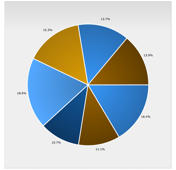
A pie chart using the Claro theme
With declarative chart creation, the main chart settings go within the container node. Plots and series get their own nodes with custom attributes containing chart settings, as would plugins and other chart pieces.
Important note: while it's certainly possible to create charts declaratively, it's highly recommended that developers create them programmatically. dojox/charting does not yet fully support the data-dojo attributes introduced in Dojo 1.6+.
Programmatically
Programmatic chart creation requires a bit more code but provides more stability and control. The same chart could be created programmatically with the following code:
<script>
require([
// load modules...
], function(Chart, theme, PiePlot){
// Create the chart within it's "holding" node
var pieChart = new Chart("chartNode");
// Set the theme
pieChart.setTheme(theme);
// Add the only/default plot
pieChart.addPlot("default", {
type: PiePlot, // our plot2d/Pie module reference as type value
radius: 200,
fontColor: "black",
labelOffset: -20
});
// Add the series of data
pieChart.addSeries("January",chartData);
// Render the chart!
pieChart.render();
});
</script>
<!-- create the chart -->
<div id="chartNode" style="width: 550px; height: 550px;"></div>
The code above should give you a basic example of dojox/charting, but there's much more to chart creation than that. Let's dig deeper into dojox/charting and its capabilities.
Chart Themes
The Dojo charting library provides numerous themes for developers to choose from. Themes vary in visual complexity; some themes use solid hex colors while more complex chart themes use advanced logic to calculate linear and even radial gradients to enhance their look. Themes can be found within the dojox/charting/themes resource. Themes are simply one JavaScript file with theme-specific data. The following is the code which creates the "Miami Nice" theme:
define([
    // Require the SimpleTheme class which is used by all non-gradient based themes
    "../SimpleTheme",
    "./common"
], function(Theme, themes){

    themes.MiamiNice=new Theme({
        colors: [
            "#7f9599",
            "#45b8cc",
            "#8ecfb0",
            "#f8acac",
            "#cc4482"
        ]
    });

    return themes.MiamiNice;
});
More complex themes are also available, by requiring dojox/charting/themes/Theme. One example would be the "Claro" theme which uses gradients and customized font settings:
define(["../Theme", "dojox/gfx/gradutils", "./common"], function(Theme, gradutils, themes){
    // created by Tom Trenka

    var g = Theme.generateGradient,
        defaultFill = {type: "linear", space: "shape", x1: 0, y1: 0, x2: 0, y2: 100};

    themes.Claro = new Theme({
        chart: {
            fill:       {
                type: "linear",
                x1: 0, x2: 0, y1: 0, y2: 100,
                colors: [
                    { offset: 0, color: "#dbdbdb" },
                    { offset: 1, color: "#efefef" }
                ]
            },
            stroke:    {color: "#b5bcc7"}
        },
        plotarea: {
            fill:       {
                type: "linear",
                x1: 0, x2: 0, y1: 0, y2: 100,
                colors: [
                    { offset: 0, color: "#dbdbdb" },
                    { offset: 1, color: "#efefef" }
                ]
            }
        },
        axis:{
            stroke:    { // the axis itself
                color: "#888c76",
                width: 1
            },
            tick: {    // used as a foundation for all ticks
                color:     "#888c76",
                position:  "center",
                font:      "normal normal normal 7pt Verdana, Arial, sans-serif",    // labels on axis
                fontColor: "#888c76"                                // color of labels
            }
        },
        series: {
            stroke:  {width: 2.5, color: "#fff"},
            outline: null,
            font: "normal normal normal 7pt Verdana, Arial, sans-serif",
            fontColor: "#131313"
        },
        marker: {
            stroke:  {width: 1.25, color: "#131313"},
            outline: {width: 1.25, color: "#131313"},
            font: "normal normal normal 8pt Verdana, Arial, sans-serif",
            fontColor: "#131313"
        },
        seriesThemes: [
            {fill: g(defaultFill, "#2a6ead", "#3a99f2")},
            {fill: g(defaultFill, "#613e04", "#996106")},
            {fill: g(defaultFill, "#0e3961", "#155896")},
            {fill: g(defaultFill, "#55aafa", "#3f7fba")},
            {fill: g(defaultFill, "#ad7b2a", "#db9b35")}
        ],
        markerThemes: [
            {fill: "#2a6ead", stroke: {color: "#fff"}},
            {fill: "#613e04", stroke: {color: "#fff"}},
            {fill: "#0e3961", stroke: {color: "#fff"}},
            {fill: "#55aafa", stroke: {color: "#fff"}},
            {fill: "#ad7b2a", stroke: {color: "#fff"}}
        ]
    });

    themes.Claro.next = function(elementType, mixin, doPost){
        var isLine = elementType == "line";
        if(isLine || elementType == "area"){
            // custom processing for lines: substitute colors
            var s = this.seriesThemes[this._current % this.seriesThemes.length],
                m = this.markerThemes[this._current % this.markerThemes.length];
            s.fill.space = "plot";
            if(isLine){
                s.stroke  = { width: 4, color: s.fill.colors[0].color};
            }
            m.outline = { width: 1.25, color: m.fill };
            var theme = Theme.prototype.next.apply(this, arguments);
            // cleanup
            delete s.outline;
            delete s.stroke;
            s.fill.space = "shape";
            return theme;
        }
        else if(elementType == "candlestick"){
            var s = this.seriesThemes[this._current % this.seriesThemes.length];
            s.fill.space = "plot";
            s.stroke  = { width: 1, color: s.fill.colors[0].color};
            var theme = Theme.prototype.next.apply(this, arguments);
            return theme;
        }
        return Theme.prototype.next.apply(this, arguments);
    };

    themes.Claro.post = function(theme, elementType){
        theme = Theme.prototype.post.apply(this, arguments);
        if((elementType == "slice" || elementType == "circle") && theme.series.fill && theme.series.fill.type == "radial"){
            theme.series.fill = gradutils.reverse(theme.series.fill);
        }
        return theme;
    };

    return themes.Claro;
});
Whether the theme you implement (or create) is basic or complex, implementing the theme within your chart couldn't be easier. Simply require the resource and call "setTheme" on the chart:
require([
     // Require the basic 2d chart resource: Chart2D
    "dojox/charting/Chart",

    // Require the theme of our choosing
    "dojox/charting/themes/Claro",

], function(Chart, theme){

    // Create the chart within it's "holding" node
    var pieChart = new Chart("chartNode");

    // Set the theme
    pieChart.setTheme(theme);

    // ...
});
You may use any number of themes on a given page. Want to learn how to create a custom chart theme for your web application? Read Dojo Charting: Dive Into Theming.
Chart Components: Plots, Axes, Series
Defining a basic chart and implementing its theme is quite simple. The real work comes in when defining plots, axes, and series. Each piece serves its own distinct, important purpose.
Plots
One of the main focuses of plots within dojox/charting is defining the type of chart to be added and providing values for the specific chart type's settings. dojox/charting features numerous 2D charts including:
- Default - Universal line chart capable of rendering lines, fill areas under those lines, and placing markers at data points. This plot type is used if no plot type was specified when adding it to a chart.
- Lines - Basic line chart. Uses Default.
- Areas - Area under data line(s) will be filled. Uses Default.
- Markers - Lines with markers. Uses Default.
- MarkersOnly - Markers, sans lines. Uses Default.
- Stacked - Data sets charted in relation to the previous data set. Extension of Default.
- StackedLines - Stacked data sets using lines. Uses Stacked.
- StackedAreas - Stacked data sets with filled areas under chart lines. Uses Stacked.
- Bars - Horizontal bars.
- ClusteredBars - Horizontal bars with clustered data sets. Uses Bars.
- StackedBars - Stacked data sets with horizontal bars. Uses Bars.
- Columns - Vertical bars.
- ClusteredColumns - Vertical bars with clustered data sets. Uses Columns.
- StackedColumns - Stacked data sets with vertical bars. Uses Columns.
- Pie - The traditional pie chart.
- Scatter - Similar to MarkerOnly, yet capable of charting using gradient fields.
You can see each chart type in action by visiting Dojo's nightly charting tests.
Plots are added to a chart with the chart's addPlot method, passing it the chart's name (usually "default") and plot-specific options:
// Add the default plot
chart.addPlot("default",{
    // Add the chart type
    type: "Pie"
});
When using dojox/charting/Chart, you need to require each plot-type module you wish to use.
Some of the standard plot options include:
- type - The chart type (Pie, Bars, Scatter, etc.)
- lines - Represents if lines should be added within the chart
- markers - Represents if markers should be added to data points within the chart
- areas - Represents if areas within the chart should be shaded
- shadows - Represents if shadows should be added to lines within the plot (ex:
{dx:4, dy:4}) - tension - Adds curves to lines within plots for added smoothness. Values can be:
- X - Cubic bezier lines
- x - Similar to "X" but assumes that the point set is closed (a loop). It can be used when plotting true XY data.
- S - Quadratic bezier lines.
- gap - Represents the number of pixels between bars
Each chart type may have its own custom options. The Pie plot type, for example, has a radius setting which defines the size of the chart's radius:
// Add the default plot
chart.addPlot("default",{
    // Add the chart type
    type: "Pie",
    // Add the radius size because it's a pie chart
    radius: 200 //pixels
});
Before creating your chart, take the time to visit the dojox/charting Reference Guide to see what special settings and customizations are available for the chart type you'd prefer.
Axes
Most charts feature axes and many of those are the traditional x and y setup. An axis may be horizontal (the default) or vertical. Axes are added to charts with addAxis method. The following code snippet adds x and y axes to a chart:
// Add the X axis
chart.addAxis("x");
// Ad the Y axis
chart.addAxis("y",{
    vertical: true // y is vertical!
});
You may also create custom axes on your chart:
// Add a custom "dw" axis
chart.addAxis("dw",{
    vertical: true,
    leftBottom: false
});
Some of the standard axis options include:
- fixUpper - Aligns chart ticks (can be "major", "minor", "micro", and "none")
- fixLower - Aligns chart ticks (can be "major", "minor", "micro", and "none")
- leftBottom - Determines the side of the chart the axis is placed (default is
true) - min - The minimum number an axis can start at
- max - The maximum number an axis can end at
You can learn more about an axis' settings including customization of colors, fonts, stepping, and precision in the Dojo reference guide.
Series
This element is simply a series of data to be rendered to the chart. A series is added to the chart with the addSeries method. The addSeries method accepts three arguments:
- name - The name of the series. Also represents the series label when the Legend plugin is used.
- data - The array of data
- options An object containing series options, which may include:
- stroke - Color and width of lines (ex:
{ color:"red", width: 2 }) - fill - Fill color of bar / line / pie piece
Adding a series can be as easy as:
// Add a simple axis to the chart
chart.addSeries("Visits",[10,20,30,40,50],{
    stroke: {
        color: "blue",
        width: 3
    },
    fill: "#123456"
});
A multi-axes series of data would look like:
// Add a multi-axes data series to the chart
chart.addSeries("Visits",[
    { x: 1, y: 200 },
    { x: 2, y: 185 },
    // and so on...
],{
    stroke: {
        color: "blue",
        width: 3
    },
    fill: "#123456"
});
A chart can have any number of overlapping series as the developer would like.
dojox/charting Examples
With the pieces of dojox/charting defined, it's time to create some basic charts.
Line Chart: Monthly Sales
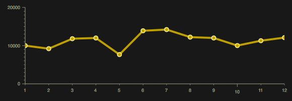
The Monthly Sales chart is a lines chart which features multiple axes and the "Tom" theme.
<script>
require([
// Require the basic chart class
"dojox/charting/Chart",
// Require the theme of our choosing
"dojox/charting/themes/Tom",
// Charting plugins:
// We want to plot Lines
"dojox/charting/plot2d/Lines",
// We want to use Markers
"dojox/charting/plot2d/Markers",
// We'll use default x/y axes
"dojox/charting/axis2d/Default",
// Wait until the DOM is ready
"dojo/domReady!"
], function(Chart, theme) {
// When the DOM is ready and resources are loaded...
// Define the data
var chartData = [10000,9200,11811,12000,7662,13887,14200,12222,12000,10009,11288,12099];
// Create the chart within it's "holding" node
var chart = new Chart("chartNode");
// Set the theme
chart.setTheme(theme);
// Add the only/default plot
chart.addPlot("default", {
type: "Lines",
markers: true
});
// Add axes
chart.addAxis("x");
chart.addAxis("y", { min: 5000, max: 15000, vertical: true, fixLower: "major", fixUpper: "major" });
// Add the series of data
chart.addSeries("SalesThisDecade",chartData);
// Render the chart!
chart.render();
});
</script>
<div id="chartNode" style="width:800px;height:400px;"></div>
A line chart using the Tom theme
Stacked Areas Chart: Monthly Sales
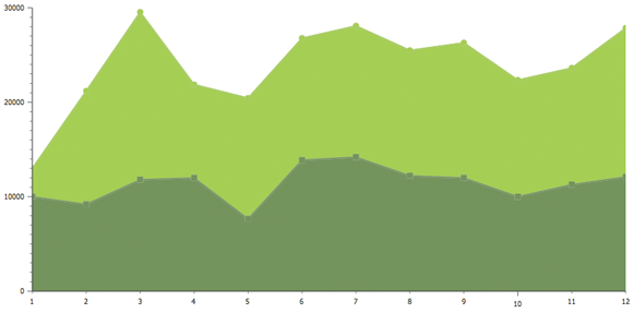
This chart builds on the first chart but adds a second axes to show multiple data sets. This chart also uses the Dollar theme.
<script>
require([
// Require the basic 2d chart resource: Chart2D
"dojox/charting/Chart",
// Require the theme of our choosing
"dojox/charting/themes/Dollar",
// Charting plugins:
// We want to plot StackedAreas
"dojox/charting/plot2d/StackedAreas",
// We want to use Markers
"dojox/charting/plot2d/Markers",
// We'll use default x/y axes
"dojox/charting/axis2d/Default",
// Wait until the DOM is ready
"dojo/domReady!"
], function(Chart, theme) {
// Define the data
var chartData = [10000,9200,11811,12000,7662,13887,14200,12222,12000,10009,11288,12099];
var chartData2 = [3000,12000,17733,9876,12783,12899,13888,13277,14299,12345,12345,15763];
// Create the chart within it's "holding" node
var chart = new Chart("chartNode");
// Set the theme
chart.setTheme(theme);
// Add the only/default plot
chart.addPlot("default", {
type: "StackedAreas",
markers: true
});
// Add axes
chart.addAxis("x");
chart.addAxis("y", { min: 5000, max: 30000, vertical: true, fixLower: "major", fixUpper: "major" });
// Add the series of data
chart.addSeries("Monthly Sales - 2010",chartData);
chart.addSeries("Monthly Sales - 2009",chartData2);
// Render the chart!
chart.render();
});</script>
<div id="chartNode" style="width:800px;height:400px;"></div>
A stacked areas chart using the Dollar theme
Columns Chart: Monthly Sales
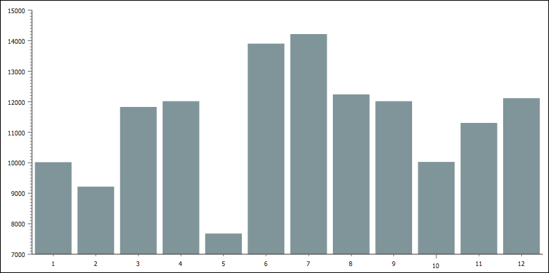
This chart builds on the original Line chart but instead uses columns. A 5-pixel gap is placed between columns; the MiamiNice theme is used.
<script>
require([
// Require the basic chart class
"dojox/charting/Chart",
// Require the theme of our choosing
"dojox/charting/themes/MiamiNice",
// Charting plugins:
// We want to plot Columns
"dojox/charting/plot2d/Columns",
// We want to use Markers
"dojox/charting/plot2d/Markers",
// We'll use default x/y axes
"dojox/charting/axis2d/Default",
// Wait until the DOM is ready
"dojo/domReady!"
], function(Chart, theme) {
// Define the data
var chartData = [10000,9200,11811,12000,7662,13887,14200,12222,12000,10009,11288,12099];
// Create the chart within it's "holding" node
var chart = new Chart("chartNode");
// Set the theme
chart.setTheme(theme);
// Add the only/default plot
chart.addPlot("default", {
type: "Columns",
markers: true,
gap: 5
});
// Add axes
chart.addAxis("x");
chart.addAxis("y", { vertical: true, fixLower: "major", fixUpper: "major" });
// Add the series of data
chart.addSeries("Monthly Sales",chartData);
// Render the chart!
chart.render();
});
</script>
<div id="chartNode" style="width:800px;height:400px;"></div>
A column chart using the MiamiNice theme
Charting Plugins
The dojox/charting library provides functional and aesthetically pleasing plugins to enhance your forms.
Legend
Charts often include legends to further clarify the data provided within the chart. Using the dojox/charting/widget/Legend is easy: require the resource and create an instance, assigning it a chart:
<script>
require([
// Require the basic chart class
"dojox/charting/Chart",
// Load the Legend widget class
"dojox/charting/widget/Legend"
], function(Chart, Legend) {
// Create the chart within it's "holding" node
var chart = new Chart("chartNode");
//this legend is created within an element with a "legend1" ID.
var legend = new Legend({ chart: chart }, "legend1");
});
</script>
<!-- create the DOM node for the chart -->
<div id="chartNode" style="width:800px;height:400px;"></div>
<div id="legend"></div>
Tooltip
The Tooltip plugin sheds light on values when hovering over marks and chart pieces, depending on the chart type. Using the Tooltip plugin is just as easy as using the Legend plugin; simply include the plugin resource and assign a new instance to the chart and plot:
<script>
require([
// Require the basic chart class
"dojox/charting/Chart",
// Load the Tooltip class
"dojox/charting/action2d/Tooltip"
], function(Chart, Tooltip) {
// Create the chart within it's "holding" node
var chart = new Chart("chartNode");
var tip = new Tooltip(chart, "default");
});
</script>
Include the Dijit theme of your choice to style your tooltips. Also note that the Tooltip plugin must be assigned to the chart before the render method is called on the chart.
MoveSlice and Magnify
The MoveSlice and Magnify plugins use a touch of animation to react to the mouse's mouseover event. MoveSlice moves a pie chart piece and Magnify slightly enlarges chart markers. Both are implemented by creating a new instance and passing the chart and plot to it:
// Moves a pie slice: use the "pieChart" chart, and "default" plot
var slice = new MoveSlice(pieChart, "default");

// Magnifies a marker: use the "chart" chart, and "default" plot
var magnify = new Magnify(chart, "default");});
Like the Tooltip plugin, the MoveSlice and Magnify plugins must be assigned to the chart before the render method is called on the chart.
Highlight
The Highlight plugin changes the color of an area when the mouse enters the area:
// Highlights an area: use the "chart" chart, and "default" plot
var highlight = new Highlight(chart, "default");
Monthly Sales with Legend, Tooltips, and Magnify
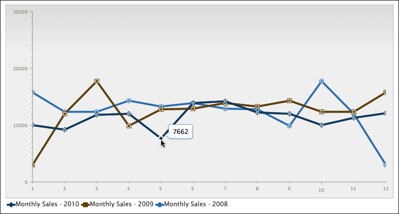
Let's add the Legend, Tooltip, and Magnify plugin to a line chart:
<link rel="stylesheet" href="/path/to/dijit/themes/claro/claro.css" media="screen">
<script>
require([
// Require the basic chart class
"dojox/charting/Chart",
// Require the theme of our choosing
"dojox/charting/themes/Claro",
// We want to plot Lines
"dojox/charting/plot2d/Lines",
// Load the Legend, Tooltip, and Magnify classes
"dojox/charting/widget/Legend",
"dojox/charting/action2d/Tooltip",
"dojox/charting/action2d/Magnify",
// We want to use Markers
"dojox/charting/plot2d/Markers",
// We'll use default x/y axes
"dojox/charting/axis2d/Default",
// Wait until the DOM is ready
"dojo/domReady!"
], function(Chart, theme, LinesPlot, Legend, Tooltip, Magnify) {
// Define the data
var chartData = [10000,9200,11811,12000,7662,13887,14200,12222,12000,10009,11288,12099];
var chartData2 = [3000,12000,17733,9876,12783,12899,13888,13277,14299,12345,12345,15763];
var chartData3 = [3000,12000,17733,9876,12783,12899,13888,13277,14299,12345,12345,15763].reverse();
// Create the chart within it's "holding" node
var chart = new Chart("chartNode");
// Set the theme
chart.setTheme(theme);
// Add the only/default plot
chart.addPlot("default", {
type: LinesPlot,
markers: true
});
// Add axes
chart.addAxis("x");
chart.addAxis("y", { min: 5000, max: 30000, vertical: true, fixLower: "major", fixUpper: "major" });
// Add the series of data
chart.addSeries("Monthly Sales - 2010",chartData);
chart.addSeries("Monthly Sales - 2009",chartData2);
chart.addSeries("Monthly Sales - 2008",chartData3);
// Create the tooltip
var tip = new Tooltip(chart,"default");
// Create the magnifier
var mag = new Magnify(chart,"default");
// Render the chart!
chart.render();
// Create the legend
var legend = new Legend({ chart: chart }, "legend");
});</script>
<div id="chartNode" style="width:800px;height:400px;"></div>
<div id="legend"></div>
We are using Tooltips which are based on the Dijit Tooltip, therefore we need to make sure we load a Dijit theme stylesheet. In this example we loaded Claro.
A line chart with a legend, tooltips, and magify enabled, using the Claro theme
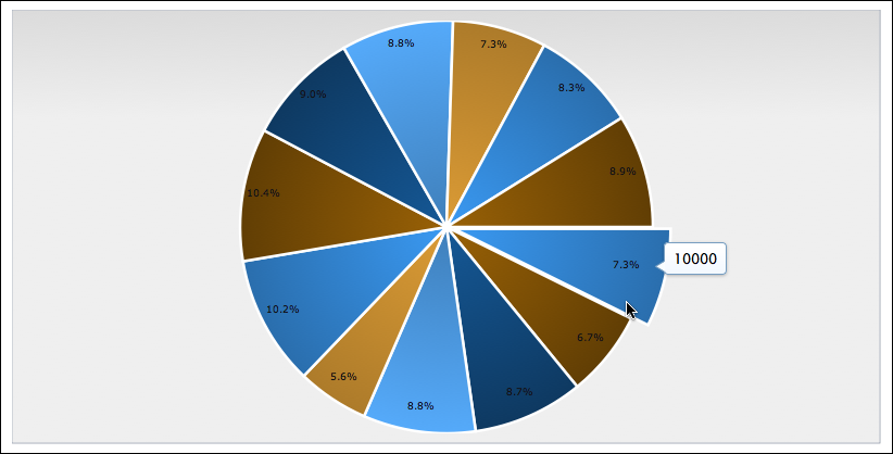
Monthly Sales Pie Chart with MoveSlice
Add a bit of dynamism to your Pie Chart with MoveSlice:
<link rel="stylesheet" href="/path/to/dijit/themes/claro/claro.css" media="screen">
<script>
require([
// Require the basic chart class
"dojox/charting/Chart",
// Require the theme of our choosing
"dojox/charting/themes/Claro",
// Charting plugins:
// We want to plot a Pie chart
"dojox/charting/plot2d/Pie",
// Retrieve the Legend, Tooltip, and MoveSlice classes
"dojox/charting/action2d/Tooltip",
"dojox/charting/action2d/MoveSlice",
// We want to use Markers
"dojox/charting/plot2d/Markers",
// We'll use default x/y axes
"dojox/charting/axis2d/Default",
// Wait until the DOM is ready
"dojo/domReady!"
], function(Chart, theme, Pie, Tooltip, MoveSlice) {
// Define the data
var chartData = [10000,9200,11811,12000,7662,13887,14200,12222,12000,10009,11288,12099];
// Create the chart within it's "holding" node
var chart = new Chart("chartNode");
// Set the theme
chart.setTheme(theme);
// Add the only/default plot
chart.addPlot("default", {
type: Pie,
markers: true,
radius:170
});
// Add axes
chart.addAxis("x");
chart.addAxis("y", { min: 5000, max: 30000, vertical: true, fixLower: "major", fixUpper: "major" });
// Add the series of data
chart.addSeries("Monthly Sales - 2010",chartData);
// Create the tooltip
var tip = new Tooltip(chart,"default");
// Create the slice mover
var mag = new MoveSlice(chart,"default");
// Render the chart!
chart.render();
});
</script>
<div id="chartNode" style="width:800px;height:400px;"></div>
A pie chart with MoveSlice, using the Claro theme
Monthly Sales with Highlights
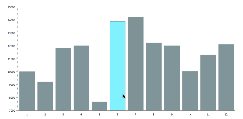
The Highlight plugin would look great with the Columns chart:
<script>
require([
// Require the basic chart class
"dojox/charting/Chart",
// Require the theme of our choosing
"dojox/charting/themes/MiamiNice",
// We want to plot Columns
"dojox/charting/plot2d/Columns",
// Require the highlighter
"dojox/charting/action2d/Highlight",
// We want to use Markers
"dojox/charting/plot2d/Markers",
// We'll use default x/y axes
"dojox/charting/axis2d/Default",
// Wait until the DOM is ready
"dojo/domReady!"
], function(Chart, theme, ColumnsPlot, Highlight) {
// Define the data
var chartData = [10000,9200,11811,12000,7662,13887,14200,12222,12000,10009,11288,12099];
// Create the chart within it's "holding" node
var chart = new Chart("chartNode");
// Set the theme
chart.setTheme(theme);
// Add the only/default plot
chart.addPlot("default", {
type: ColumnsPlot,
markers: true,
gap: 5
});
// Add axes
chart.addAxis("x");
chart.addAxis("y", { vertical: true, fixLower: "major", fixUpper: "major" });
// Add the series of data
chart.addSeries("Monthly Sales",chartData);
// Highlight!
new Highlight(chart,"default");
// Render the chart!
chart.render();
});</script>
<div id="chartNode" style="width:800px;height:400px;"></div>
A column chart with highlight, using the MiamiNice theme
Conclusion
The Dojo Toolkit provides a complete charting library capable of creating elegant, eye-catching, and dynamic charts of various types. dojox/charting is unmatched by other charting libraries in flexibility, functionality, and extendability. Don't serve your data to users in a boring way -- dress up your data with dojox/charting!
dojox/charting Resources
Looking for more detail about Dojo's charting library? Check out these great resources:
