dojox/mobile/TabBar
| Authors: | Yoshiroh Kamiyama |
|---|---|
| Developers: | Yoshiroh Kamiyama |
| since: | V1.6 |
TabBar is a container widget that has typically multiple TabBarButtons which controls visibility of views. It can be used as a tab container.
Constructor Parameters
| Parameter | Type | Default | Description |
| iconBase | String | “” | The default icon path for child items. If a child item does not have its own icon parameter specified, this value is used as its icon path. This parameter is especially useful when all or most of the icons are the same, or you use CSS sprite icons, where you specify an aggregated icon image with this parameter and an icon position for each icon. |
| iconPos | String | “” | The default icon position for child items. This parameter is especially useful when all or most of the icons are the same. |
| barType | String | tabBar | “tabBar”(default), “segmentedControl”, “standardTab”, “slimTab”, “flatTab”, or “tallTab” |
| fill | String | “auto” | Define if the bar should resize its children so that they evenly fill all the available space. Available values are :
|
| closable | Boolean | false | If true, user can close (destroy) a child tab by clicking the X on the tab. This property is NOT effective for “tabBar” and “tallBar”. |
| center | Boolean | true | If true, place the tabs in the center of the bar. This property is NOT effective for “tabBar”. |
| syncWithViews | Boolean | false | If true, this widget listens to view transition events to be synchronized with view’s visibility. |
| tag | String | “ul” | A name of html tag to create as domNode. |
Examples
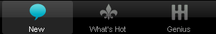
Tab Bar
This type of bar typically appears at the bottom of the screen to control visibility of multiple views.
require([
  "dojox/mobile",
  "dojox/mobile/parser",
  "dojox/mobile/TabBar"
]);
<ul data-dojo-type="dojox/mobile/TabBar">
  <li data-dojo-type="dojox/mobile/TabBarButton"
      data-dojo-props='icon1:"images/tab-icon-16.png",
                       icon2:"images/tab-icon-16h.png",
                       moveTo:"view1", selected:true'>New</li>
  <li data-dojo-type="dojox/mobile/TabBarButton"
      data-dojo-props='icon1:"images/tab-icon-15.png",
                       icon2:"images/tab-icon-15h.png",
                       moveTo:"view2"'>What's Hot</li>
  <li data-dojo-type="dojox/mobile/TabBarButton"
      data-dojo-props='icon1:"images/tab-icon-10.png",
                       icon2:"images/tab-icon-10h.png",
                       moveTo:"view3"'>Genius</li>
</ul>
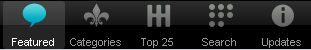
Tab Bar (CSS Sprite)
In this example, an aggregated icon image as below is used for each TabBarButton icon. This way the number of requests to the server can be reduced and thus the performance could be improved.
(tab-icons.png)
<ul data-dojo-type="dojox/mobile/TabBar"
    data-dojo-props='iconBase:"images/tab-icons.png"'>
  <li data-dojo-type="dojox/mobile/TabBarButton"
      data-dojo-props='iconPos1:"0,0,29,29",
                       iconPos2:"29,0,29,29",
                       selected:true'>Featured</li>
  <li data-dojo-type="dojox/mobile/TabBarButton"
      data-dojo-props='iconPos1:"0,29,29,29",
                       iconPos2:"29,29,29,29"'>Categories</li>
  <li data-dojo-type="dojox/mobile/TabBarButton"
      data-dojo-props='iconPos1:"0,58,29,29",
                       iconPos2:"29,58,29,29"'>Top 25</li>
  <li data-dojo-type="dojox/mobile/TabBarButton"
      data-dojo-props='iconPos1:"0,87,29,29",
                       iconPos2:"29,87,29,29"'>Search</li>
  <li data-dojo-type="dojox/mobile/TabBarButton"
      data-dojo-props='iconPos1:"0,116,29,29",
                       iconPos2:"29,116,29,29"'>Updates</li>
</ul>
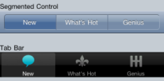
Segmented Control
This type of bar is typically used at the top of the screen to control visibility of multiple views.
<ul data-dojo-type="dojox/mobile/TabBar" data-dojo-props='barType:"segmentedControl"'>
  <li data-dojo-type="dojox/mobile/TabBarButton" data-dojo-props='selected:true'>New</li>
  <li data-dojo-type="dojox/mobile/TabBarButton">What's Hot</li>
  <li data-dojo-type="dojox/mobile/TabBarButton">Genius</li>
</ul>
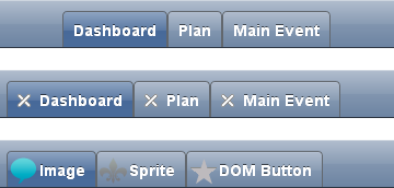
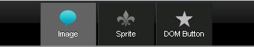
Standard Tab
Standard Tab can be used to create tabbed panes. If the closable=true option is specified, each tab shows the X button, and you can close a tabbed pane by clicking on it.
<ul data-dojo-type="dojox/mobile/TabBar" data-dojo-props='barType:"standardTab"'>
  <li data-dojo-type="dojox/mobile/TabBarButton" data-dojo-props='selected:true'>Dashboard</li>
  <li data-dojo-type="dojox/mobile/TabBarButton">Plan</li>
  <li data-dojo-type="dojox/mobile/TabBarButton">Main Event</li>
</ul>

<ul data-dojo-type="dojox/mobile/TabBar"
    data-dojo-props='barType:"standardTab", closable:true, center:false'>
  <li data-dojo-type="dojox/mobile/TabBarButton" data-dojo-props='selected:true'>Dashboard</li>
  <li data-dojo-type="dojox/mobile/TabBarButton">Plan</li>
  <li data-dojo-type="dojox/mobile/TabBarButton">Main Event</li>
</ul>

<ul data-dojo-type="dojox/mobile/TabBar"
    data-dojo-props='barType:"standardTab",
                     center:false,
                     iconBase:"images/tab-icons.png"'>
  <li data-dojo-type="dojox/mobile/TabBarButton"
      data-dojo-props='icon1:"images/tab-icon-16.png",
                       icon2:"images/tab-icon-16h.png",
                       selected:true'>Image</li>
  <li data-dojo-type="dojox/mobile/TabBarButton"
      data-dojo-props='iconPos1:"0,29,29,29",
                       iconPos2:"29,29,29,29"'>Sprite</li>
  <li data-dojo-type="dojox/mobile/TabBarButton"
      data-dojo-props='icon1:"mblDomButtonGrayStar",
                       icon2:"mblDomButtonYellowStar"'>DOM Button</li>
</ul>
If the fill=”always” option is specified, each tab is resized so that they all fill the entire content of the bar.
<ul data-dojo-type="dojox/mobile/TabBar" data-dojo-props='barType:"standardTab", fill:"always"'>
  <li data-dojo-type="dojox/mobile/TabBarButton" data-dojo-props='selected:true'>Dashboard</li>
  <li data-dojo-type="dojox/mobile/TabBarButton">Plan</li>
  <li data-dojo-type="dojox/mobile/TabBarButton">Main Event</li>
</ul>

<ul data-dojo-type="dojox/mobile/TabBar"
    data-dojo-props='barType:"standardTab", closable:true, center:false, fill:"always"'>
  <li data-dojo-type="dojox/mobile/TabBarButton" data-dojo-props='selected:true'>Dashboard</li>
  <li data-dojo-type="dojox/mobile/TabBarButton">Plan</li>
  <li data-dojo-type="dojox/mobile/TabBarButton">Main Event</li>
</ul>

<ul data-dojo-type="dojox/mobile/TabBar"
    data-dojo-props='barType:"standardTab",
                     center:false,
                     fill:"always",
                     iconBase:"images/tab-icons.png"'>
  <li data-dojo-type="dojox/mobile/TabBarButton"
      data-dojo-props='icon1:"images/tab-icon-16.png",
                       icon2:"images/tab-icon-16h.png",
                       selected:true'>Image</li>
  <li data-dojo-type="dojox/mobile/TabBarButton"
      data-dojo-props='iconPos1:"0,29,29,29",
                       iconPos2:"29,29,29,29"'>Sprite</li>
  <li data-dojo-type="dojox/mobile/TabBarButton"
      data-dojo-props='icon1:"mblDomButtonGrayStar",
                       icon2:"mblDomButtonYellowStar"'>DOM Button</li>
</ul>
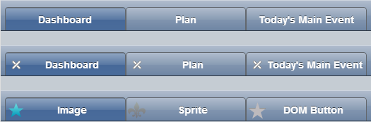
Slim Tab
Slim Tab is a space-saving type of tab bar. This may be useful especially for smaller screen devices.
<ul data-dojo-type="dojox/mobile/TabBar" data-dojo-props='barType:"slimTab"'>
  <li data-dojo-type="dojox/mobile/TabBarButton" data-dojo-props='selected:true'>Dashboard</li>
  <li data-dojo-type="dojox/mobile/TabBarButton">Plan</li>
  <li data-dojo-type="dojox/mobile/TabBarButton">Main Event</li>
</ul>

<ul data-dojo-type="dojox/mobile/TabBar"
    data-dojo-props='barType:"slimTab", closable:true, center:false'>
  <li data-dojo-type="dojox/mobile/TabBarButton" data-dojo-props='selected:true'>Dashboard</li>
  <li data-dojo-type="dojox/mobile/TabBarButton">Plan</li>
  <li data-dojo-type="dojox/mobile/TabBarButton">Main Event</li>
</ul>

<ul data-dojo-type="dojox/mobile/TabBar"
    data-dojo-props='barType:"slimTab",
                     center:false,
                     iconBase:"images/tab-icons.png"'>
  <li data-dojo-type="dojox/mobile/TabBarButton"
      data-dojo-props='icon1:"images/tab-icon-16.png",
                       icon2:"images/tab-icon-16h.png",
                       selected:true'>Image</li>
  <li data-dojo-type="dojox/mobile/TabBarButton"
      data-dojo-props='iconPos1:"0,29,29,29",
                       iconPos2:"29,29,29,29"'>Sprite</li>
  <li data-dojo-type="dojox/mobile/TabBarButton"
      data-dojo-props='icon1:"mblDomButtonGrayStar",
                       icon2:"mblDomButtonYellowStar"'>DOM Button</li>
</ul>
If the fill=”always” option is specified, each tab is resized so that they all fill the entire content of the bar.
<ul data-dojo-type="dojox/mobile/TabBar" data-dojo-props='barType:"slimTab", fill:"always"'>
  <li data-dojo-type="dojox/mobile/TabBarButton" data-dojo-props='selected:true'>Dashboard</li>
  <li data-dojo-type="dojox/mobile/TabBarButton">Plan</li>
  <li data-dojo-type="dojox/mobile/TabBarButton">Main Event</li>
</ul>

<ul data-dojo-type="dojox/mobile/TabBar"
    data-dojo-props='barType:"slimTab", closable:true, center:false, fill:"always"'>
  <li data-dojo-type="dojox/mobile/TabBarButton" data-dojo-props='selected:true'>Dashboard</li>
  <li data-dojo-type="dojox/mobile/TabBarButton">Plan</li>
  <li data-dojo-type="dojox/mobile/TabBarButton">Main Event</li>
</ul>

<ul data-dojo-type="dojox/mobile/TabBar"
    data-dojo-props='barType:"slimTab",
                     center:false,
                     fill:"always",
                     iconBase:"images/tab-icons.png"'>
  <li data-dojo-type="dojox/mobile/TabBarButton"
      data-dojo-props='icon1:"images/tab-icon-16.png",
                       icon2:"images/tab-icon-16h.png",
                       selected:true'>Image</li>
  <li data-dojo-type="dojox/mobile/TabBarButton"
      data-dojo-props='iconPos1:"0,29,29,29",
                       iconPos2:"29,29,29,29"'>Sprite</li>
  <li data-dojo-type="dojox/mobile/TabBarButton"
      data-dojo-props='icon1:"mblDomButtonGrayStar",
                       icon2:"mblDomButtonYellowStar"'>DOM Button</li>
</ul>
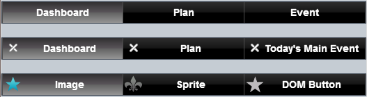
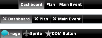
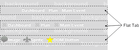
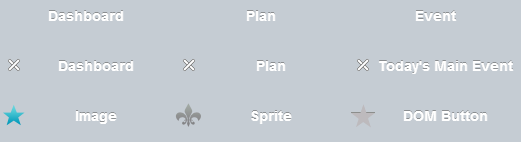
Flat Tab
Flat Tab has no borders and no background color by default to be displayed through the application’s background color or background image. (If necessary, you can set background to Flat Tab by overriding the css class “mblTabBar”.
<ul data-dojo-type="dojox/mobile/TabBar" data-dojo-props='barType:"flatTab"'">
  <li data-dojo-type="dojox/mobile/TabBarButton" data-dojo-props='selected:true'>Dashboard</li>
  <li data-dojo-type="dojox/mobile/TabBarButton">Plan</li>
  <li data-dojo-type="dojox/mobile/TabBarButton">Main Event</li>
</ul>

<ul data-dojo-type="dojox/mobile/TabBar" data-dojo-props='barType:"flatTab", closable:true, center:false'">
  <li data-dojo-type="dojox/mobile/TabBarButton" data-dojo-props='selected:true'>Dashboard</li>
  <li data-dojo-type="dojox/mobile/TabBarButton">Plan</li>
  <li data-dojo-type="dojox/mobile/TabBarButton">Main Event</li>
  </ul>

<ul data-dojo-type="dojox/mobile/TabBar"
    data-dojo-props='barType:"flatTab",
                     center:false,
                     iconBase:"images/tab-icons.png"'">
  <li data-dojo-type="dojox/mobile/TabBarButton"
      data-dojo-props='icon1:"images/tab-icon-16.png",
                       icon2:"images/tab-icon-16h.png"'>Image</li>
  <li data-dojo-type="dojox/mobile/TabBarButton"
      data-dojo-props='iconPos1:"0,29,29,29",
                       iconPos2:"29,29,29,29"'>Sprite</li>
  <li data-dojo-type="dojox/mobile/TabBarButton"
      data-dojo-props='icon1:"mblDomButtonGrayStar",
                       icon2:"mblDomButtonYellowStar",
                       selected:true'>DOM Button</li>
</ul>
If the fill=”always” option is specified, each tab is resized so that they all fill the entire content of the bar.
<ul data-dojo-type="dojox/mobile/TabBar" data-dojo-props='barType:"flatTab", fill:"always"'">
  <li data-dojo-type="dojox/mobile/TabBarButton" data-dojo-props='selected:true'>Dashboard</li>
  <li data-dojo-type="dojox/mobile/TabBarButton">Plan</li>
  <li data-dojo-type="dojox/mobile/TabBarButton">Main Event</li>
</ul>

<ul data-dojo-type="dojox/mobile/TabBar" data-dojo-props='barType:"flatTab", fill:"always", closable:true, center:false'">
  <li data-dojo-type="dojox/mobile/TabBarButton" data-dojo-props='selected:true'>Dashboard</li>
  <li data-dojo-type="dojox/mobile/TabBarButton">Plan</li>
  <li data-dojo-type="dojox/mobile/TabBarButton">Main Event</li>
  </ul>

<ul data-dojo-type="dojox/mobile/TabBar"
    data-dojo-props='barType:"flatTab",
                     center:false,
                     fill:"always",
                     iconBase:"images/tab-icons.png"'">
  <li data-dojo-type="dojox/mobile/TabBarButton"
      data-dojo-props='icon1:"images/tab-icon-16.png",
                       icon2:"images/tab-icon-16h.png"'>Image</li>
  <li data-dojo-type="dojox/mobile/TabBarButton"
      data-dojo-props='iconPos1:"0,29,29,29",
                       iconPos2:"29,29,29,29"'>Sprite</li>
  <li data-dojo-type="dojox/mobile/TabBarButton"
      data-dojo-props='icon1:"mblDomButtonGrayStar",
                       icon2:"mblDomButtonYellowStar",
                       selected:true'>DOM Button</li>
</ul>
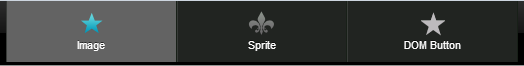
Tall Tab
<ul data-dojo-type="dojox/mobile/TabBar"
    data-dojo-props='barType:"tallTab", iconBase:"images/tab-icons.png"'>
  <li data-dojo-type="dojox/mobile/TabBarButton"
      data-dojo-props='icon1:"images/tab-icon-16.png",
                       icon2:"images/tab-icon-16h.png",
                       selected:true'>Image</li>
  <li data-dojo-type="dojox/mobile/TabBarButton"
      data-dojo-props='iconPos1:"0,29,29,29",
                       iconPos2:"29,29,29,29"'>Sprite</li>
  <li data-dojo-type="dojox/mobile/TabBarButton"
      data-dojo-props='icon1:"mblDomButtonGrayStar",
                       icon2:"mblDomButtonYellowStar"'>DOM Button</li>
</ul>
If the fill=”always” option is specified, each tab is resized so that they all fill the entire content of the bar.
<ul data-dojo-type="dojox/mobile/TabBar"
    data-dojo-props='barType:"tallTab", fill:"always", iconBase:"images/tab-icons.png"'>
  <li data-dojo-type="dojox/mobile/TabBarButton"
      data-dojo-props='icon1:"images/tab-icon-16.png",
                       icon2:"images/tab-icon-16h.png",
                       selected:true'>Image</li>
  <li data-dojo-type="dojox/mobile/TabBarButton"
      data-dojo-props='iconPos1:"0,29,29,29",
                       iconPos2:"29,29,29,29"'>Sprite</li>
  <li data-dojo-type="dojox/mobile/TabBarButton"
      data-dojo-props='icon1:"mblDomButtonGrayStar",
                       icon2:"mblDomButtonYellowStar"'>DOM Button</li>
</ul>
Grouped Tab Bar
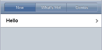
TabBar forms kind of tab container whose panes are views. You may, however, want to treat the entire tab container as one view. In such cases, you can nest the view classes as shown in the following example. In this example, subview1, subview2, and subview3 are in the top level view groupview1. You can move to the hello view from subview1 or subview2, and then return to the top level view (=groupview1) instead of a specific child view (subview1, subview2, or subview3). When you return to groupview1, the currently visible view in groupview1 is shown.
<div id="groupview1" data-dojo-type="dojox/mobile/View" data-dojo-props='selected:true'>
    <ul data-dojo-type="dojox/mobile/TabBar" data-dojo-props='barType:"segmentedControl", fixed:"top"'>
      <li data-dojo-type="dojox/mobile/TabBarButton" data-dojo-props='moveTo:"subview1", selected:true'>New</li>
      <li data-dojo-type="dojox/mobile/TabBarButton" data-dojo-props='moveTo:"subview2"'>What's Hot</li>
      <li data-dojo-type="dojox/mobile/TabBarButton" data-dojo-props='moveTo:"subview3"'>Genius</li>
    </ul>

    <div id="subview1" data-dojo-type="dojox/mobile/ScrollableView" data-dojo-props='selected:true'>
      <ul data-dojo-type="dojox/mobile/EdgeToEdgeList">
        <li data-dojo-type="dojox/mobile/ListItem" data-dojo-props='moveTo:"hello"'>Hello</li>
      </ul>
    </div>

    <div id="subview2" data-dojo-type="dojox/mobile/ScrollableView">
      <ul data-dojo-type="dojox/mobile/RoundRectList">
        <li data-dojo-type="dojox/mobile/ListItem" data-dojo-props='moveTo:"hello"'>Hello</li>
      </ul>
    </div>

    <div id="subview3" data-dojo-type="dojox/mobile/ScrollableView">
      <div data-dojo-type="dojox/mobile/RoundRect" data-dojo-props='shadow:true'>View3</div>
    </div>
</div>

<div id="hello" data-dojo-type="dojox/mobile/ScrollableView">
    <h1 data-dojo-type="dojox/mobile/Heading" data-dojo-props='back:"Group1", moveTo:"groupview1"'>Hello</h1>
    <div data-dojo-type="dojox/mobile/RoundRect" data-dojo-props='shadow:true'>Hello View</div>
</div>
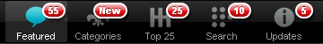
Tab Bar with Badge
You can use the ‘badge’ parameter of dojox/mobile/TabBarButton to add dojox/mobile/Badge onto TabBar.
<ul data-dojo-type="dojox/mobile/TabBar"
    data-dojo-props='iconBase:"images/tab-icons.png"'>
  <li data-dojo-type="dojox/mobile/TabBarButton"
      data-dojo-props='iconPos1:"0,0,29,29",
                       iconPos2:"29,0,29,29",
                       selected:true,
                       badge:"55"'>Featured</li>
  <li data-dojo-type="dojox/mobile/TabBarButton"
      data-dojo-props='iconPos1:"0,29,29,29",
                       iconPos2:"29,29,29,29",
                       badge:"New"'>Categories</li>
  <li data-dojo-type="dojox/mobile/TabBarButton"
      data-dojo-props='iconPos1:"0,58,29,29",
                       iconPos2:"29,58,29,29",
                       badge:"25"'>Top 25</li>
  <li data-dojo-type="dojox/mobile/TabBarButton"
      data-dojo-props='iconPos1:"0,87,29,29",
                       iconPos2:"29,87,29,29",
                       badge:"10"'>Search</li>
  <li data-dojo-type="dojox/mobile/TabBarButton"
      data-dojo-props='iconPos1:"0,116,29,29",
                       iconPos2:"29,116,29,29",
                       badge:"5"'>Updates</li>
</ul>