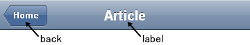
Heading is a widget that represents a navigation bar, which usually appears at the top of an application. It usually displays the title of the current view and can contain a navigational control.
If you use it with dojox/mobile/ScrollableView, it can also be used as a fixed header bar or a fixed footer bar. In such cases, specify the fixed=”top” attribute to be a fixed header bar or the fixed=”bottom” attribute to be a fixed footer bar.
Heading can have one or more ToolBarButton widgets as its children.
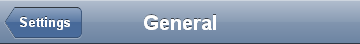
Example 1
<div data-dojo-type="dojox/mobile/Heading"
     data-dojo-props='back:"Settings", moveTo:"settings"'>General</div>
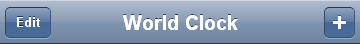
Example 2
<div data-dojo-type="dojox/mobile/Heading" data-dojo-props='label:"World Clock"'>
  <span data-dojo-type="dojox/mobile/ToolBarButton">Edit</span>
  <span data-dojo-type="dojox/mobile/ToolBarButton"
        data-dojo-props='icon:"mblDomButtonWhitePlus"'
        style="float:right;" onclick="console.log('+ was clicked')"></span>
</div>
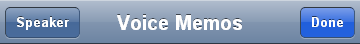
Example 3
<div data-dojo-type="dojox/mobile/Heading" data-dojo-props='label:"Voice Memos"'>
  <span data-dojo-type="dojox/mobile/ToolBarButton"
        data-dojo-props='label:"Speaker"'></span>
  <span data-dojo-type="dojox/mobile/ToolBarButton"
        data-dojo-props='label:"Done",defaultColor:"mblColorBlue"'
        style="float:right;"></span>
</div>
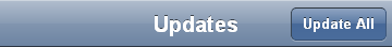
Example 4
<div data-dojo-type="dojox/mobile/Heading" data-dojo-props='label:"Updates"'>
  <span data-dojo-type="dojox/mobile/ToolBarButton"
        data-dojo-props='label:"Update All"' style="float:right;"></span>
</div>
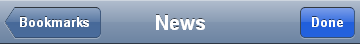
Example 5
<div data-dojo-type="dojox/mobile/Heading"
     data-dojo-props='label:"News", back:"Bookmarks", moveTo:"bookmarks"'>
  <span data-dojo-type="dojox/mobile/ToolBarButton"
        data-dojo-props='label:"Done",defaultColor:"mblColorBlue"'
        style="float:right;"></span>
</div>
Example 6
<div data-dojo-type="dojox/mobile/Heading">
  <span data-dojo-type="dojox/mobile/ToolBarButton"
        data-dojo-props='label:"Done",defaultColor="mblColorBlue"'></span>
  <span data-dojo-type="dojox/mobile/ToolBarButton"
        data-dojo-props='label:"New Folder"'
        style="float:right;"></span>
</div>
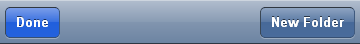
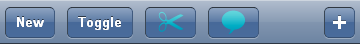
Example 7
<div data-dojo-type="dojox/mobile/Heading">
  <span data-dojo-type="dojox/mobile/ToolBarButton"
        data-dojo-props='toggle:true'>New</span>
  <span data-dojo-type="dojox/mobile/ToolBarButton"
        data-dojo-props='toggle:"true"'>Toggle</span>
  <span data-dojo-type="dojox/mobile/ToolBarButton"
        data-dojo-props='icon:"images/tab-icon-18h.png", moveTo:"view3"'
        style="padding:0 10px"></span>
  <span data-dojo-type="dojox/mobile/ToolBarButton"
        data-dojo-props='icon:"images/tab-icons.png", iconPos:"29,0,29,29", moveTo:"view3"'
        style="padding:0 10px"></span>
  <span data-dojo-type="dojox/mobile/ToolBarButton"
        data-dojo-props='icon:"mblDomButtonWhitePlus", moveTo:"view3"'
        style="float:right;"></span>
</div>
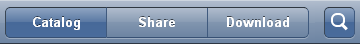
Example 8
<div data-dojo-type="dojox/mobile/Heading">
  <ul data-dojo-type="dojox/mobile/TabBar" data-dojo-props='barType:"segmentedControl"'>
    <li data-dojo-type="dojox/mobile/TabBarButton" style="width:80px"
        data-dojo-props='selected:true'>Catalog</li>
    <li data-dojo-type="dojox/mobile/TabBarButton" style="width:80px">Share</li>
    <li data-dojo-type="dojox/mobile/TabBarButton" style="width:80px">Download</li>
  </ul>
  <span data-dojo-type="dojox/mobile/ToolBarButton"
        data-dojo-props='icon:"mblDomButtonWhiteSearch"' style="float:right;"></span>
</div>
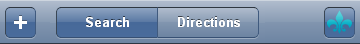
Example 9
<div data-dojo-type="dojox/mobile/Heading">
  <table cellpadding="0" cellspacing="0" style="width:100%;"><tr>
  <td><span data-dojo-type="dojox/mobile/ToolBarButton"
            data-dojo-props='icon:"mblDomButtonWhitePlus"'></span></td>
  <td align="center"><div data-dojo-type="dojox/mobile/TabBar"
                          data-dojo-props='barType:"segmentedControl"' style="margin:auto;">
    <div data-dojo-type="dojox/mobile/TabBarButton"
         data-dojo-props='selected:true' style="width:80px">Search</div>
    <div data-dojo-type="dojox/mobile/TabBarButton" style="width:80px">Directions</div>
  </div></td>
  <td align="right"><span data-dojo-type="dojox/mobile/ToolBarButton"
                          data-dojo-props='icon:"images/tab-icon-15h.png"'
                          style="float:right;"></span></td>
  </tr></table>
</div>
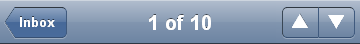
Example 10
<div data-dojo-type="dojox/mobile/Heading"
     data-dojo-props='back:"Inbox", label:"1 of 10"'>
  <ul data-dojo-type="dojox/mobile/TabBar"
      data-dojo-props='barType:"segmentedControl", selectOne:false'
      style="float:right;">
    <li data-dojo-type="dojox/mobile/TabBarButton"
        data-dojo-props='icon:"mblDomButtonWhiteUpArrow"'></li>
    <li data-dojo-type="dojox/mobile/TabBarButton"
        data-dojo-props='icon:"mblDomButtonWhiteDownArrow"'></li>
  </ul>
</div>
Example 11
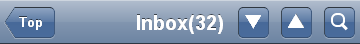
<div data-dojo-type="dojox/mobile/Heading"
     data-dojo-props='back:"Top", label:"Inbox(32)"'>
  <span data-dojo-type="dojox/mobile/ToolBarButton"
        data-dojo-props='icon:"mblDomButtonWhiteSearch"'
        style="float:right;"></span>
  <span data-dojo-type="dojox/mobile/ToolBarButton"
        data-dojo-props='icon:"mblDomButtonWhiteUpArrow"'
        style="float:right;"></span>
  <span data-dojo-type="dojox/mobile/ToolBarButton"
        data-dojo-props='icon:"mblDomButtonWhiteDownArrow"'
        style="float:right;"></span>
</div>