| Authors: | Yoshiroh Kamiyama |
|---|
| Developers: | Yoshiroh Kamiyama |
|---|
| since: | V1.5 |
|---|
Heading is a widget that represents a navigation bar, which usually appears at the top of an application. It usually displays the title of the current view and can contain a navigational control.
If you use it with dojox.mobile.ScrollableView, it can also be used as a fixed header bar or a fixed footer bar. In such cases, specify the fixed=”top” attribute to be a fixed header bar or the fixed=”bottom” attribute to be a fixed footer bar.
Heading can have one or more ToolBarButton widgets as its children.
| Parameter |
Type |
Default |
Description |
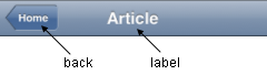
| back |
String |
“” |
A label for the navigational control to return to the previous View. |
| href |
String |
“” |
A URL to open when the navigational control is pressed. |
| moveTo |
String |
“” |
The id of the transition destination view which resides in the current page. If the value has a hash sign
(‘#’) before the id (e.g. #view1) and the dojo.hash module is loaded by the user application, the view
transition updates the hash in the browser URL so that the user can bookmark the destination view. In this
case, the user can also use the browser’s back/forward button to navigate through the views in the browser
history. If null, transitions to a blank view. If ‘#’, returns immediately without transition. |
| transition |
String |
“slide” |
A type of animated transition effect. You can choose from the standard transition types, “slide”, “fade”,
“flip”, or from the extended transition types, “cover”, “coverv”, “dissolve”, “reveal”, “revealv”,
“scaleIn”, “scaleOut”, “slidev”, “swirl”, “zoomIn”, “zoomOut”. If “none” is specified, transition occurs
immediately without animation. |
| label |
String |
“” |
A title text of the heading. If the label is not specified, the innerHTML of the node is used as a label. |
| iconBase |
String |
“” |
The default icon path for child items. If a child item does not have its own icon parameter specified,
this value is used as its icon path. This parameter is especially useful when all or most of the icons are
the same, or you use CSS sprite icons, where you specify an aggregated icon image with this parameter and
an icon position for each icon. |
Example 1
<h1 data-dojo-type="dojox.mobile.Heading" back="Settings" moveTo="settings">General</h1>

Example 2
<h1 data-dojo-type="dojox.mobile.Heading" label="World Clock">
  <div data-dojo-type="dojox.mobile.ToolBarButton" style="padding: 0px 14px">Edit</div>
  <div data-dojo-type="dojox.mobile.ToolBarButton" class="mblDomButtonWhitePlus" style="float:right;"></div>
</h1>

Example 3
<h1 data-dojo-type="dojox.mobile.Heading" label="Voice Memos">
  <div data-dojo-type="dojox.mobile.ToolBarButton" label="Speaker"></div>
  <div data-dojo-type="dojox.mobile.ToolBarButton" label="Done" class="mblColorBlue" style="width:45px;float:right;"></div>
</h1>

Example 4
<h1 data-dojo-type="dojox.mobile.Heading" label="Updates">
  <div data-dojo-type="dojox.mobile.ToolBarButton" label="Update All" style="float:right;"></div>
</h1>

Example 5
<h1 data-dojo-type="dojox.mobile.Heading" label="News" back="Bookmarks" moveTo="bookmarks">
  <div data-dojo-type="dojox.mobile.ToolBarButton" label="Done" class="mblColorBlue" style="width:45px;float:right;"></div>
</h1>

Example 6
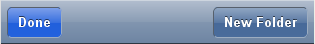
<h1 data-dojo-type="dojox.mobile.Heading">
  <div data-dojo-type="dojox.mobile.ToolBarButton" label="Done" class="mblColorBlue"></div>
  <div data-dojo-type="dojox.mobile.ToolBarButton" label="New Folder" style="float:right;"></div>
</h1>
Example 7
<div data-dojo-type="dojox.mobile.Heading">
  <div data-dojo-type="dojox.mobile.ToolBarButton" toggle="true">New</div>
  <div data-dojo-type="dojox.mobile.ToolBarButton" toggle="true">Toggle</div>
  <div data-dojo-type="dojox.mobile.ToolBarButton" icon="images/a-icon-12.png" moveTo="view3"></div>
  <div data-dojo-type="dojox.mobile.ToolBarButton" icon="images/tab-icons.png" iconPos="29,0,29,29" moveTo="view3"></div>
  <div data-dojo-type="dojox.mobile.ToolBarButton" class="mblDomButtonWhitePlus" moveTo="view3" style="float:right;"></div>
</div>

Example 8
<h1 data-dojo-type="dojox.mobile.Heading">
  <ul data-dojo-type="dojox.mobile.TabBar" barType="segmentedControl" style="float:left;margin-left:6px;">
    <li data-dojo-type="dojox.mobile.TabBarButton" style="width:80px" selected="true">Catalog</li>
    <li data-dojo-type="dojox.mobile.TabBarButton" style="width:80px">Share</li>
    <li data-dojo-type="dojox.mobile.TabBarButton" style="width:80px">Download</li>
  </ul>
  <div data-dojo-type="dojox.mobile.ToolBarButton" class="mblDomButtonWhiteSearch" style="float:right;"></div>
</h1>

Example 9
<h1 data-dojo-type="dojox.mobile.Heading" align="center">
  <table cellpadding="0" cellspacing="0" style="width:100%;"><tr>
  <td><div data-dojo-type="dojox.mobile.ToolBarButton" class="mblDomButtonWhitePlus"></div></td>
  <td align="center"><div data-dojo-type="dojox.mobile.TabBar" barType="segmentedControl" style="margin:auto;">
    <div data-dojo-type="dojox.mobile.TabBarButton" selected="true" style="width:80px">Search</div>
    <div data-dojo-type="dojox.mobile.TabBarButton" style="width:80px">Directions</div>
  </div></td>
  <td align="right"><div data-dojo-type="dojox.mobile.ToolBarButton" icon="images/tab-icon-15h.png" style="float:right;"></div></td>
  </tr></table>
</h1>

Example 10
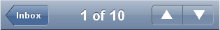
<h1 data-dojo-type="dojox.mobile.Heading" back="Inbox" label="1 of 10">
  <ul data-dojo-type="dojox.mobile.TabBar" barType="segmentedControl" style="float:right;margin-right:6px;">
    <li data-dojo-type="dojox.mobile.TabBarButton" class="mblDomButtonWhiteUpArrow" selectOne="false"></li>
    <li data-dojo-type="dojox.mobile.TabBarButton" class="mblDomButtonWhiteDownArrow" selectOne="false"></li>
  </ul>
</h1>
Example 11
<h1 data-dojo-type="dojox.mobile.Heading" back="Top" label="Inbox(32)">
  <div data-dojo-type="dojox.mobile.ToolBarButton" class="mblDomButtonWhiteSearch" style="float:right;"></div>
  <div data-dojo-type="dojox.mobile.ToolBarButton" class="mblDomButtonWhiteUpArrow" style="float:right;"></div>
  <div data-dojo-type="dojox.mobile.ToolBarButton" class="mblDomButtonWhiteDownArrow" style="float:right;"></div>
</h1>